Learn all about Cricut Design Space Kerning to make your projects look more professional! Plus get tips and tricks for better letter spacing overall when working with fonts in Cricut Design Space.
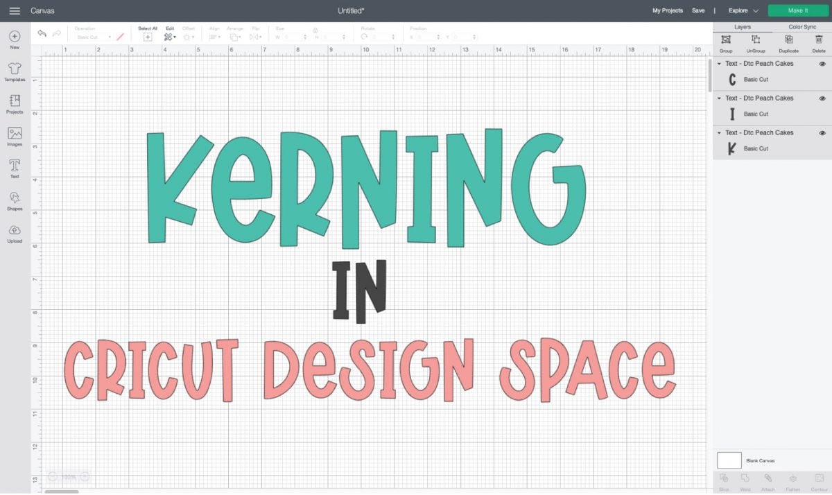
In May 2021, Cricut announced a new feature in Cricut Design Space—kerned fonts.
As someone with a background in graphic design, I’ve been excited about the ability to kern fonts for a while. So when I went to actually use this new feature, I found Cricut’s use of the word “kerning” to be a little…misleading. And while this new feature does vastly improve working with fonts, do think there’s still room for improvement, as you’ll see.
This is a much more in-depth post about fonts and kerning overall because I’m a huge font nerd, but I think it’s helpful for Cricut crafters to know more about design so you can make your projects even better and more professional!
Want to know more about working with fonts and your Cricut? I’ve got a ton of tutorials!
- Font Basics in Cricut Design Space
- How to Upload Fonts to Cricut Design Space
- Working with Script Fonts in Cricut Design Space
- Curving Text in Cricut Design Space
- Kerning Fonts in Cricut Design Space
- Where to Find Free and Cheap Fonts for the Cricut
- 101 Fonts for Cricut & Silhouette
- Single Line Fonts for Writing, Engraving, and Foiling
What is Kerning?
Kerning isn’t a word you may have heard before. In graphic design, kerning is the amount of space between two characters, most often letters in a word. Good designers change the amount of spacing between letters to make the word more visually pleasing. There’s no true mathematical formula for good kerning—it’s really up to a designer’s eye.
In this example I made in Adobe Illustrator, you’ll see the difference in the word BOAT:
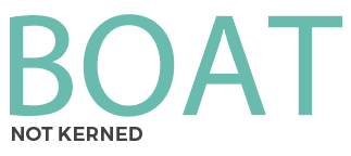
Letters with diagonal sides tend to be the hardest to kern, like that A. The negative space between the O and the A, and the space between the A and the T is too large—it creates a gaping space between the letters and makes the end of the word feel a bit untethered.
In this second example, I’ve used the kerning tool in Illustrator to adjust the spacing between the individual letters. Now the A tucks under the O a little better, and the T is over the diagonal stroke of the A.
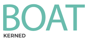
The word feels more grounded and whole than it did before kerning.
Kerning vs. Letter Spacing
You may be thinking this seems a lot like letter spacing. But letter spacing refers to the overall spacing of a word to make it more or less dense, while kerning adjusts the spacing between two specific characters/letters to make it more visually pleasing. Here’s an example of normal and increased letter spacing:

But if you look closely at that first example of beautiful, it could actually use some kerning. The B and the E are a bit far apart, that A could be tucked under the U a little better, etc. Here’s a version after kerning:

You can also find a bunch of great Kerning Tips at 99 Designs.
Cricut Kerning & “Kerned Fonts”
So now let’s talk about Cricut kerning. When the feature was first announced, I assumed we’d get granular control over the spacing between letters so we can kern things to be more visually pleasing. For example this is what kerning looks like in Adobe Illustrator, where you can adjust the amount of spacing in tiny increments:

Instead, we got “kerned fonts” in Cricut Design Space. There’s no granular level control. Kerning only applies to Cricut fonts, not system fonts (learn more about system fonts in my post All About Cricut Design Space Fonts).
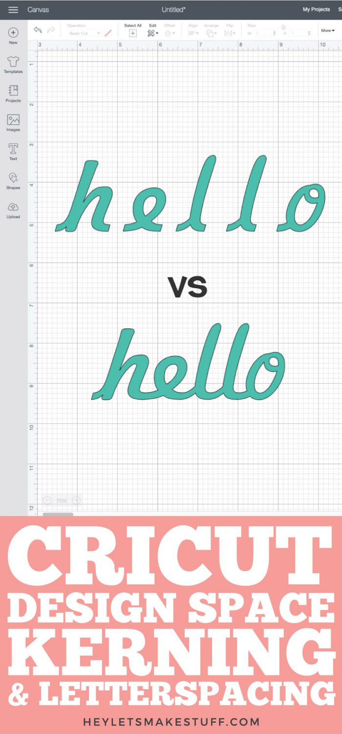
Until they released “kerned Cricut fonts,” Cricut had notoriously bad letter spacing. You’d type a word into Cricut Design Space and select a font (this one is Aphrodite Pro) it would look something like this:

Like, it’s the opposite of magnificent. It’s ma gni f icent, if you will.
This is because Cricut Design Space would read each letter as a separate image and the software would not overlap them at all. The fix before the new kerned fonts was to ungroup to letters and space them individually. You can learn more about how to do that in my post Working with Fonts in Cricut Design Space.
But with the addition of “kerned fonts” in Cricut Design Space, Cricut has given us a much better starting point. Basically instead of the individual kerning, they have just fixed the no-overlap issue on a bunch of their fonts and called them “kerned fonts.”
To filter by kerned fonts, you can select Only Kerned Fonts in the Font Toolbar. Just check the box and it will filter by fonts that have been kerned by the Cricut design team.

In the below example, I’ve selected the Alyssa Stencil Script, which is a kerned font. You can see that the spacing between the letters is MUCH better than the above example. Type and cut your project—super simple.

So instead of true kerning, Cricut has just fixed the letter spacing on certain fonts. I really think “letter spaced fonts” would have been a more accurate name for these fonts, but I’m not in charge of these things.
Fixing Cricut Design Space Kerning
That being said, some of these “kerned” Cricut Design Space fonts aren’t perfect. There are a lot of them that will work straight out of Design Space for most applications, but here are three kerned fonts that need additional tweaking using my tips in Working with Fonts in Cricut Design Space. I just wanted to give you a few more ideas of how you can make your projects even more professional.
First up is the kerned Cricut font Bikini Babe. You can see that the kerned version of this font isn’t perfect—that first A clumsily overlaps the M and the G, and that last I is not close enough to the C. I also feel like the final T is off on its own a bit. So I ungrouped the letters and reconfigured them myself in the below example.
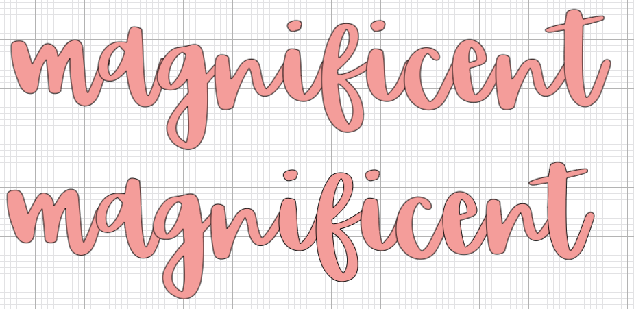
Second up is the kerned Cricut font DTC Peach Cakes. Not sure what this one looked like before kerning, but I feel like there are some real gaping holes in this one, particular around that first A and the Ns. Ungrouped them and my updated version is on the bottom.
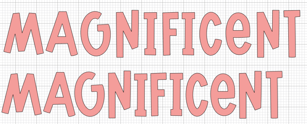
Finally, here’s the kerned Cricut font Magnifico Daytime. This one has a fun shadow effect, but in the Cricut kerned version those shadows overlap in weird ways. I ungrouped the letters and reconfigured them so they are more evenly spaced.

So you can see how the kerned versions of these fonts are much better than they used to be (see that first magnificent font!), but they could still use some work to make them even better.
So that’s a basic overview of kerning, letter spacing, and Cricut Design Space kerning and kerned fonts. Hope you found it helpful to make your designs even more professional!


Comments & Reviews
Clarice says
What is the most efficient method for thickening letters in a chosen font? I find this to be quite tricky. Thanks for your help.
Crystal Summers says
Hi Clarice,
Some fonts have a “bold” option, which is the easiest way to make them thicker. However, if that isn’t an option or isn’t your desired thickness, you can try this more manual way. I usually click on the word/phrase and unlock the little lock icon. I then pull the design side-to-side or top-to-bottom to change the width. Once I find a thickness I like, I lock the design again and resize accordingly with those lock specs.
Hope this helps!
Crystal, HLMS Community Manager