If your sublimation prints are dull, here are 14 ways you can improve the quality of your projects and get brighter sublimation prints!
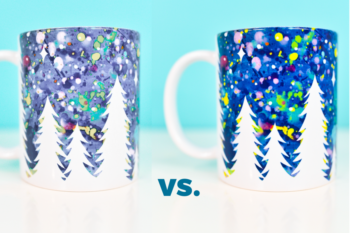
If you’re frustrated because your sublimation projects are coming out dull or washed out, there are a lot of reasons this could bed happening. In today’s post, I’m going to run through 14 different reasons your sublimation prints might be dull and how you can fix them. That way you’re getting the brightest, most vivid sublimation prints!
There is a lot that can go wrong with sublimation. You may want to start with my overview of Troubleshooting Sublimation Printing. if you’re having issues specifically with your colors being incorrect, you’ll also want to read my post Sublimation ICC Profiles & Color Management. Finally, if your printer is clogged, start with my post Fixing a Clog in an Epson EcoTank Printer.
Okay, let’s dive into these 12 reasons your sublimation prints are dull—and how to make them look better!
1. Prints out of the Printer
To start off with, prints right out of your printer will be dull. This is because sublimation ink is a different formulation than regular pigment ink. It doesn’t become bright until it’s heated and the ink goes through the actual sublimation process.
As you can see here, the print is quite dull right out of the printer and the color looks totally wrong. But after I pressed it to my garment, the color completely changed. It’s bright and colorful and looks fantastic.
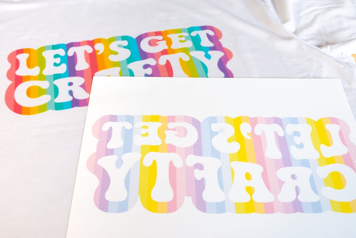
So never judge a sublimation project by it’s print! You’ll need to press it to your project to know the true color. My recommendation is to buy some cheap polyester fabric for testing, so you’re not wasting your blanks trying to get it right.
2. Print Quality Settings
Another problem with your actual print may be your print settings. Most printers allow you to change your print settings from options that use less ink like draft, normal, or standard to print settings that use more ink like high or best.

Generally, it’s good to use a higher-quality setting if your prints are dull. This is because the higher-quality settings lay more ink down on the page, giving you a brighter press.
That being said, you can always test different printer settings. For some materials, you may find a standard setting to be enough, or even better than the high-quality setting if the ink starts to migrate.
3. Paper Settings
Additionally, you may want to change your paper settings. Printers should have a range of options, but generally matte paper tends to work best if you’re struggling with prints that aren’t vibrant enough.
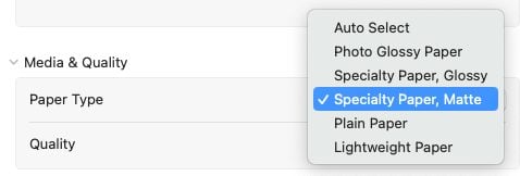
Matte paper holds more ink than other paper, which has the same effect as the paper quality above. More ink generally equals a more vibrant print.
4. Image Quality
Another problem could be your image quality. There are a couple of things that could go wrong here, so let’s take a look.
Resolution
To start, you’ll want a good resolution for your images. 300dpi is recommended. The problem is, if you just pull an image off a website or sometimes a photo app (particularly off the cloud), often these will just be 72dpi. Which means you may end up with a pixelated, faded image.
You’ll also have the same problem if you download a 300dpi image but then you try and make it larger than its largest dimensions—you’ll end up with pixelation.
This is why I recommend downloading and purchasing your sublimation files from a reputable source. See my post Where to Find Cheap and Free Sublimation Files for more information.
If you are scanning old photos into your computer, make sure you are scanning them in at 300dpi at the size you want to use them. If you want to make them bigger than the size of the photo itself, you may have to increase the dpi to 600 or more.
Photo Quality
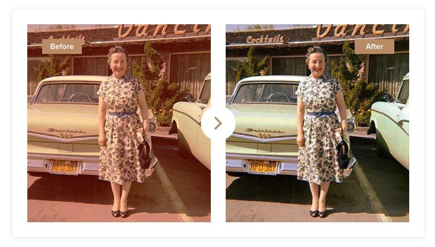
Often, people want to sublimate older photos. The problem is, old photos are just not as high quality as the photos we take today. Many times they have faded over the years or the color has changed.
You can use a free app like PhotoGlory to help fix old photos and restore them to their correct color. Then they will be more accurate when you sublimate them.
5. Contrast
Another edit you might want to make to your photos is to increase the contrast. If you have an image that is sort of…flat in color, you can increase the contrast of the photo to help the darks be dark and the lights be light. This can be done in pretty much any photo editing software, including free programs.
6. Wrong or Low-Quality Paper
Now let’s move on from the file and printing options to the actual products you will use to sublimate your projects. First up is paper. Some crafters say you can use plain copy paper, but in my experience that leaves me with faded images.
I actually tested a bunch of sublimation papers, including copy paper. You can see the difference below. On the left is a high-quality sublimation paper (TexPrint) and on the right is regular copy paper. The difference is stark—the sublimation paper is vibrant and the colors are beautiful, and the copy paper is much more faded
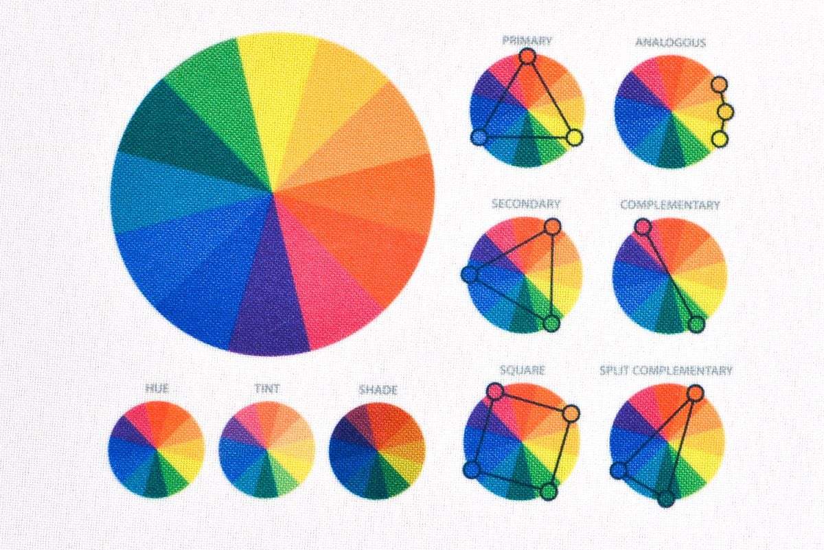
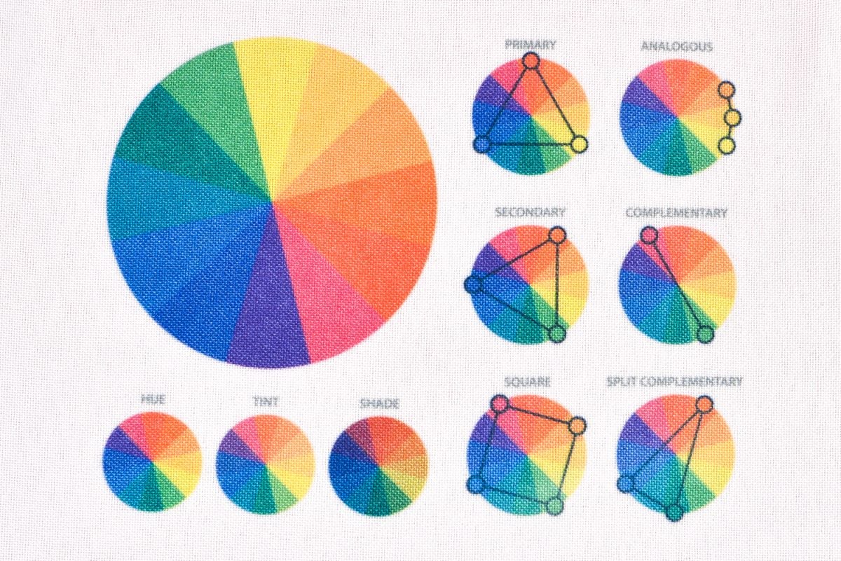
This is the same thing I’ve talked about above—sublimation paper is designed to hold and release more ink than copy paper. More ink equals a more vibrant image.
7. Wrong Side of the Paper
Speaking of paper, make sure you are printing on the correct side of the sublimation paper! Many brands have a watermark on the back, but sometimes they don’t. Which can make it really difficult to know which side of the paper to use.
Flip over a sheet of your paper and you’ll see that one side is brighter white than the other side. The backside might be slightly more gray or slightly more pink or just not as bright of a white. Make sure you are printing on the bright white side.
8. Non-Poly Blank or Low Poly Count
Another reason you might see a faded image is due to your blank. To start, your blank needs to be either 65%+ polyester or have a poly-coating.
For garments and other soft textiles, the minimum is 65% polyester. 100% polyester is going to get you the most vibrant image, and the more you go down in that polyester count the more faded or vintage your image will be. I see a lot of people ask why their image is so faded and it turns out they used a 100% cotton blank. So make sure you are using a garment that has a high polyester count suitable for sublimation.
Here you can really see the difference between a cotton tee (left) and a polyester tee (right).
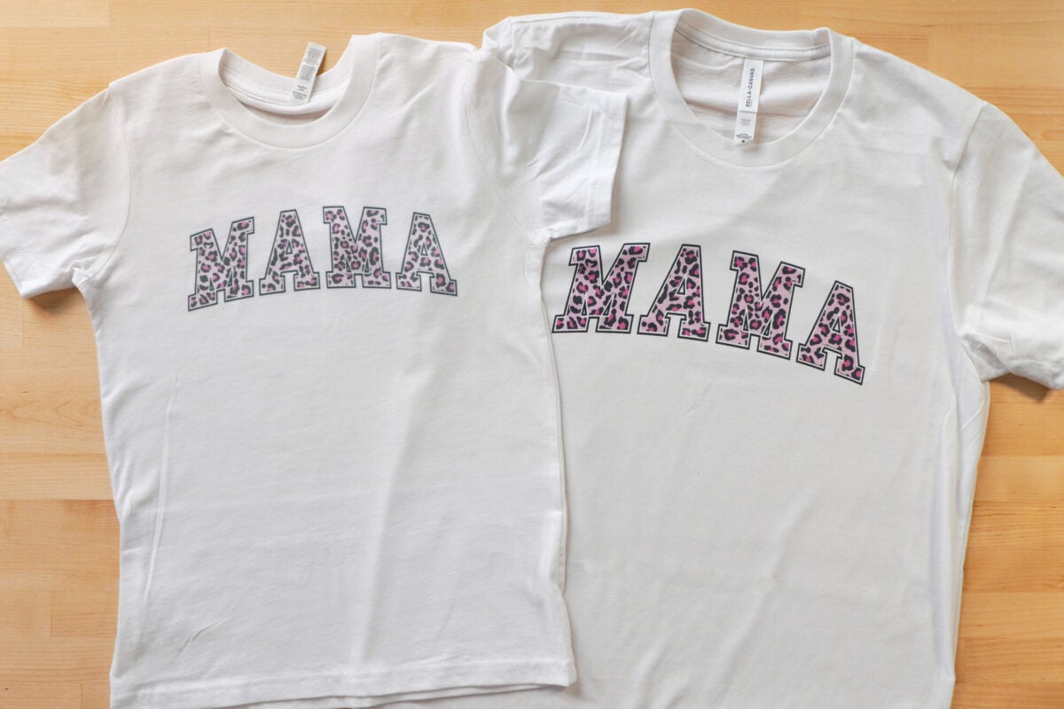
If you buy a hard sublimation blank, it will have the correct coating. But if you, for example, go to the Dollar Tree and grab a ceramic mug, the color won’t transfer properly because there is no poly coating for the ink to bond with. So again, you want to make sure you have a sublimation-specific blank.
9. Bad Sublimation Coating
Even if you’ve purchased a sublimation-specific blank, there’s a chance you will end up with faded images due to a bad sublimation coating. With more and more sublimation blank manufacturers, most overseas, the quality control from places like Amazon is…not the best. So occasionally you may get a blank that just has a terrible sublimation coating.
You project may turn out faded or uneven, or the coating might flake off. There’s nothing to really fix here—I just recommend buying from more reputable manufacturers. I have found Cricut, PYD Life, HTVRont are all good brands to get on Amazon and I’ve had good luck with their coatings.
10. Moisture Problems
Moisture is the enemy of sublimation and if your blank has moisture in it, it can really mess with the quality of your transfer.
For pretty much all blanks, you’ll want to either do a pre-press to get any moisture out, or you’ll want to hover your hot heat press over a blank to help release that moisture.
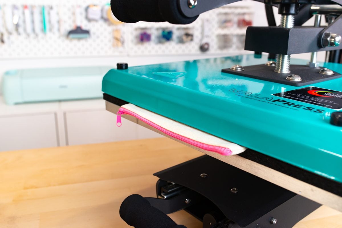
And then you’ll also want to make sure your print itself is dry. Sometimes an ink-heavy print will take a longer time to completely dry. You can also hover your heat press over the print (do not press down) to help it dry faster.
11. Time and Temperature
Time, temperature, and pressure (which we’ll talk about next) are critical for getting your sublimation projects right. I have a whole post on Finding the Right Sublimation Time, Temperature, and Pressure for your project.
If your sublimation prints are dull, you may have a time or temperature problem. Your time may not be long enough or your temperature high enough. Follow the tips and tricks in the above post for help getting it right. You can see from my post How to Sublimate on Slate, that I really had to up my time and temperature to get a bright and vivid result.
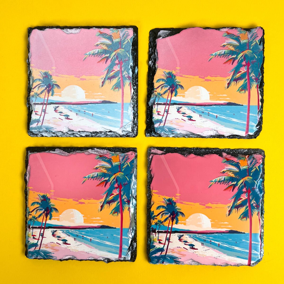
Also note that you can overcook a project too. If your blacks are coming out a faded brown, you’ve most likely pressed your project for too long or at too high of a temperature.
12. Pressure
Pressure is the third piece of the puzzle when it comes to pressing your blank, but I wanted to separate it out because I see this one go wrong for a lot of people.
Most sublimation blanks just require medium pressure and can be done with a handheld press like the Cricut EasyPress. But there are some sublimation blanks that need heavier pressure and work better with a traditional heat press. Again, a big one is sublimation slates—I haven’t been able to make a sublimation slate successfully with my EasyPress.
13. Uneven Heat
If you are seeing only part of your image is faded, it’s most likely an uneven heating or uneven pressure problem. Maybe you are using a handheld press and unknowingly adding more pressure to one side of your project. Maybe you have some low temperature points in your press. You can even have a problem if your table under your press isn’t level.
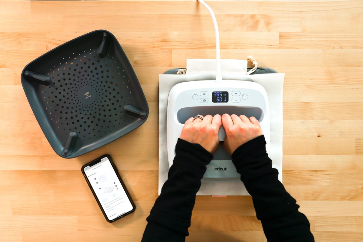
Overall you want firm, even heat across your project to prevent fading due to uneven heating.
14. Double Pressing
Finally, you may find that double pressing a project causes fading. Let’s say you are working on a project larger than your heat press. You will need to overlap some of that pressing time. Sometimes, usually depending on the type of blank, you may see some fading in the overlap that got pressed twice.
This is because you are actually re-sublimating the ink in the overlap and some of it is escaping. And because of that, you end up with less ink in the overlap than everywhere else. There’s really no workaround for this because you do need to overlap your presses if you’re making a large project. But you can try different sublimation blanks because some are worse than others.
I hope you found this post helpful if your sublimation prints are dull! You can use the tips and tricks in this post to see if you’re having any problems—and fix them before you make your next project!


Leave A Reply!