If you want to start designing SVG files for your Cricut, Silhouette, or laser cutter, there’s no better program than Adobe Illustrator! Let’s start with a basic Adobe Illustrator workspace overview so you can start designing your own cut files!
I’ve had more and more requests lately for more Adobe Illustrator content. If you’ve ever wanted to start designing your own SVG files for cutting on your Cricut, Silhouette, or laser machine, you may have heard about Adobe Illustrator. It’s a graphic design program that works the best with cutting machines, as you’ll see.
In this post, I’m going to give you a basic overview of what Adobe Illustrator looks like when you first open it up. I’ll show you how to create a new file and then we’ll go over all of the different parts of the workspace, a few basic tools, and talk a little bit more about what makes Adobe Illustrator so great for designing cut files.

Then in future posts, we’ll dive in deeper—into manipulating shapes, working with colors, adding text, and using some very fun tools. And we’ll ignore the tools that have nothing to do with creating SVG files so you’re not overwhelmed. All of these tutorials will be Adobe Illustrator for beginners. I know you can do it!
A caveat: almost everything I’ve learned in Illustrator has been self-taught! The good news is that means you can totally do it as well. You don’t need a graphic design degree or fancy training. But that also means that how I do something might not be how someone else does it in a different tutorial. You’ll quickly learn that there are often several ways to do the same task in Illustrator and each user has their preference.
Additionally, I am using a Mac, but things should look very similar on a PC, and I give keyboard shortcuts for both in this post. All shortcuts are in parentheses. I highly recommend learning the keyboard shortcuts because it will speed up your process so much! You can also download a free printable Adobe Illustrator cheat sheet below to print and keep by your computer.
Adobe Illustrator can be an intimidating software, but as you’ll come to learn, there is so much you can do in this robust program. I know Adobe Illustrator isn’t cheap, but if you really want to design amazing cut files, it’s definitely worth it. You can also do other graphic design tasks like designing printables, presentations, mockups, and more in this software. Pretty much everything you see on my blog and shop has been designed in Illustrator!
Watch the Video
Want a video walkthrough of everything in this post? Click play below! Or keep scrolling for a written tutorial.
Vector Design Software
Adobe Illustrator is a “vector” design software. This means Illustrator works in points (called anchor points) and lines (called paths) instead of pixels, like you might with Photoshop.
The wonderful thing about vectors is that they can be resized to any size you need them to be. You can make them very small or very large and they never lose any resolution or quality as shown below on the left. Compare that to a bitmap image (you may also hear these called raster images or pixel images). If you enlarge a bitmap image beyond it’s original size, your image will become pixelated, as shown below on the right.

Think about how most fonts work. You can enlarge a font and put it on a billboard and it will look exactly the same as if you print it on your home printer. That’s because most fonts are vector-based.
Why Vectors are Good for Cutting Machines
Why does this matter? Because if you think about how a cutting machine works, it cuts lines and turns at points. Which is exactly how a vector file is built. If you try and upload a bitmap image to Cricut Design Space, for example, it will try and turn it into a Print then Cut image. But if you upload a vector image (usually an SVG), your Cricut will be able to cut your image for you.
Creating a New File in Adobe Illustrator
Open Adobe Illustrator and you’ll be greeted with the welcome screen.
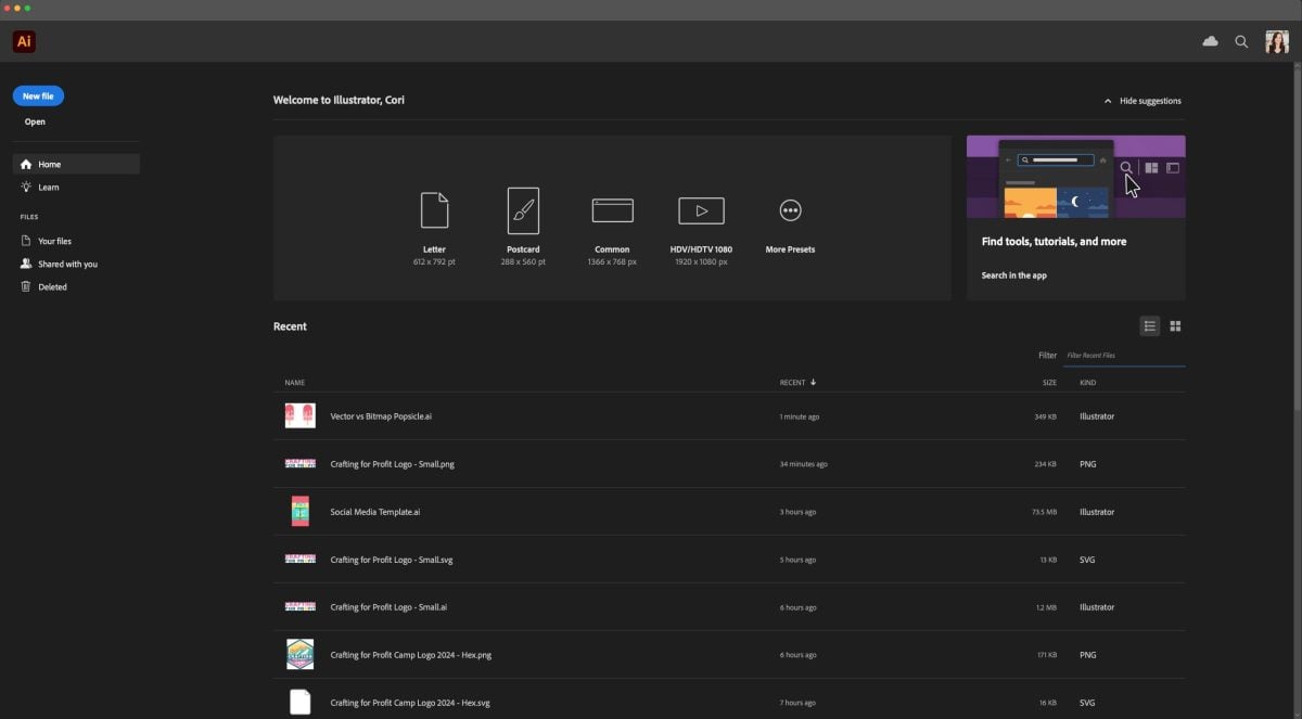
In the middle, you’ll see some common file sizes that you can select from, as well as any recent files you had open.
On the right you can create a new file or open a file you’ve already been working on. Let’s click New File. This will open another screen where you can set up your file. In the center you’ll see any recent file sizes you’ve worked with and along the top there are templates for common file sizes.
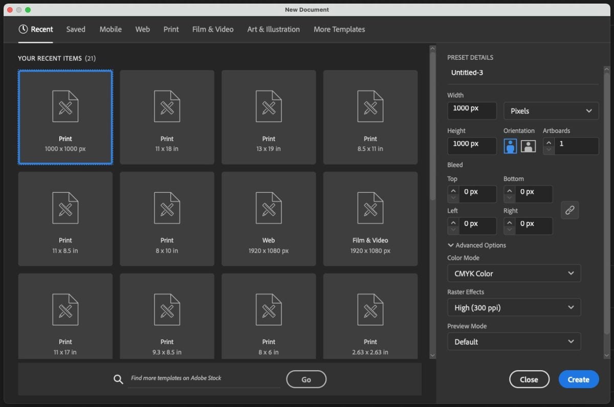
On the right, you can decide what unit of measurement you’d like to work in. Despite this being a vector program, I’ve gotten used to working in pixels, and for most of my files I start with a document that is 1000px x 1000px. You can also choose from inches or centimeters or several other units if you prefer.
I generally design my SVG files in the CMYK color mode (for printers) vs. RGB mode (for screens). This is because the actual color of cut files doesn’t really matter—you can have a purple file and cut it in yellow paper, for example. But along with my SVG files I also give folks PNG and JPEG files, which are both bitmap image types. And those are more likely to be printed and I want those colors to be as true as possible. If you are only doing design that will be on-screen, you can change the color mode on the left to RGB—your colors will often be more vibrant that way.
Click Create.
Adobe Illustrator Workspace Overview
Now you’ll see your workspace! I know this whole screen is intimidating. (I am totally intimidated in Photoshop and every time I go in there I wonder what everything is!)
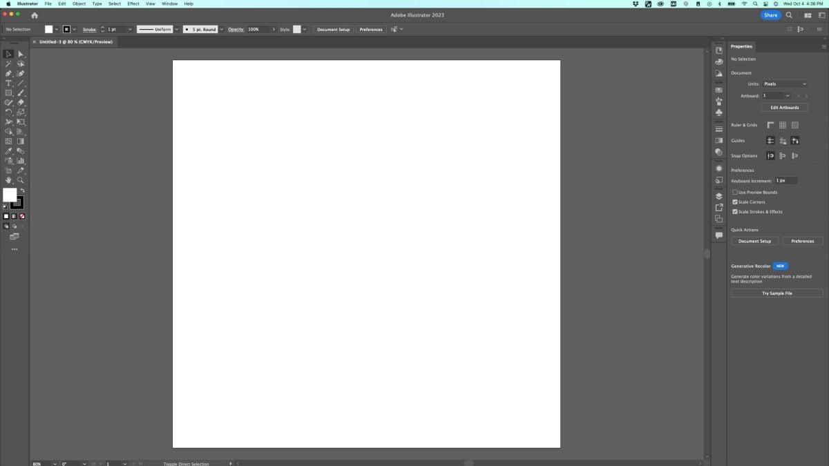
Your workspace might look a little different than mine, but let’s try and get on the same page. In the upper right, there is an icon that looks like a screen with a right sidebar. Click on that and select Essentials Classic.
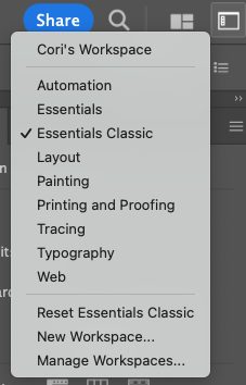
Now your screen should look closer to my screen. If you do not see the Properties panel on the left, don’t worry. We will get that added in a few.
Note that your workspace can be endlessly customized. You can move tools around, add tools, open and close panels, and more. If you end up with a set-up that you really like, you can go to New Workspace in that same dropdown and save your workspace. Then you will always have things set up how you prefer!
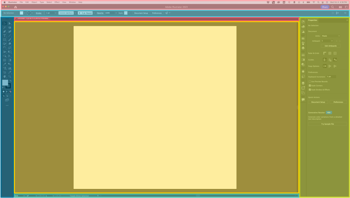
Let’s take a look at the parts of the workspace, which I have color coded below.
(Note: if all of a sudden all your toolbars are gone and you only see your artboard in the middle, you’ve probably hit the tab key. Hit the tab key again and your menus and toolbars should return.)
The Menu Bar (Light Pink)
At the top of your screen, you’ll see the Menu Bar. This is a really powerful area because it contains many of the tools you see on the workspace in menu form. So if you can’t find something elsewhere in your workspace, you should be able to find it in one of these dropdowns: File, Edit, Object, Type, Select, Effect, Window, View, and Help. As we go through this Illustrator series, we’ll use a lot of the tools from these menus.
The Control Panel (Light Blue)
Below the menu bar is the Control Panel. The Control Panel is contextual, which means that it changes based on what you have selected on your art board (see below). For example, if you have text selected, you’ll see fonts and sizing and spacing options. If you have a shape selected, you’ll see alignment and sizing and other tools related to shapes.
This is also where I tend to work with colors in Illustrator, using the color dropdowns in the top left. These are your fill and stroke colors. Fill is the color inside your shape and stroke is the outline color of your shape. But as you’ll see, there are several other places to work with colors, so if some other process works better for you, do that.
Document Tabs (Dark Pink)
You can have more than one document open and this is where you can click to get to each document. Think of them like tabs in your internet browser.
Artboard (Yellow)
This is where the magic happens! All of your design will happen on the artboard. The white part is the document size you selected earlier—in my case, a 1000px x 1000px square. Think of it like a piece of paper or a canvas. You will want all of your final artwork to remain on the artboard, but you can use the gray space for dragging things out of the way.
You can also have several artboards in your workspace. In that New File screen, you can increase the number of artboards if you’d like. This is helpful for presentations and other multi-page documents.
Toolbar (Dark Blue)
On the left is your toolbar. If you hover over the tool you’ll see a little video about what it does, along with its keyboard shortcut. If there’s a little arrow in the bottom right of the tool, you can click on it to see similar tools.
There are a lot of tools here but I’ll just cover a few that you’ll want to know right away. We’ll go into more detail about these as we go along in this series:
- Select (V): This is your “home base” tool. This tool allows you to select an object on your screen and move it, rotate it, resize it, and more. Get used to hitting V on the keyboard to get back to this tool.
- Direct Select (A): This tool selects a part of an object.
- Pen (P): This is an incredibly robust tool that will allow you to draw your own images. It’s a bit tricky to learn, but once you do, the sky is the limit.
- Text (T): Use this tool to type text.
- Line Segment (\): This tool draws a line.
- Rectangle (M): This tool draws a rectangle. Hold down shift to constrain the proportions to draw a square. Click on the little triangle next to the rectangle tool to see other shapes, including ellipse (circle), polygon, and star.
- Color: There are two colored boxes toward the bottom of the toolbar that you can also use to change your colors.
There are obviously so many more tools in this section but for now, play around with those tools to get a feeling for what they can do. We’ll go into using these tools and more in upcoming tutorials.
Panels (Green)
The Panels are where more advanced processes live. Instead of just drawing a simple rectangle, you can use tools here to manipulate that rectangle by combining it with other shapes, for example. This section can get a little more confusing, so be patient with yourself. If you hover over a panel icon with your mouse, it will tell you what it is.
All of the panels live under Windows in the Menu bar, so if you can’t find one in the panels on the left, go to the Windows dropdown and choose it. Then you can drag and drop that panel into the panel toolbar.
A few panels you’ll want to play around with include:
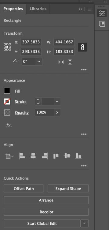
- Properties: The Properties panel has an icon that looks like three little sliders and is similar to the Control Panel but even more robust (if you don’t see it, go to the menu and choose Window > Properties). This panel is also contextual and changes based on what you have selected. I like this panel so much that I drag it to the right of the rest of the panels and then click on the two tiny arrows at the top of that bar to open it. If it’s taking up too much of your screen, you can always minimize it by clicking on the slider icon, but I find it really handy for applying all sorts of processes to an object.
For example if I have a rectangle selected on my artboard, I’ll see basic sizing tools, the fill color, stroke color, and opacity of my rectangle, align tools, and then some quick actions like creating an offset.
- Color / Color Guide / Swatches: These are more panels you can use to change the colors of objects on your art board.
- Pathfinder / Align / Transform: Go to Window > Pathfinder. This will open up these three tools that are related. We’ll use these tools a lot, so click at the top of the window and drag them into the panel toolbar on the left.
- Pathfinder: This modifies overlapping shapes, similar to the Combine tools in Cricut Design Space if you are familiar with them. This includes Unite, Minus Front, Exclude, etc. Try drawing two overlapping rectangles on your artboard and then applying different options to those rectangles to see how this tool works.
- Align: If you have a single object selected on your artboard and use one of the align tools, it will align your object to the artboard (align left, for example, will align your object to the left side of the artboard). If you have more than one object selected, your objects will be aligned in relation to each other (align left, then, would align all the objects you have selected by their left edges). Try drawing several rectangles on the artboard and applying the different align options to see what happens.
- Transform: Transform has basic resizing controls, plus there may be other tools that are contextual to whatever you have selected.
- Layers: This is an important panel as we get into designing SVG files. You can use this panel to help you know if you have everything correct so that it will import into your cutting design software properly.
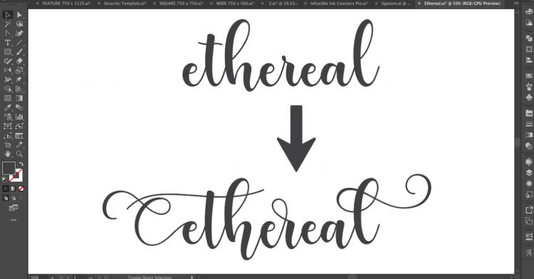
- Glyphs: This is another panel that isn’t standard, so you’ll need to go to Window > Type > Glyphs. Glyphs are each individual letter in a font and some fonts have alternate glyphs you can use.
Again, there are so many more panels here than the ones I’ve covered. A lot of them are not applicable to designing SVG files, but there may be others in there that we’ll tackle in upcoming tutorials.
Status Bar (Teal)
Honestly I never look at this bar, but one helpful thing here might be to see how zoomed in you are on your artboard.
Moving Around the Artboard
Speaking of zooming, instead of using that dropdown in the status bar, the shortcut for zooming in and out of your artboard is CRTL+ / CTRL- on a PC and CMD+ / CMD- on a Mac. This is so much faster than going to that dropdown or to View > Zoom In / Zoom Out.
You can also hold the space bar down and that will give you a little hand that will allow you to “grab” the art board and move it around. If you have an Apple Magic Mouse, you can move around the artboard by just moving your finger across the top of the mouse.
Whew! That was a lot and all we did was cover the basic workspace and a few tools.
In the next Adobe Illustrator tutorial, we’re going to dive into shapes a bit more and talk about what exactly makes a shape in Illustrator: anchor points, paths, and handles. These are the basic building blocks of everything you’ll do in Adobe Illustrator and it’s important to know how they work!

Want some more information about Adobe Illustrator? Check out my blog on the Skillshare Illustrator Classes for Cricut Users!


Leave A Reply!