Want to easily add color to your Adobe Illustrator SVGs and other designs? This Adobe Illustrator color tutorial will walk you through the basics, as well as give you tips to help you use color to delineate layers in your SVG designs.
Welcome back to my weekly series on using Adobe Illustrator for SVG designers and crafters! In this series, I’m breaking down Illustrator into easy-to-digest content specifically for creating cut files for your Cricut, Silhouette, or other crafting machine. I highly recommend you work through the tutorials in order, since they build on one another.
- Workspace Overview (video)
- Paths, Anchor Points, and Handles (video)
- Make an SVG from a Font (video)
- Tips for Using Fonts in SVGs (video)
- Color Basics (video)
- Using Shapes and Lines to Make Illustrations (video)
- Using the Pen Tool (video)
- Creating Fun Text Effects (video)
- Image Trace (video)
- 10 Quick Tricks for SVG Design (video)
Today we’re talking color! Color is so much more than just making your SVGs prettier. Color can help delineate the layers of your file and how they will be cut by your cutting machine. We’ll go through the basics of color and creating a color palette, and then talk about how colors relate to cutting when it comes to your SVG files.
As always, I encourage you to use keyboard shortcuts. They will speed up your workflow and you’ll be much faster at creating your SVG designs. I use shortcuts in this lesson in parentheses. You can also download a keyboard shortcut printable below to help you remember the most popular shortcuts for SVG design.
Watch the Video
Want a video tutorial for using color in SVGs? I walk you through all the important ways to use color in this video! Just click play below. Or read on for a written tutorial!
Get the Free Illustrator Shortcuts File
Want access to this free file? Join my FREE craft library! All you need is the password to get in, which you can get by filling out the form below. The file number is: P121.
Basic Adobe Illustrator Color
Like with so many things in Adobe Illustrator, there are many ways to work with color. My preference is to use a combination of the color tools in the Control Panel at the top and the Toolbar on the left. You can also work with color in the Swatches Panel, which is similar to the dropdown menus in the Control Panel.
Colors in Illustrator are called “swatches” and each colored box represents a color swatch. If you want to do additional learning beyond this tutorial, I would recommend searching “Adobe Illustrator color swatches” vs. just “Adobe Illustrator color” to get the best search results.
Let’s draw a circle on our artboard (L). The default coloring is a white fill (the color inside your shape) with a 1pt black stroke (the outline around your shape).
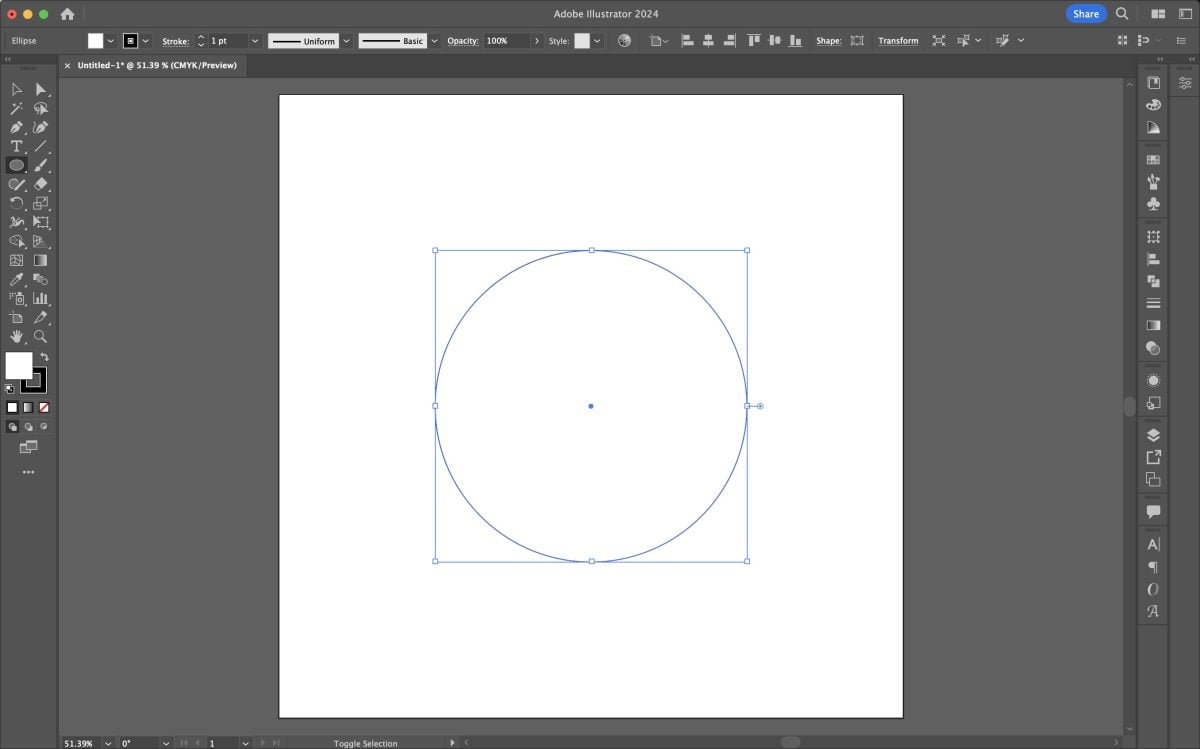
You can see this both the fill and the stroke swatches in the upper left of the control panel, as well as in the toolbar on the left side. The left color swatch is the fill and the right color swatch is the stroke.
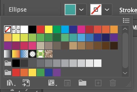
Generally, for SVG files I recommend using an “empty” stroke swatch, especially for beginners. This means that there is no stroke at all. So let’s change the color of both our fill and our stroke. Select your circle (V), and using the dropdowns in the upper right, change the fill to a color (I chose the teal swatch) and change the stroke to empty by selecting the white swatch with the red line through it.
Now you can see we have a teal circle with no stroke around the outside.
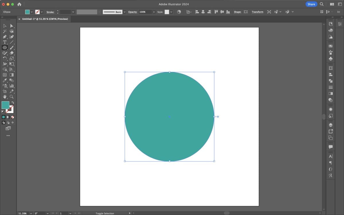
At its most basic, that’s how to change color in Illustrator!
You can also double click the swatches at the bottom of the Toolbar on the left and it will open the Color Picker.
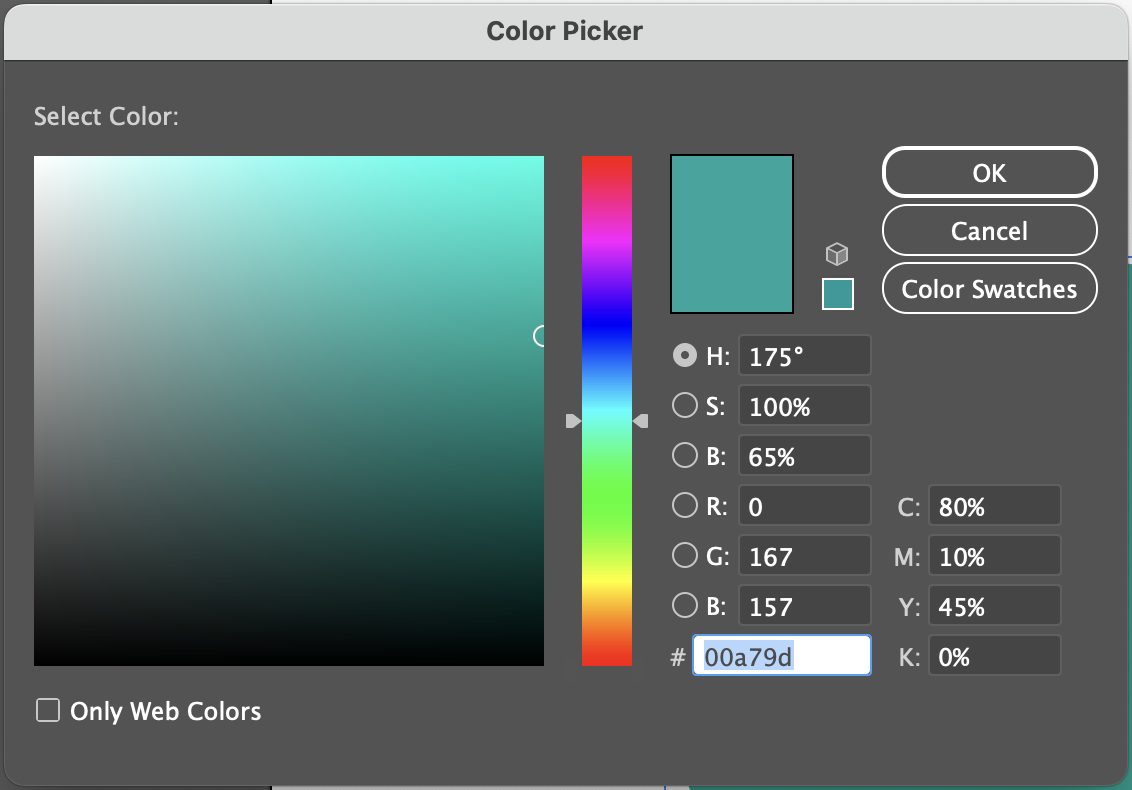
Here you have some more options. You can use your mouse to select a color using the gradient picker on the right. If you have specific Hex, HSB, RBG, or CMYK colors you want to use, you can enter those values on the right in the corresponding boxes. This allows you to pick specific colors, which is great if you have brand or other colors you want to use.
Default Swatches in Adobe Illustrator
If you use the Control Panel dropdown or the Swatches Panel, you’ll see Adobe Illustrator’s default swatch library. There is a wide range of color swatches here and if you’d like to stick to just those, that’s totally fine.

You can also click the Swatch Library icon at the bottom of the panel to see some of Adobe Illustrator’s other default swatch libraries.

So for example, let’s say I navigated to Color Properties and chose Bright. A new swatch library would open with coordinating bright colors.
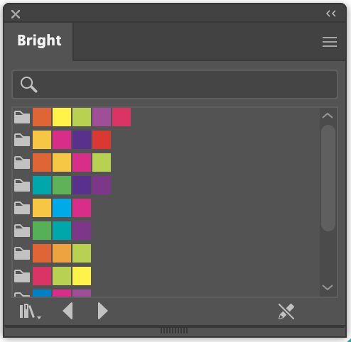
This is another way to find good color combinations without having to create your own color palette.
Creating and Saving a Color Palette
Now if you want to create your own color palette, that’s easy too! I won’t go into actually picking a color palette here, but I have a few resources:
- My course Crafting Your Signature Style. This course goes through the visual branding for a small craft business and includes picking a color palette as well as a bunch of color palette examples.
- Canva’s Color Palette Generator
- Coolors Color Palette Generator
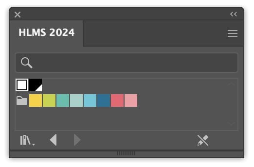
You can also just click around with the color tools above to create a color palette you like. This is how I created my color palette, by picking colors that I thought might go well together and then going into the Color Picker to adjust them until I got something I really liked.
I suggest making a small circle (L) for each of your colors. So my color palette looks like this:
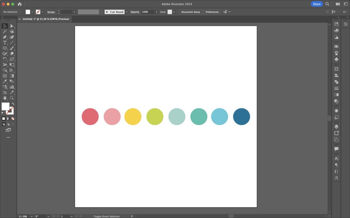
You can have as many or as few colors as you’d like. I find that this works for about 80% of the SVGs I make. I do pull in a few other colors occasionally, like orange for Halloween or shades of brown for fall, but generally I stick to this palette. This means that my entire SVG shop looks nice and cohesive.
This doesn’t matter as much if you’re just designing for yourself, but if you do want to start a shop I suggest coming up with a color palette that feels cohesive.
Once you have your color palette on your artboard in circles like these, let’s go back up to the color swatch dropdown and delete all of the swatches we don’t need. Don’t worry about deleting them permanently—they’ll appear again the next time you open Illustrator. Using your mouse, select all of the swatches you want to delete. I usually keep black and white to make them easy to access from my new palette.
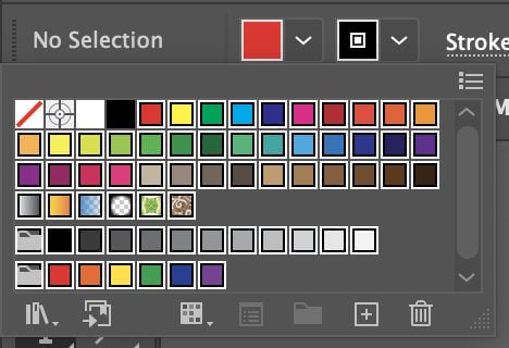
Then click the trash can icon in the bottom right to delete the swatches.
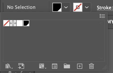
Then use the Selection Tool (V) to drag and select all of your circles on your artboard. Go back to the color dropdown in the Content Panel up in the top left corner, and choose the little folder icon to create a new color group.
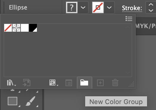
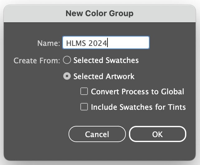
This will create a new color group with your particular colors. Name your color swatch group and click OK.
Then go to the color dropdown again and you’ll see that there’s now a row for your new colors.
To be able to access this palette even after you close Illustrator, you’ll need to save it. Click on the Swatches Library icon at the bottom left of the dropdown and choose Save Swatches.
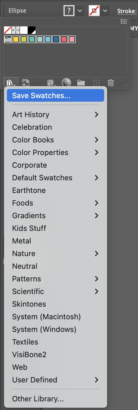
Give you swatches a name and then you’ll be able to open your swatches any time you want by going to that same dropdown > User Defined and then selecting your palette. Your normal swatches will go back to normal in the dropdown but you’ll always have access to your new palette! I’ll be using this palette as we color our SVGs.
Using Colors to Delineate Cut Layers
Back in the How to Make an SVG from a Font tutorial, I taught you how to make a compound path (Shift+Command+8 (Mac) / Shift+Control+8 (PC)) so your image would cut correctly in your cutting machine software. We’re going to expand on that in this tutorial.
When you are creating an SVG, I want you think about the best way to cut it. Many SVG designers will just make a single-color SVG with a single compound path, usually black. Here’s an example. It’s designed properly and it’s kinda cute. But that black sun is just…depressing.
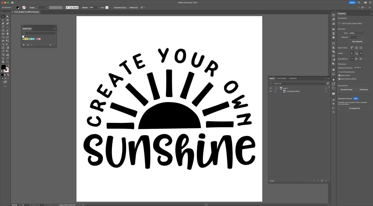
You can see in the Layers Panel on the right that the entire SVG is one compound path in a single layer.

This means that the entire file will cut as a single piece on a cutting machine mat. Yes, you could use the cutting machine’s software to copy and contour this file to make it more than one layer, but that can be a pain and is just more work to do.
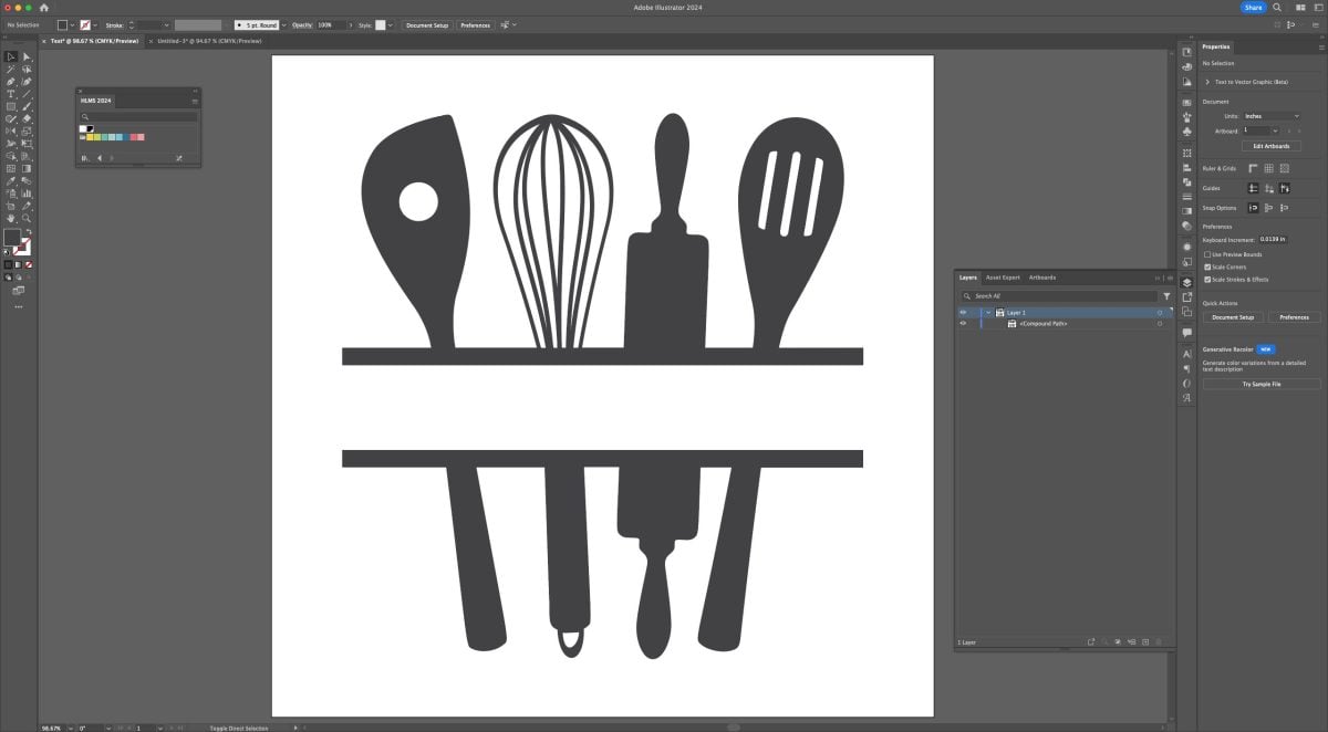
For some SVGs, a single layer totally works. Like this kitchen monogram file is all a single piece (it’s designed for the buyer to add their own name in the blank in the cutting software). I could have designed it so the utensils had different colors, but this is just a simple example of a single-color, single-cut SVG that’s perfect for a simple project.
But let’s go back to the sun SVG. This SVG is so much more successful if I designed it with the sun as a separate yellow compound path.
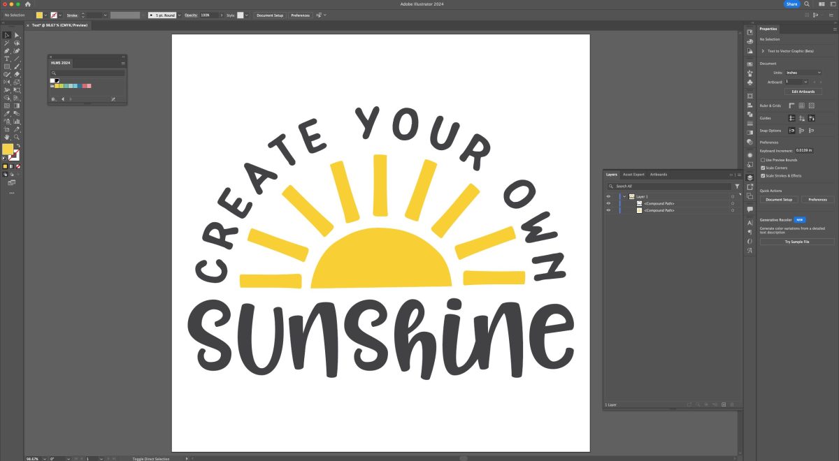
And again, a close up of the layers panel showing two compound paths. This will show up as two layers in cutting software.

This gives the crafter so much more flexibility when cutting their file. Perhaps they want to cut the words out of black and the sun out of a gold glitter. Or the words in pink and the sun in a shimmery yellow.
You could even design this file using three separate compound paths to give people even more flexibility.
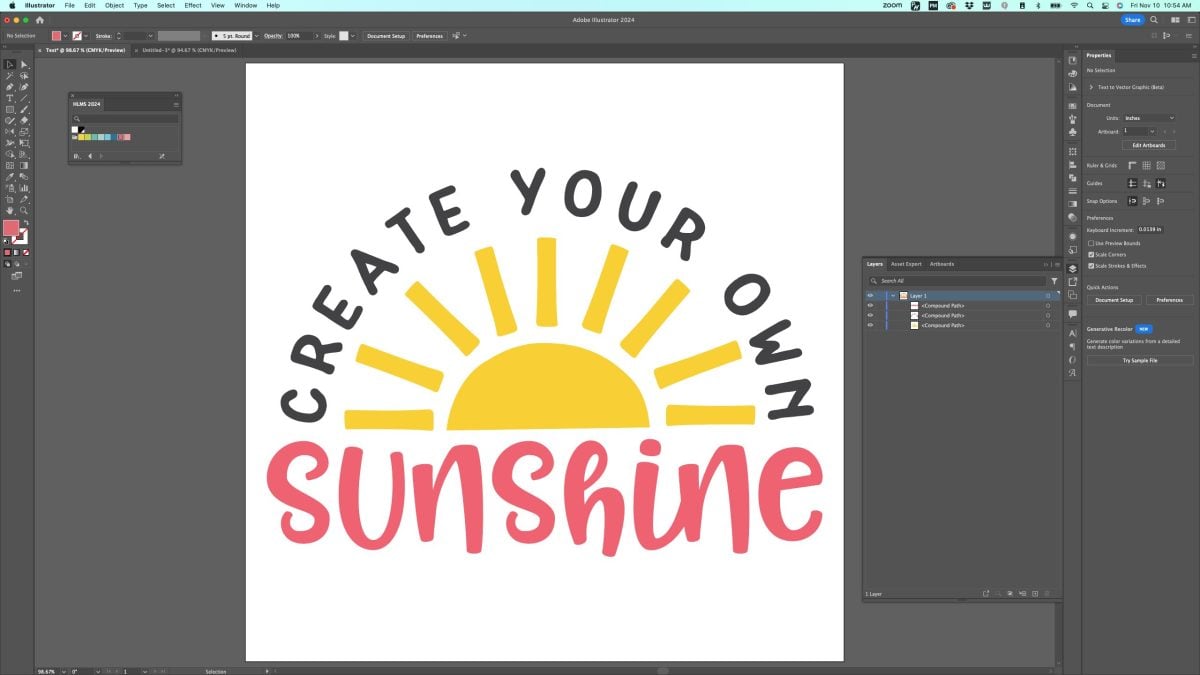
You can see the three compound paths in the Layers Panel, too.
You, of course, can design your files however you’d like. If you’re designing them for personal use, then definitely just design them with the materials you have in mind. But if you’re designing to sell your files, always keep in mind how your buyers may want to cut their files. I think providing some flexibility is a good idea.
Technically you could make all the compound paths the same color, but I have found that not only does it help to delineate the layers visually, coloring your SVG files just makes them cuter overall and they stand out better in a sea of black images.
Separating Images by Layer for Laser Cutters
While the above instructions should work for cutting machine software, if you’re planning to use your files on a laser, you may want to take an extra step. I have found that Glowforge in particular has issues with separating out the different layers so you can set them to cut, score, or engrave.
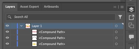
So for laser machines in particular, I like to make each of my compound paths its own layer. This is easy to do. In the Layers panel, click the small plus sign at the bottom. This will create a new layer.
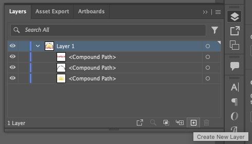
You can see Layer 2 has been added to the Layers panel.
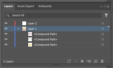
Now click and drag one of the compound paths for your image onto that layer. You may need to click the little arrow to the left of the layer name to see your compound path is now on Layer 2.
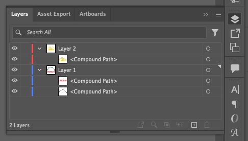
Continue creating new layers and dragging your compound paths until they are all on their own layer.
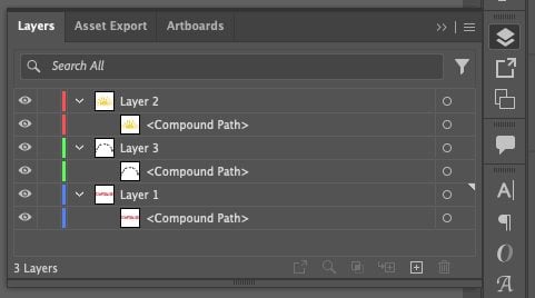
Then when you bring this file into a laser software, it will have an easier time letting you select the linetype (cut, score, or engrave) for each layer.
Layered Images
Now let’s talk about layered images. In the example above, none of the words or images overlapped. But maybe you’ve designed this cut file. We’ll go into how to create a cut file just like this in a future tutorial!
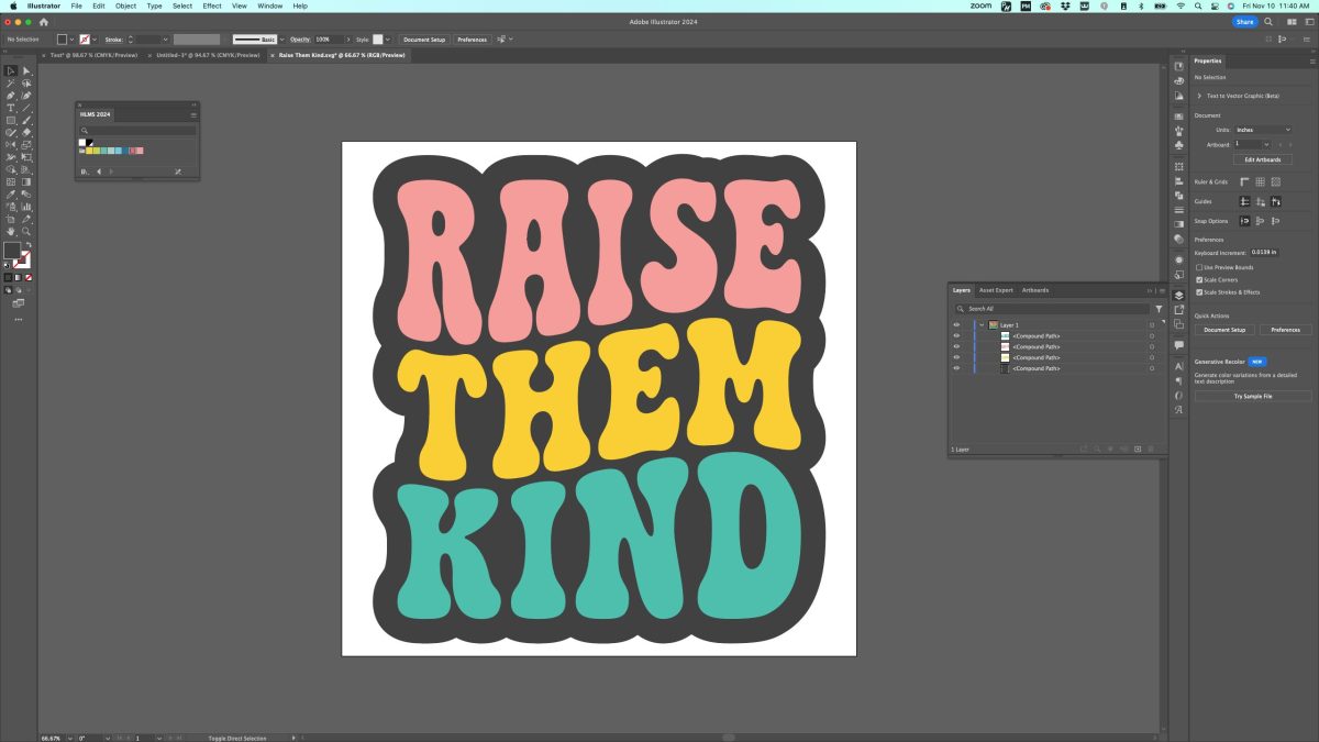
How do you want people to make this file? Should that black compound path be one entire piece?
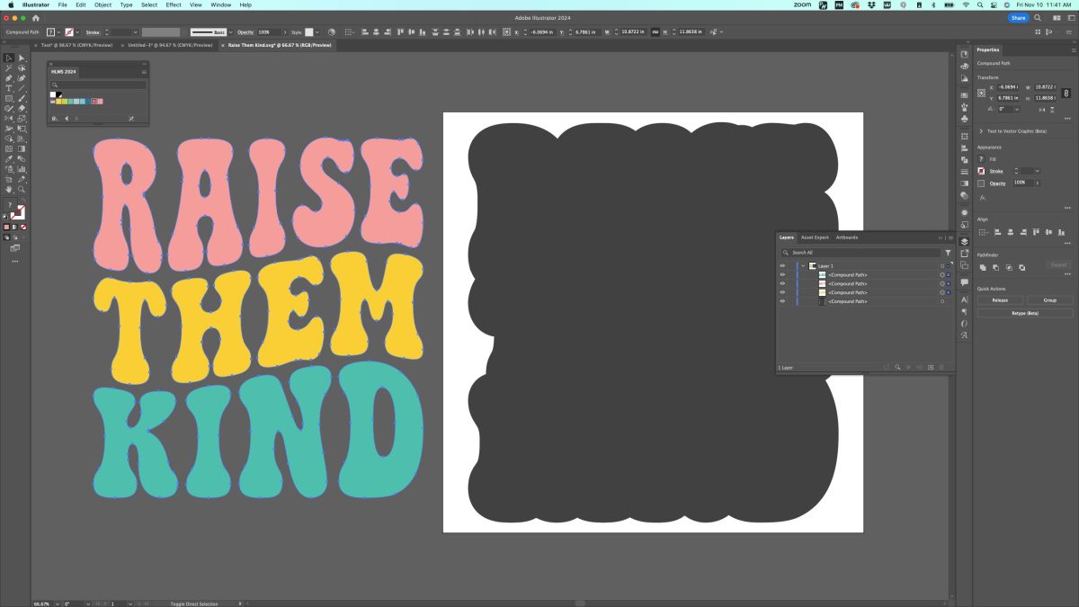
Or should that black compound path have “Raise Them Kind” cut out of it so perhaps there won’t be as many layers of vinyl or HTV?
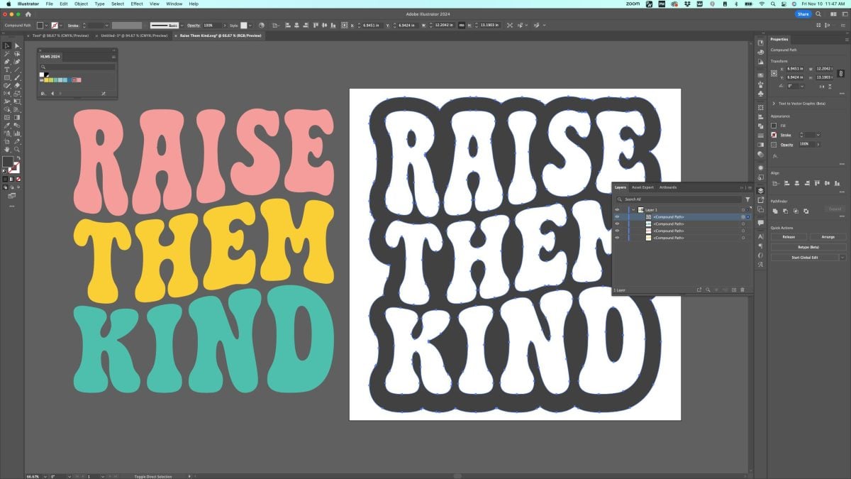
Personally, I think keeping that solid black option is better because it offers more flexibility. You can easily use it with cardstock, you can layer your vinyl or HTV, or it’s easy for the user to the Slice and Set method in their cutting software to create that cut out so you don’t need to layer.
When it doubt, think about the flexibility of your file. That will allow people to use your files more easily for their particular project.
Other Adboe Illustrator Color Elements
There are other “appearance” ways to use colors in Adobe Illustrator, including gradients, patterns, opacity, and more. However, if you use these tool in cut files, your cutting software will strip away the special appearance and you’ll be left with a solid color for your image. So while these tools are cool and I do use them for sublimation images, printables, and more, I won’t be covering them in this series of tutorials that focuses on SVG files.
I hope you found this Adobe Illustrator colors tutorial helpful! Next week we’re going to dive into creating images using shapes. We’ve done a lot with fonts so far, but if you want to start creating other elements to your SVGs, you’ll want to stay tuned for that tutorial!



Leave A Reply!