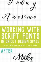
Problems cutting script fonts on your Cricut? Learn how to properly space your script fonts in Cricut Design Space and then connect them together so they cut as one piece!

This will probably make me sound like a Cricut Elitist or something, but guys, I see too many people who aren’t using script fonts correctly on their Cricut projects. After so many years in design, it’s hard for me to see terrible letter and line spacing or watch people struggle when their script letters cut out individually. Let’s learn how to work with script fonts so you get the best, most professional results!
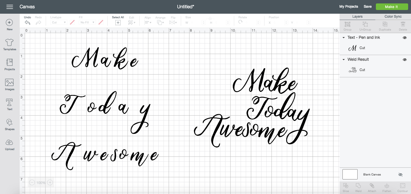
For this tutorial, we’ll be using the following example. This is the Cricut font “Pen and Ink” and, well, it’s not great when typed into Cricut Design Space as is.
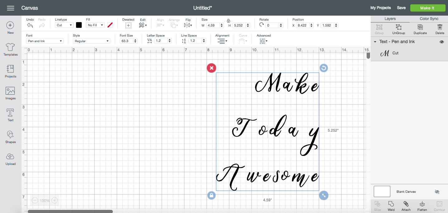
I’ve seen people slap files like this on a pillow and call it good (hint: it is not good), but we can make it SO much better using a couple tools in the font toolbar! Let’s explore them all.
Letter & Line Spacing
Letter and Line Spacing are two tools that you’ll need to get familiar with when working with fonts, particularly script fonts, in Cricut Design Space. All of the tools we’re going to use can be found in the Font Menu, which appears if you have text selected.

The letter and line spacing is, honestly, kind of a hot mess, and can be frustrating for people not used to using these features.
Letter Spacing
So to start off with in our example, our letters are way farther apart than we probably want. This is particularly apparent in script fonts in Cricut Design Space, but also matters for block fonts. Let’s adjust the letter spacing using the Letter Spacing tool.

The default letter spacing for fonts is 1.2. 1.2-whats, I’m not sure. But for most fonts, you’ll find it’s way too spaced out. So we can use the Letter Spacing tool to bring our letters closer together. You can type in a number or you can use the little stepper arrows to adjust by .1 at a time. Usually I take it to 0, but that still wasn’t enough.
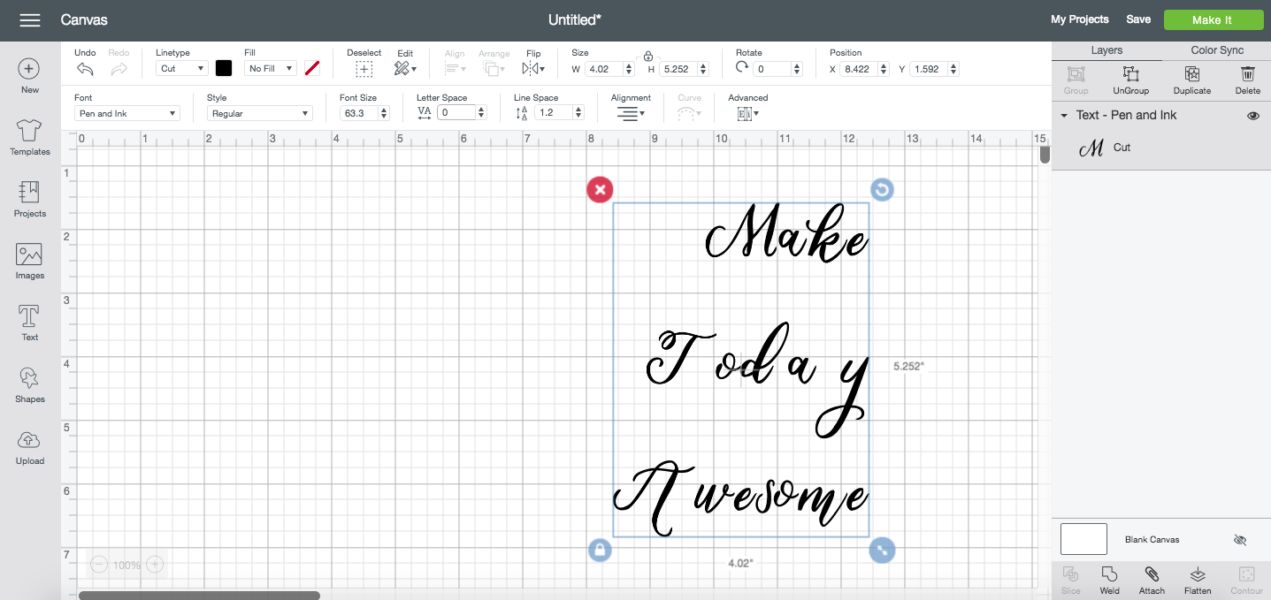
So I took it down to -0.5. It’s a lot better, but still a mess.

What is that “y” doing way over there? Why are the “s” and “o” in awesome so much closer together than all the other letters? We will fix this in the next lesson using Ungroup to Letters. But know that often changing the letter spacing is enough, particularly with block fonts.
Line Spacing
I also think that the space between the three lines is way too far apart. The default line spacing for fonts is also 1.2 somethings. We can use the Line Spacing tool to bring our lines closer together. You can type in a number or you can use the little stepper arrows to adjust by .1 at a time. I ended up reducing the line spacing all the way to -6. I’d bring it even closer together, but then that “y” would start to encroach on the word below it.
Ungroup to Letters & Lines
The next set of tools allows you to make even more detailed adjustments to your fonts. They can be found under the Advanced dropdown in the Font Toolbar.
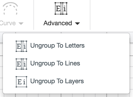
For this example, I’m going to be using Ungroup to Lines first, then Ungroup to Letters. Ungroup to Layers doesn’t really apply to this tutorial.
Ungroup to Lines
Ungroup to Lines only works if you have more than one line of text in a single text box. This tool then takes your lines and ungroups them into their own text boxes. So when I use Ungroup to Lines on this text box, you’ll see I now have three different lines of text, represented by three different layers in the Layers Panel.
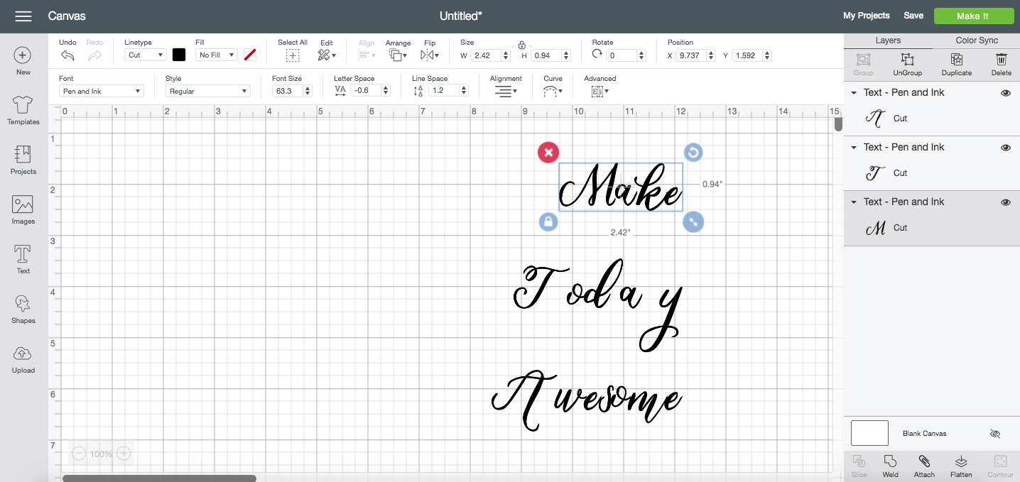
We can now move each line independently. I rearranged them to make them fit more snugly together. Getting a little better, right?

Note that you cannot use Ungroup to Lines after you Ungroup to Letters (see below). That’s why I like to use these tools in this order, rather than Ungroup to Letters first.
Ungroup to Letters
Ungroup to Letters then takes each word and separates each individual letter so you can move them separately. You’ll see each letter individually in the Layers panel as well. Make sure you have your words spelled correctly before using this tool—once you Ungroup to Letters, there’s no going back and re-typing your words in your original text box. And note that if you Ungroup to Lines first, you’ll then have to use Ungroup to Letters on each line individually.
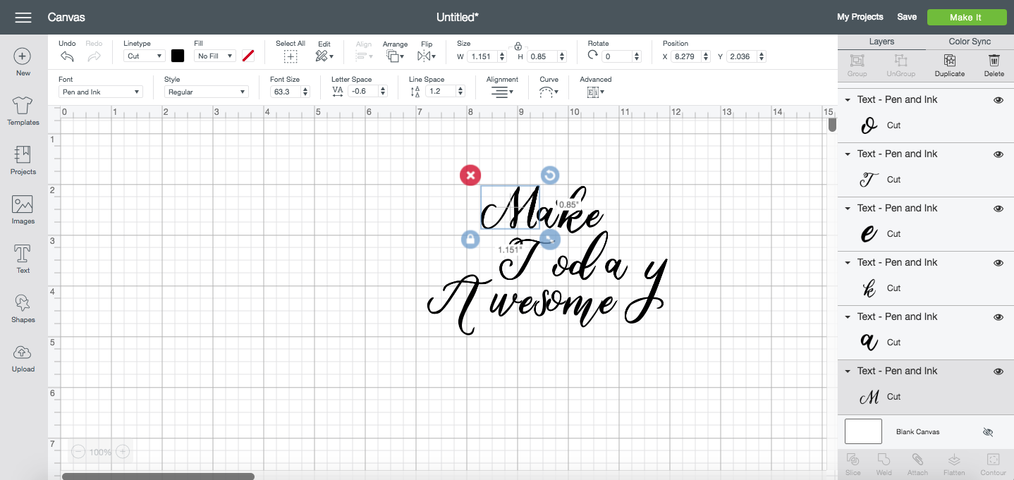
Now we can move them to be more evenly spaced! If you need to, use the Align tools in the Edit Toolbar to help evenly space or align your letters (I didn’t do this in this example—I just moved each letter individually to where I thought it looked the best).
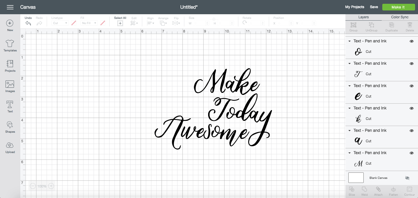
To be perfectly honest, sometimes I skip all of the tools except that last one and just move all of the letters individually. But I wanted to make sure you knew all of the different spacing and ungrouping options, since your level of success with each tool depends on the font you’re using! The more tools in your arsenal, the faster and more professional you can make your projects.
Welding Script Fonts
There’s one more important step when working with script fonts. Once you have everything is where you want it, click Weld in the Layers Panel. This will weld all of your text together so it will cut as one piece instead of individual letters!
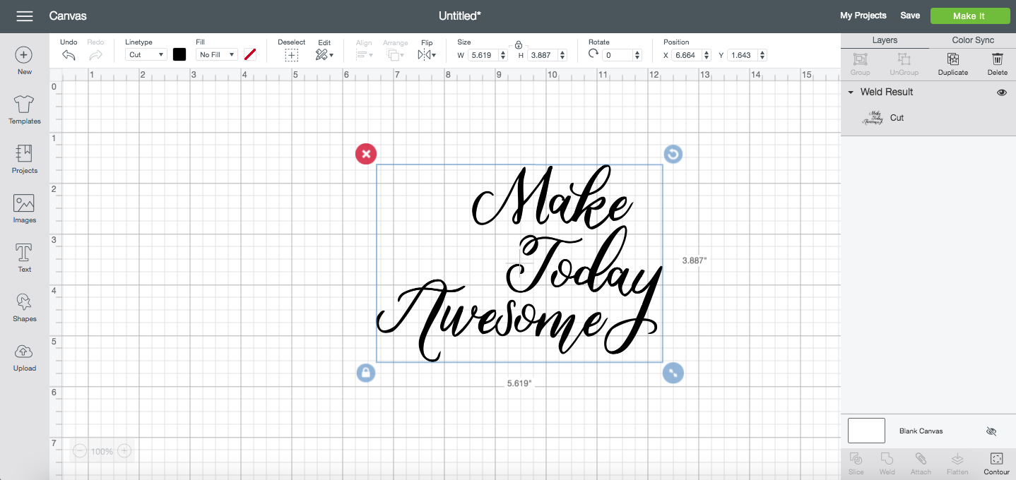
How much better is it now than what we started with? Once you get the hang of all of these tools, they’re actually pretty easy to use and can make a BIG difference in the script font files you can make in Cricut Design Space!
Want more tutorials like this? Check out my HUGE online Cricut membership course! More than 200 lessons to help you use your Cricut Explore or Maker, Cricut Design Space, and all the tools, materials, mats, blades, and more!

