Even if you’re not an artist, you create simple illustrations for your cut files using Adobe Illustrator! Here’s tips for making simple SVGs with shapes and lines, perfect for beginner designers.
Welcome back to my series on Adobe Illustrator for crafters and SVG designers! My hope is that this series gives you an accessible way to start using Adobe Illustrator specifically for designing cut files and other crafting files. We’re learning everything you need to know about designing SVGs…and nothing you don’t!
I highly recommend you work through the tutorials in order, since they build on one another and you may be confused with this tutorial if you haven’t read through the others in this series:
- Workspace Overview (video)
- Paths, Anchor Points, and Handles (video)
- Make an SVG from a Font (video)
- Tips for Using Fonts in SVGs (video)
- Color Basics (video)
- Using Shapes and Lines to Make Illustrations (video)
- Using the Pen Tool (video)
- Creating Fun Text Effects (video)
- Image Trace (video)
- 10 Quick Tricks for SVG Design (video)
Today we’re starting to look at making easy illustrations using the different shapes and line tools in Adobe Illustrator. Even if you’re not at all artistic, you can use these tools to make simple illustrations that will take those text SVGs we’ve been working on and make them into something even more special!
I felt like the easiest way to do this would be to make a bunch of different illustrations using these tools, and in each showing you how you can change settings and use different tools to make your illustrations look even better. This is designed to be fun—your illustrations don’t need to match mine perfectly. The idea is more to learn how to use these different shape and line tools to create whatever you can dream up!
Next week we’ll be going into illustrations with the Adobe Illustrator pen tool, which is more advanced. Get these basics down first because we’ll be using some of them in conjunction with next week’s tutorial!
As always, I encourage you to use keyboard shortcuts. They will speed up your workflow and you’ll be much faster at creating your SVG designs. I use shortcuts in this lesson in parentheses. You can also download a keyboard shortcut printable below to help you remember the most popular shortcuts for SVG design.
Watch the Video
Want a video tutorial for shapes in SVGs? I walk you through all the important ways to use color in this video! Just click play below. Or read on for a written tutorial!
Get the Free Illustrator Shortcuts File
Want access to this free file? Join my FREE craft library! All you need is the password to get in, which you can get by filling out the form below. The file number is: P121.
How to Make Illustrations with Adobe Illustrator Shapes and Lines
Chocolate Chip Cookie
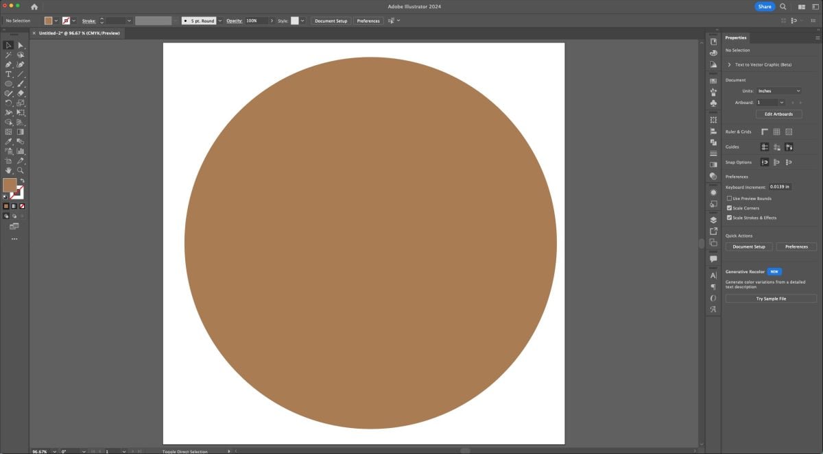
A lot of these lessons have started out with a circle, so let’s make an easy chocolate chip cookie SVG using circles!
Start by creating a circle on your artboard (L). Hold down that shift key while you draw to make a perfect circle.

Change the fill color of your circle to a cookie brown with an empty stroke. See my post on Adobe Illustrator Colors and Swatches for more information on changing colors.
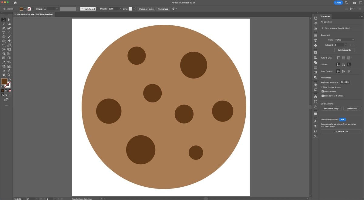
Add some smaller circles to your cookie and color them dark brown.
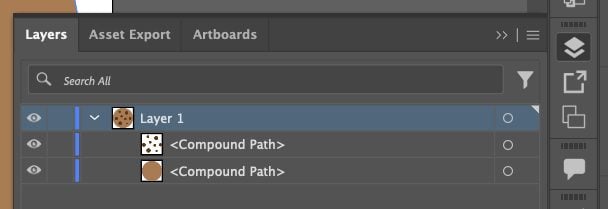
Make your light brown cookie shape a compound path (Command+8 (Mac) / Control+8 (PC)) and select all of your chocolate chips (V) and make them a compound path. In the Layers Panel, you should have a single Layer with two compound paths:
Here are a few examples of how you might use cookie illustrations:


Ruler
Rulers are great for all sorts of school and kid-themed SVG files! And they’re easy to make in Adobe Illustrator.
Start by creating a long rectangle (M).
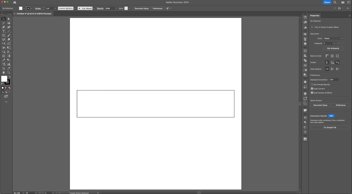
Recolor the rectangle’s fill to be yellow with an empty stroke.

Then we’ll use a little trick in Illustrator to round the corners of our ruler: Live Corners. Choose the Direct Selection Tool (A). If you hover inside a corner of your rectangle, you should see a small circle (if you don’t see it, go to View > Show Corner Widget to make sure Live Corners are turned on). Click on the little circle and drag toward the center of your rectangle. This will change any corners in your artwork evenly, so your ruler has rounded corners.

You can also click a second time on a single Live Corner and adjust the radius of the corner independently as well. Love this little tool!
Next, use the line tool (\) to draw a line on your ruler. You may need to increase the stroke thickness to be able to see it (next to the Stroke dropdown in the Control Panel at the top).
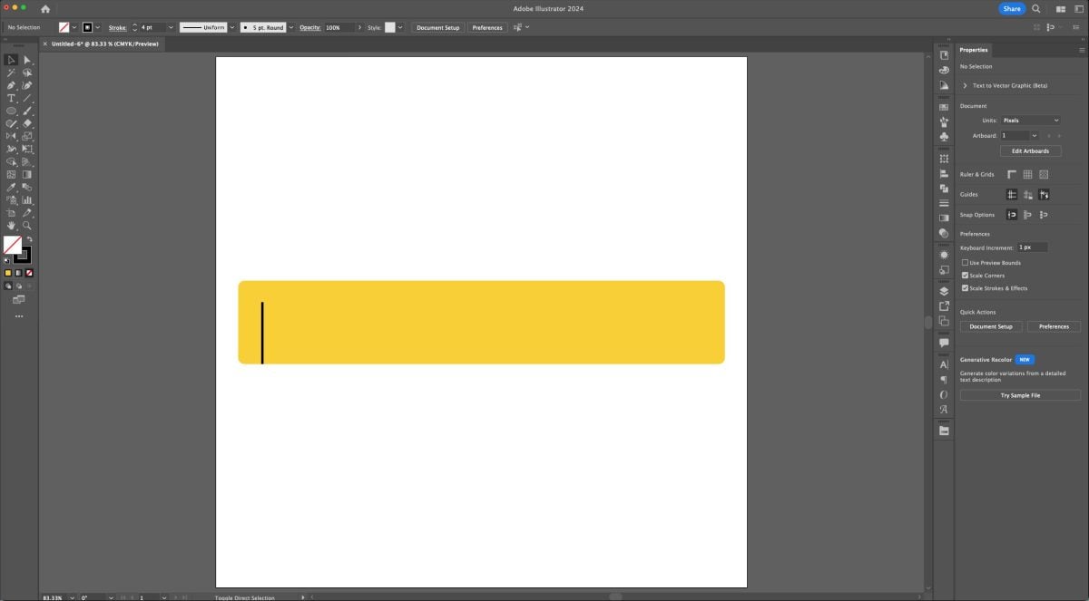
Then add more lines with copy (Command+C (Mac) / Control+C (PC)) and paste (Command+V (Mac) / Control+V (PC)). You can also use the Align tool “Horizontal Distribute Center” to make sure your lines are equally spaced.

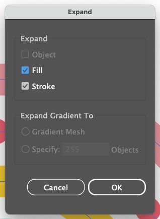
Because our lines are currently stroked lines and not shapes, we need to “expand” them into shapes (basically tall skinny rectangles). Select (V) all of the black lines and go to Object > Expand. In that window, make sure both fill and stroke is selected.
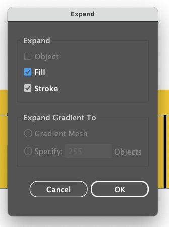
Now your lines are actually shapes. Select all of the black lines and make them a single compound path (Command+8 (Mac) / Control+8 (PC)) as well as the ruler piece and make it its own compound path.
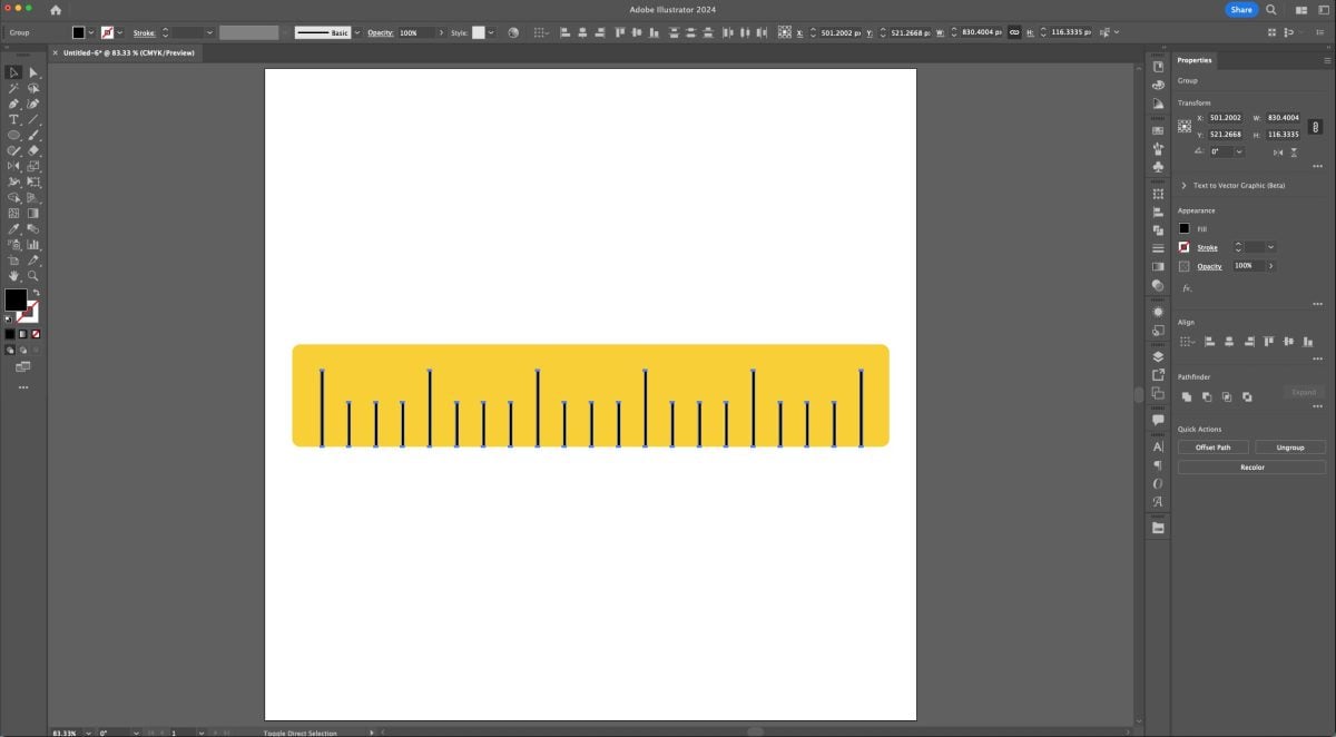
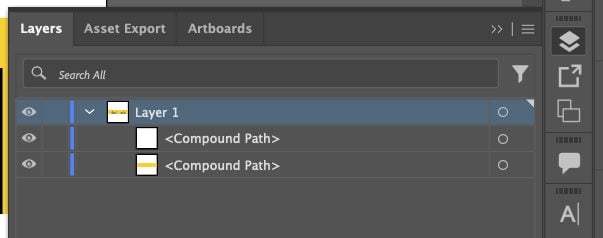
In the Layers Panel, you should have a single Layer with two compound paths:
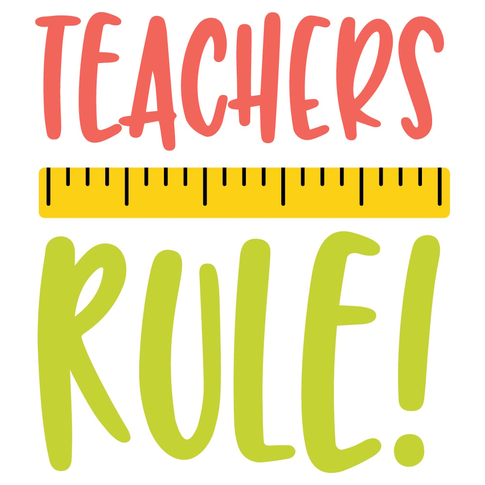
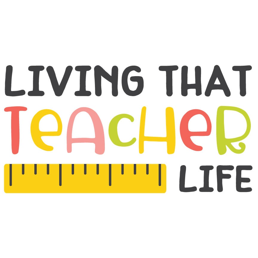
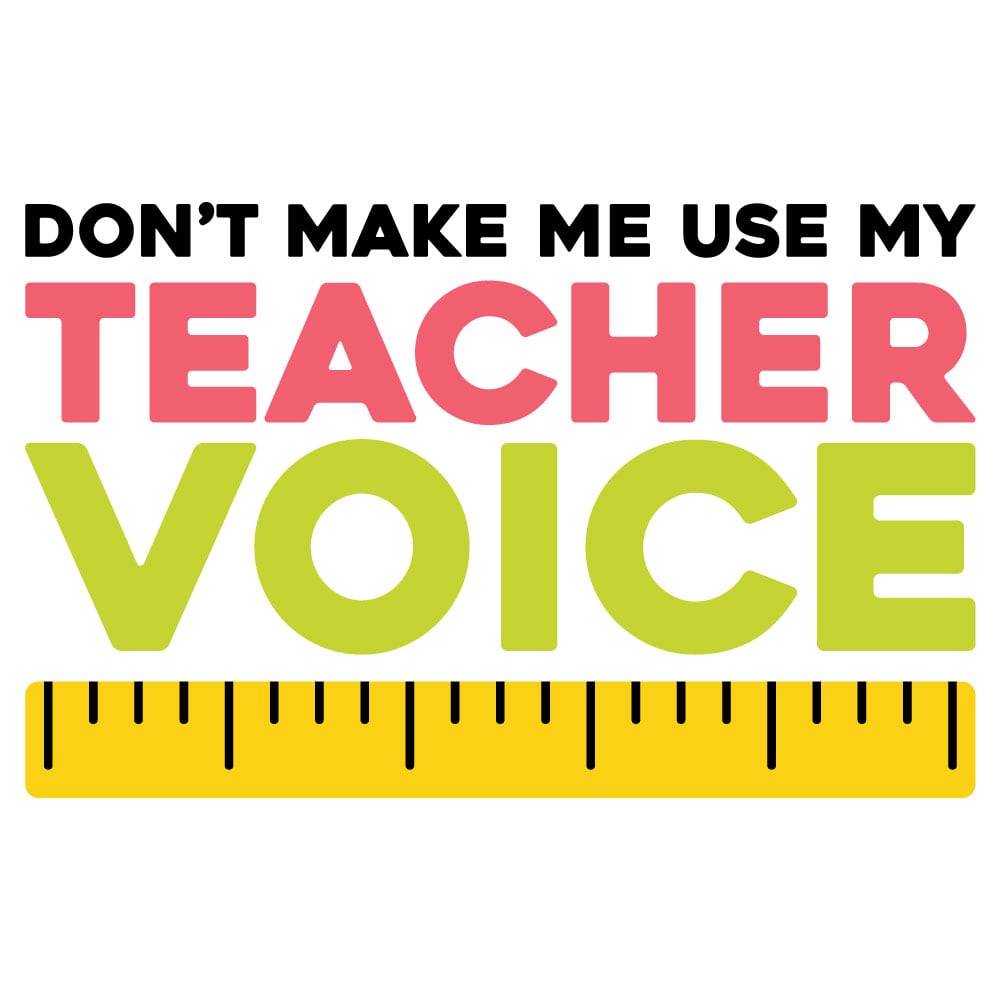
Here are a few examples of how you might use ruler illustrations (apparently I think rulers are particularly applicable to teachers…not sure what that says about me, ha!):
Sun
Let’s combine the circle and rectangle tools to make a sun! We’ll also use the rotate tool which is one of my faves.
Create a yellow circle (L) in the center of your artboard.
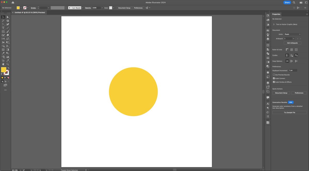
Draw a thin yellow rectangle (M) right above the circle. Use Horizontal Align Center to make sure they are aligned.

Select the rectangle (V). Hit “R” on your keyboard to activate the Rotate tool, and then use your mouse to click in the direct center of your circle. There should be a guide that says “center” when you hover over it. This will tell the Rotate tool to rotate our rectangle around the center of the circle. Hold down the Option (Mac) / Alt (PC) key and click the center of the circle.
The Rotate window will open when you click.
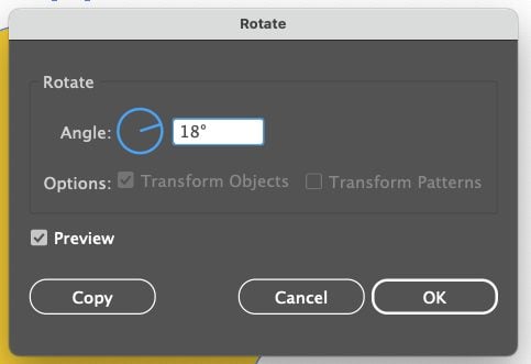
You can use whatever angle you’d like here, just make it nicely divisible by 360°. I chose 18°. Then click Copy (not OK!).
This will copy the rectangle at the specified rotation angle.

Then comes my favorite part. Use Duplicate (Command+D (Mac) / Control+D (PC)) to fill in all of the rays of the sun around the circle. As long as you clicked right in the center of the circle and you used a rotation degree divisible by 360°, it should work perfectly!
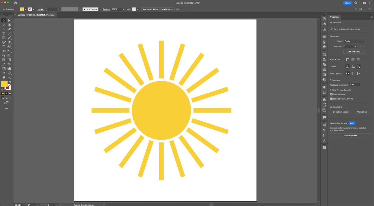
Select your entire sun and make it a compound path (Command+8 (Mac) / Control+8 (PC)). In the Layers Panel, you should have a single layer with a single compound path.

Here are a few examples of how you might use sun illustrations (I’ll teach you how to use the Eraser tool to make half a sun in an upcoming tutorial!):



Boho Rainbow
Let’s use that line tool to make a boho rainbow!
Start by creating a line (\) that goes most of the way across your artboard. Give it a substantial stroke (I did 50pt) and an empty fill.
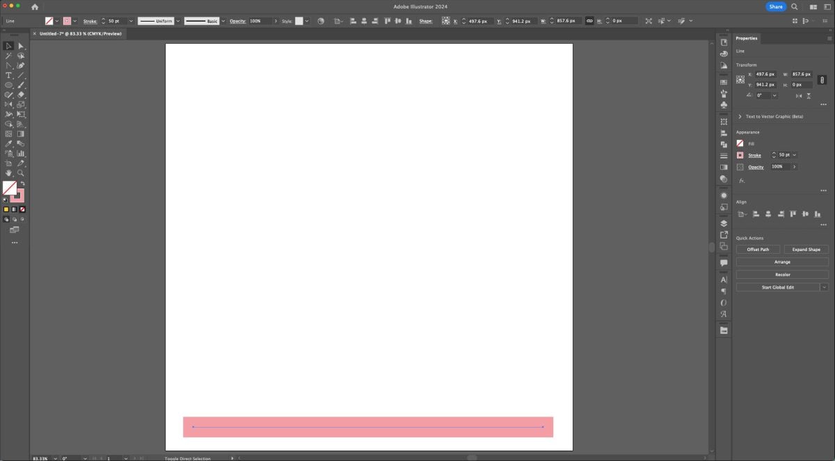
Using the Anchor Point Tool (Shift+C), click and drag the middle of the line toward the top of the artboard. (Confused here? Read my Paths, Anchor Points, and Handles tutorial!).
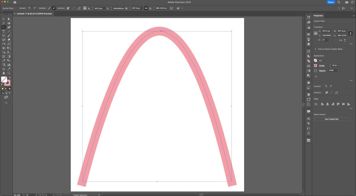
Use the handles come off the line to make the shape more of an arc.
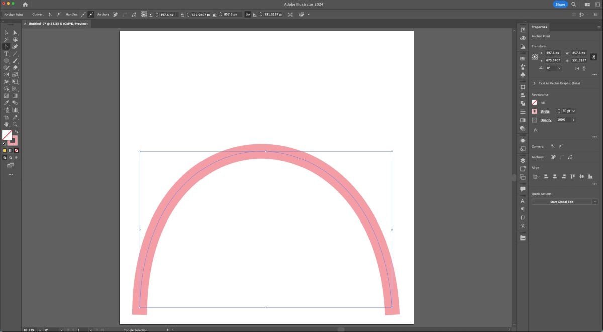
Let’s round those bottom corners by using a tool inside the Stroke Panel on the right, which looks like three different lines stacked on top of one another. (If you don’t see this panel, go to Window > Stroke to open it).
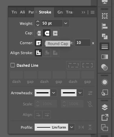
Select the arc (V) and here we can change the “Cap” to a round cap, giving us a prettier round bottom to our arc.
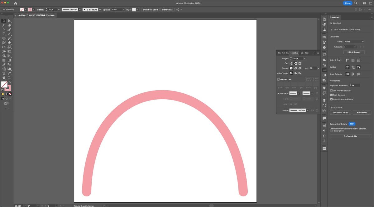
Make a second arc underneath the first, using the same method. I lowered the stroke to 40pt and colored it a darker pink.
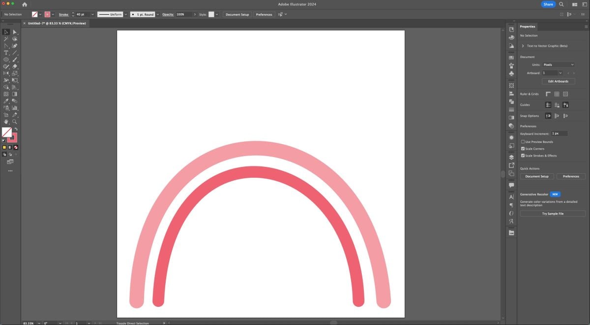
Now let’s make this second arc a dotted line. Select the arc (V) and open that stroke panel again.
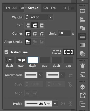
Click on the box that says “Dashed Line” and change your settings. To create a perfect circle, you’ll wan to make sure your “dash” is zero and your “gap” is larger than the weight of the stroke at the top. So I have a 40pt stroke, a 0pt dash, and a 70pt gap and I get this:
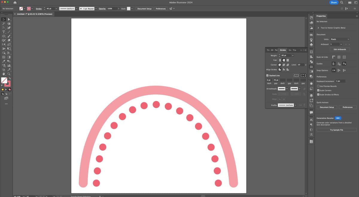
If the bottoms of the arc are uneven, change this dash setting in the the Stroke Panel to even out the bottoms:

Now finish your rainbow using a variety of stroke widths and dotted lines.
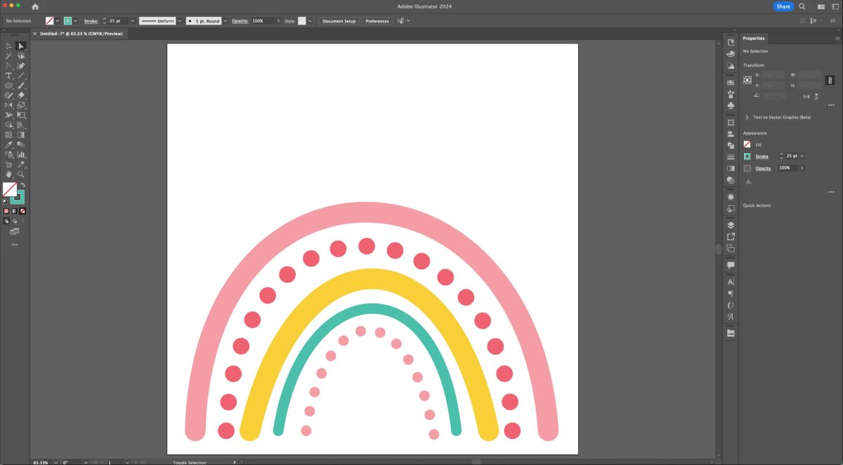
Now we need to turn our lines into shapes so we can save them as an SVG. Select all the parts of your rainbow (V) and go to Object > Expand Appearance. It won’t look like anything happened, but I promise that step is necessary—you won’t be able to do the regular expand without it.
Then go to Object > Expand. Now you’ll see that all of your lines are outlined.

Now make each arc its own compound path (Command+8 (Mac) / Control+8 (PC)). You may notice that your image “disappears” when you make that compound path. Click the empty shape and give it a color again.
Once you’re done, you should have a single layer with five compound shapes (or more or less, depending on your rainbow’s arcs!):
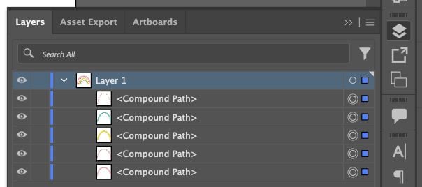
Here are a few examples of how you might use rainbow illustrations:



Firecracker
There are more than just circles, rectangles, and lines! Let’s learn how to make a triangle so we can make a firecracker SVG.
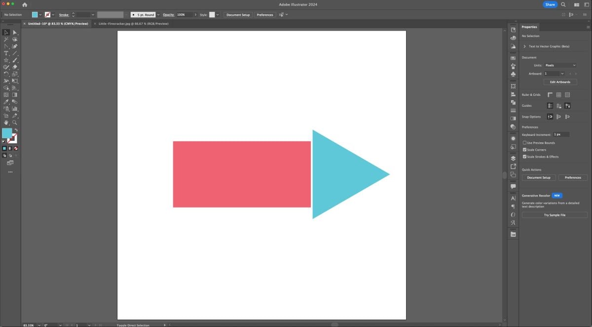
Start by creating a rectangle and color it pink or red.
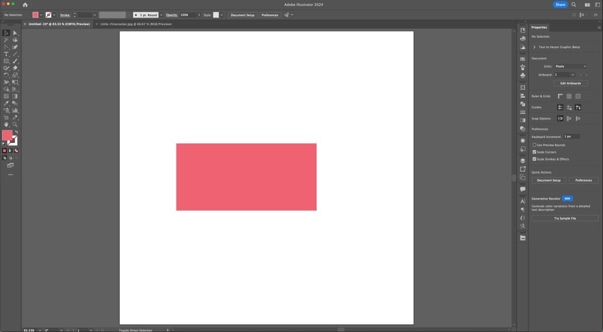
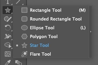
To make the triangle cone of our firecracker, we’re going to use the Star tool. Click and hold on the Rectangle tool in the Toolbar on the left. You’ll see some other shape tools. Select the Star tool.
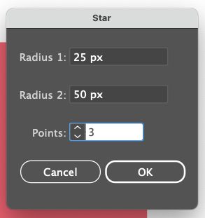
Now you’re probably thinking…how do I make a triangle out of a star? Well, a three-point star IS a triangle! So click anyway on your artboard (do not click and drag) and it will open up the Star tool. Input “3” into the points (don’t worry about the radii because it doesn’t matter on a triangle) and click OK.
Then resize, rotate, and re-color your triangle to make the cone of our firecracker.
With that same star tool, go back into the star tool and create a five-pointed star. Add three of these to your firecracker, resizing them and making them white.
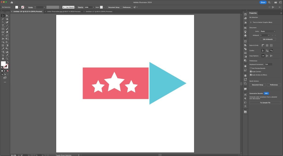
Now I don’t love all the hard corners we have going here, so let’s use those Live Corners again. Select everything on your artboard (V) and then choose the Direct Selection Tool (A). Hover over one of the corners and then use that small dot to change the radius of ALL of the corners in your image, including the stars.

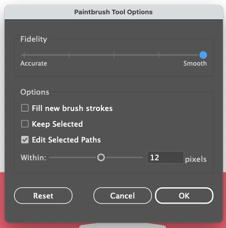
Cute! Now let’s draw the trail behind the rocket. For that, let’s use the Brush tool (B). Make sure you have a stroke color selected with an empty fill. You can change your stroke size as well (mine is 3pt). Then double click the Brush tool in the Toolbar on the left.

This will open up the Brush settings. To make it easier on yourself, slide that Fidelity slider all the way too smooth. Illustrator will help smooth out any brush lines you draw, which is great if you don’t have a steady hand or your just not good with drawing in general.
Then draw a trail coming out of the back of the firecracker. It doesn’t need to be perfect! I drew mine a few times before I really liked the one I got.
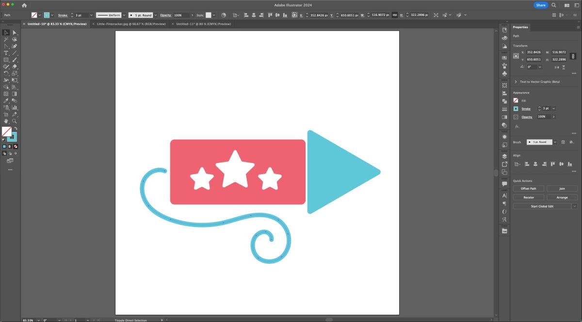
Now like with other lines, we need to expand this brush stroke. Go to Object > Expand in the toolbar at the top. Make sure both Fill and Stroke are selected.
I have found that when expanding a brush stroke that it often leaves me with a LOT of anchor points. And if you’ll remember from the first Fonts tutorial, lots of anchor points can be a nightmare for a cutting machine. To see the anchor points, select the image with the Direct Selection Tool (A).

So let’s simplify it. With the image selected (V), go to Object > Path > Simplify.

Then you can play with the slider to lower the number of anchor points while remaining true to the original shape.

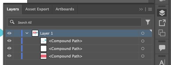
Much better! Go ahead and create compound paths for this image. I created one that had the blue nose cone and the trail in one, a red compound path, and a white compound path.
Here are a few examples of how you might use firecracker illustrations:



Tag Shape
Let’s look at the rectangle tool to make a tag shape. This looks like a lot of steps, but as you get more comfortable with Illustrator, they’ll become second nature.
Start by drawing a rectangle (M). Place it a bit to the left on your artboard.

Then create a smaller rectangle (M) and rotate it. Place it over the top right corner of your rectangle.

Select the smaller rectangle (V) and copy (Command+C (Mac) / Control+C (PC)) and paste (Command+V (Mac) / Control+V (PC)). You should have two small rectangles.
Select the new small rectangle and use the keyboard shortcut O+Enter to open the Reflect Tool. Make sure “Vertical” is selected under Axis and press OK.
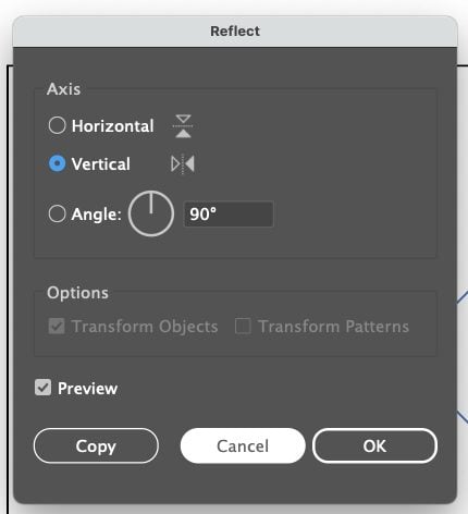
This will flip that second rectangle to reflect the first. Place it at the bottom right corner of your larger rectangle.
You can use the Align tools to make sure that the two smaller rectangles are aligned vertically.
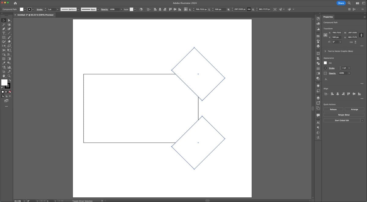
Now select (V) both small rectangles and make them a compound path (Command+8 (Mac) / Control+8 (PC)). This means these two rectangles will now function as a single shape.
Select both the large rectangle and the two smaller rectangles and open the Pathfinder Panel. Choose the Minus Front tool.
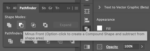
This will subtract the smaller rectangles out of the larger rectangle, leaving you with a basic tag shape.

Now add a small circle (L) for the hole in the tag.
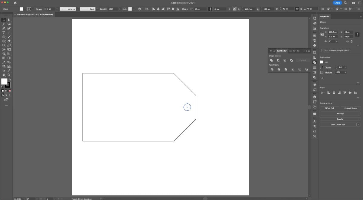
Select the small circle and the tag shape and make them a compound path (Command+8 (Mac) / Control+8 (PC)). This means that a cutting machine will cut the hole out of the tag, vs. having it separate.
Then change the fill color of your tag, making sure to have an empty stroke.
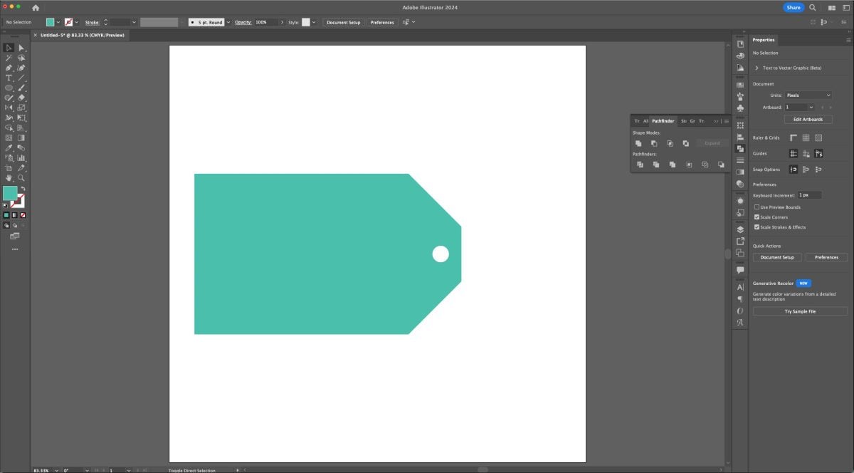
In the Layers Panel, you should have a single Layer with a single compound path:

Here are a few examples of how you might use a tag shape:



Whew! Let me tell you, it takes a lot of screenshots to explain things in Illustrator! Make sure you watch the video above to get a video explanation of everything here! Next week we’ll be talking more about the Pen tool—stay tuned!


Leave A Reply!