Fonts are one of the easiest ways to make SVG files! In this tutorial, you’ll learn to make an SVG from a font, which fonts work well (and which ones don’t!), and how to prepare your files so they cut on a cutting machine.
Welcome back to my series on using Adobe Illustrator for SVG design! We’ve gone over the basic workspace and an overview of paths, anchor points, and handles. Today we get to the fun stuff—actually designing some SVG files using basic fonts in Adobe Illustrator!
Note: this is an updated version of this SVG Design in Adobe Illustrator post. This post is updated with the newest version of Adobe Illustrator and has more information than the old post.
We’re going to be diving into the world of creating SVG files with fonts. This tutorial is going to be broken into two parts since there is a lot we can do when it comes to using fonts. We’ll cover the basics today and then some more advanced font techniques in the next tutorial. By the end of this post, you’ll be able to export a font-based SVG and use it with your cutting machine!
As always, I encourage you to use keyboard shortcuts! They will speed up your workflow and you’ll be much faster at creating your SVG designs. I use shortcuts in this lesson in parentheses. I’ve gone into more detail about the tools we’re using in previous lessons, so definitely start at the beginning!
Note: Between the last lesson and this lesson, I upgraded to Adobe Illustrator (Version 28). Not much has changed, but if you notice differences, this is why.
Watch the Video
Want a video tutorial of this entire post? I walk you through making SVGs using fonts in this video! Just click play. Or read on for a written tutorial!
Get the Free Illustrator Shortcuts File
Want access to this free file? Join my FREE craft library! All you need is the password to get in, which you can get by filling out the form below. The file number is: P121.
Watch the Video
Prefer a video about how to make an SVG with a font? Hit play below! If you’d like a written tutorial, keep reading!
Make an SVG with a Font
Open up a new document (I go through this in the workspace overview, if you haven’t read through that already).
Type Your Text
Select the Text tool (T). Let’s start by creating some basic text on your art board. You can choose whatever word you would like, but for this instance, make it a single word or a name. It will be pretty small because our artboard is 12″ x 12″.
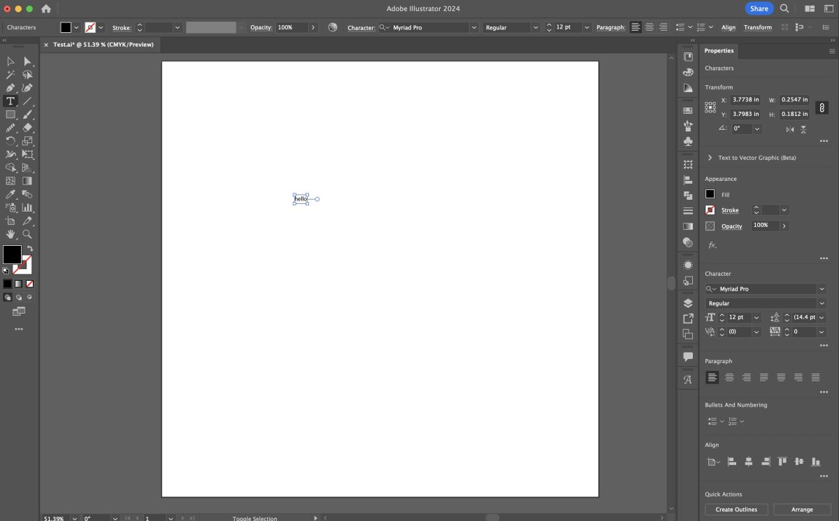
Resize Your Text
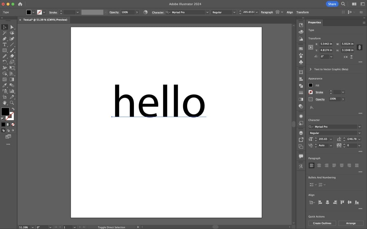
There are two easy ways to change the size of your text. Holding the shift key (this will keep your sizing proportional), click and drag on one of the corner anchor points to increase the size. See my post on paths, anchor points, and handles for more information.
Or increase the font size either in the Control Panel at the top or in the Properties Panel if you have that open on the left.
Just make your text large enough that you can easily work with it. Remember that vector files can be resized to any size without losing resolution, so the actual size isn’t super important here.
Choose a Font
Now you can choose a font ysing the font dropdown in the . You will know it’s a font because it has a blue underline, instead of an outline around it.
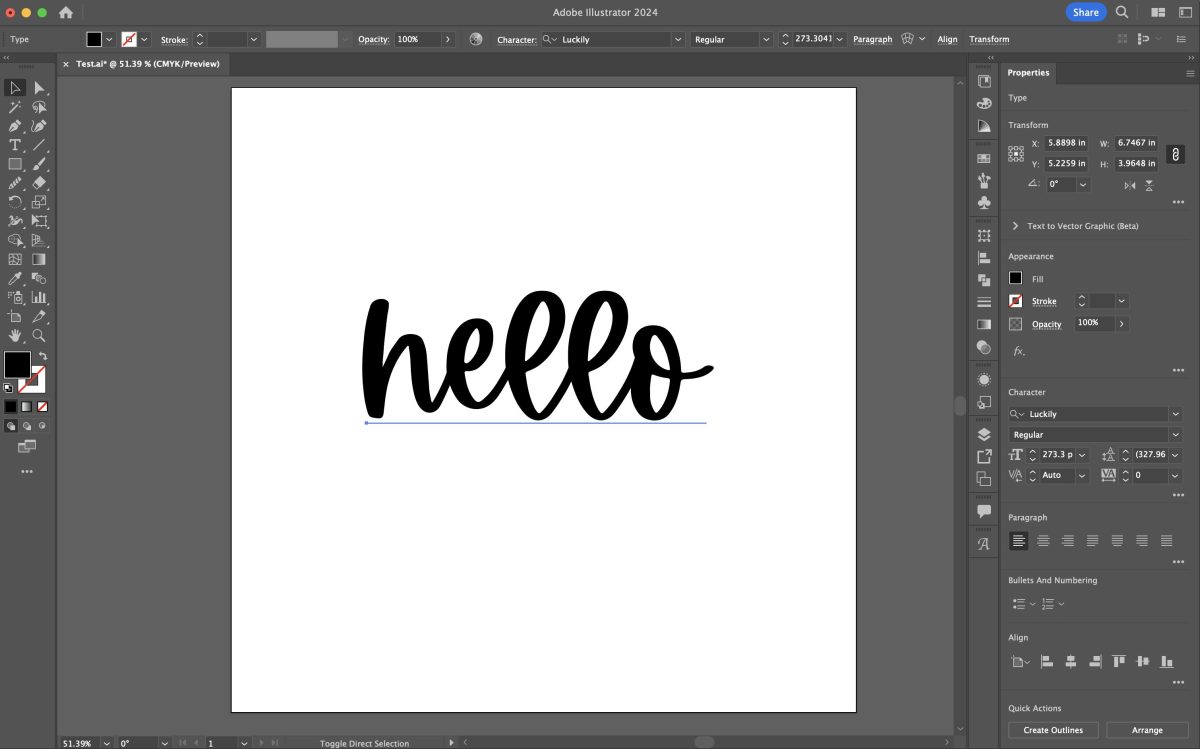
For this tutorial, I’m using the “Luckily” font, which is part of the Font Bundles Plus subscription.
I have an absolutely bonkers number of fonts on my computer. Check out my post Where to Find Cheap and Free Fonts for the Cricut to find more fonts to work with. Lately, I’ve been loving both the Font Bundles and Creative Fabrica subscriptions for fonts. Both memberships are inexpensive and you get access to tons of great fonts.
Now if we tried to export this file as is, you wouldn’t be able to upload it to Cricut Design Space or another design software. That is because the font is still, well, a font. And you can’t upload fonts to cutting machine software. We need to outline the font to turn it into a shape. Make sure you have your text exactly how you’d like it and you have no typos—once you outline your fonts, there’s no editing your text.
Outline Your Font
Note: before you do this step, scroll down to the section on saving your SVG. I like to save a version of my file with the fonts un-outlined so I know what fonts I used in my file. You may want to do this too.
Choose the Select tool (V) and click on your word. Then use the Create Outlines shortcut shift+control+O (PC) / shift+command+O (Mac). You can also go to to the menu bar at the top and go to Type > Create Outlines.
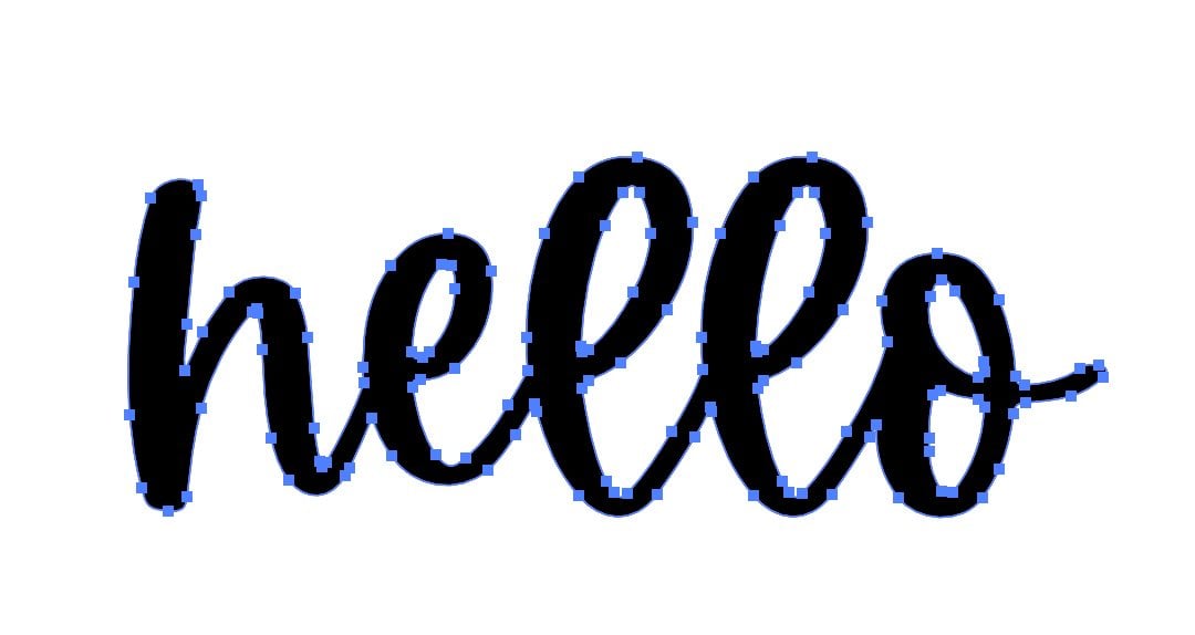
Now when you click on your text, you’ll see a thin blue outline around each letter.
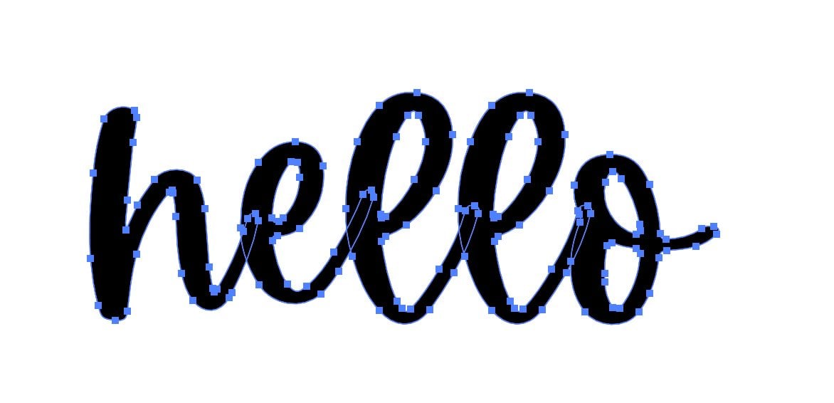
Each individual letter is now a shape. If you double click on one of the letters, it will “isolate” and you can move it individually. Sometimes I do this to help my “kerning” (we’ll talk about this next week!) or change up the design a bit. To get out of isolation mode, double click on the artboard.
Unite Your Font
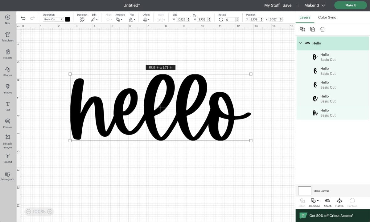
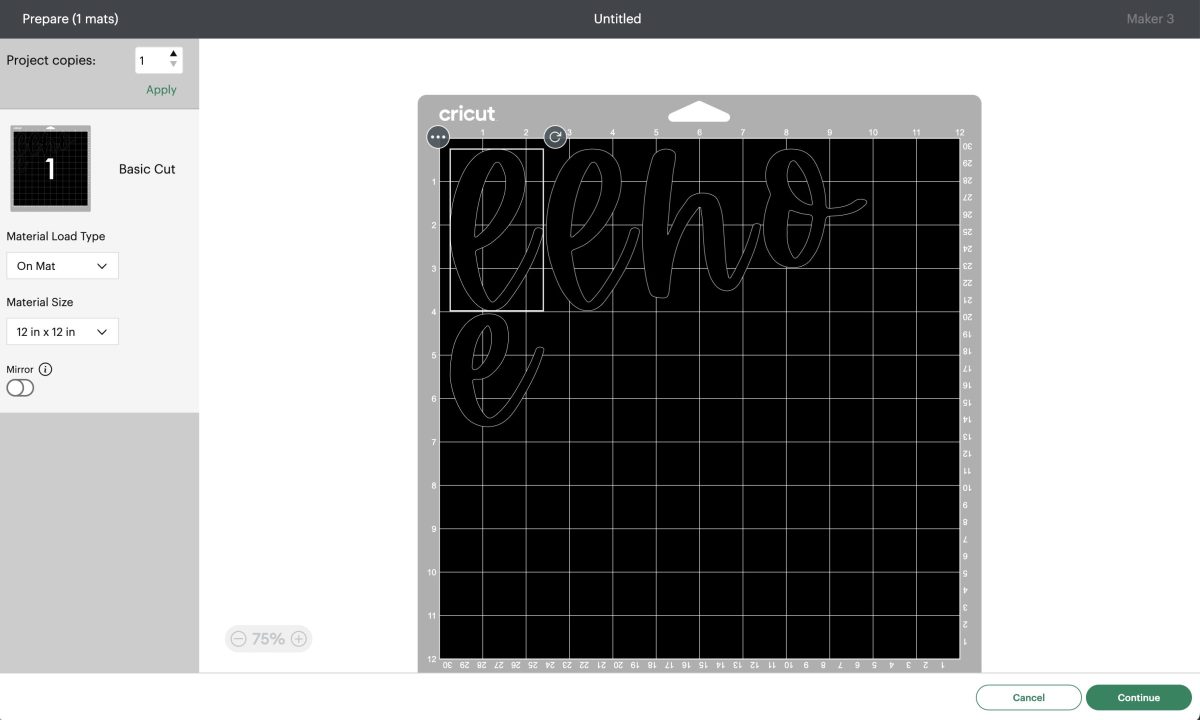
Now if we exported our image as is and uploaded it to Cricut Design Space or another cutting machine software, our letters would still be individual letters in the Layers Panel and would cut as individual letters on the mat, as you see below. Yes, you could weld or unite within Cricut Design Space, but it’s much easier to make your image correctly in Illustrator so you don’t have to do those sorts of edits in the cutting machine software.
In the workspace overview, I talked about the Pathfinder panel. If you went through that lesson, your Pathfinder panel should be on the right side in the Panels menu (go back to that lesson and add it if not). It looks like two overlapping squares. Click on that icon to open the Pathfinder panel.
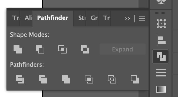
From here, click and select your word (V) and then choose the first icon in the Pathfinder panel that looks like two combined squares. If you hover over this icon it will say “unite.” Click the icon and Illustrator will unite your word into a single image.
Create a Compound Path
The final step in the design is to create a compound path. In my lesson on paths, anchor points, and handles, I mentioned how compound paths are important to SVG design. This is one of the ways that we keep all of the parts of a design together so they cut on the same mat properly. For some simple designs, this step isn’t necessary. But for many designs it is, so it’s good to get in the habit of creating a compound path now.
Select your word (V) and use the keyboard shortcut control+8 (PC) / command+O (Mac). You can also go to Object > Compound Path > Make in the menu bar at the top.

The look of your shouldn’t won’t change in this instance, but you’ll see the image is now a compound path in the Layers panel, as you’ll see in a few.

Sometimes you’ll create a compound path and it will look like your image disappears (especially if you skip the uniting step). Really, it’s just filled with no color. You should still be able to click on the image using the Select tool (V) and then you can use the color picker to change the color back to something you can see. I have a full tutorial on color coming soon!
Checking The File in the Layers Panel
Before we export our file, I like to look in the Layers panel to make sure everything looks correct. I always check the Layers Panel because it can show you if you have issues. You can click and drag the left edge of the Layers panel to make the panel wider so you can see the names of the layers.
In the Layers panel, you can see that we have a single layer that has our compound path text shape.
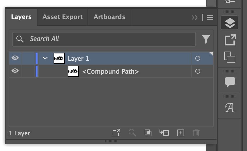
This is what we want for a single-layer SVG. If we had more layers, we’d expect to see them here as compound paths as well.
If you see anything other than the single compound path, you can investigate. Maybe you have other text on your artboard or in the gray area outside your artboard. Maybe you didn’t make the compound path properly. Maybe you have a stray anchor point or line. If you click the circle to the right of the layer, it will select that object on your canvas so you can investigate.
You can also rename your layers. This is not necessary but can be a nice step, especially once we get into making multi-layer SVG files or if you want to share or sell your files. Just click on the name of the layer and type your new name.
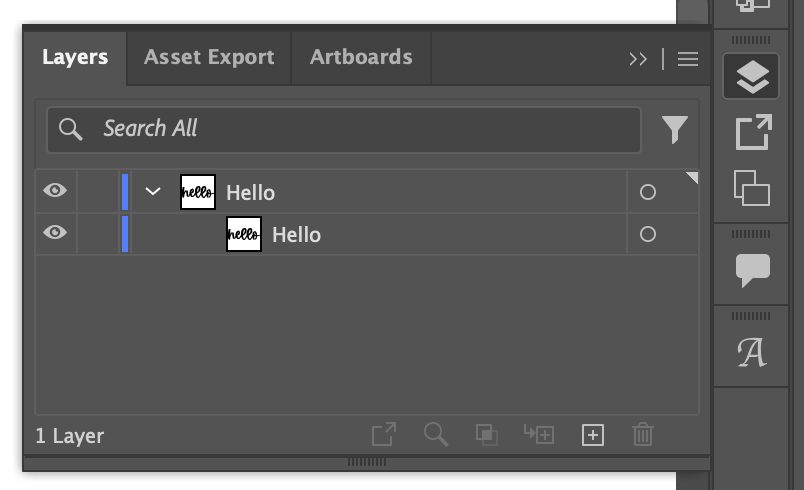
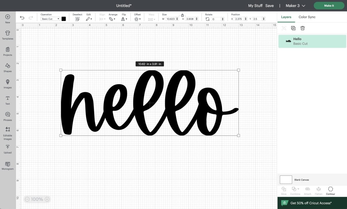
Then when you upload your SVG to your software, the name of the layer will appear in the Layers panel.
Exporting Your File as an SVG
It’s time to export our SVG! Here’s my process. You can skip the first step if you’d like, but I find it helpful.
Before I outline my text, I save my project (control+S (PC) / command+S (Mac)) as a basic .ai file (this is the default and stands for Adobe Illustrator). For this one, I named it hello.ai. This way, because my text is still in font form, I will always know what fonts I used for my SVG. Once it’s outlined, you lose access to the font name. And I can’t tell you how many times people have asked me “what font is that?” or I’ve wanted to use a font a second time and had no idea what font it was. Having the .ai file with the un-outlined font is so helpful to remember.
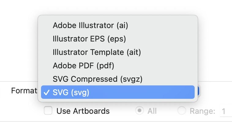
Once you have the .ai file saved, you can Save As (shift+control+S (PC) / shift_command+S (Mac). From the dropdown, choose the SVG file type (.svg). Give your file a name and hit Save.
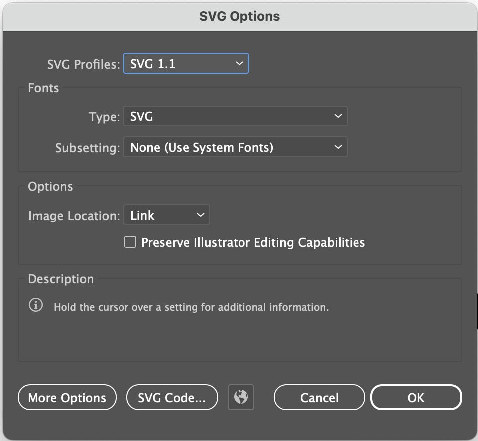
In the next screen, you’ll see some options. Don’t mess with any of them. Just hit OK and your SVG file will save! Now you have a working SVG file that you can upload to your cutting machine software.
SVG Design and Anchor Points
An important note about using fonts (or any elements!) in your SVG design. Cricut and Silhouette machines prefer “simple” artwork. And by this I mean that the machine software prefers fewer anchor points. Again, if you skipped last week’s lesson, go back because there’s important information in there about anchor points!
These machines can cut incredibly intricate designs, but the more mathematically simple they are (the fewer anchor points they have), the better.
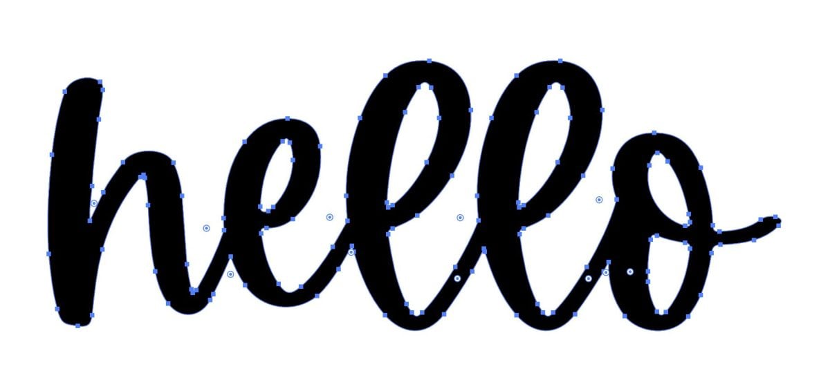
The easiest way to see your font’s anchor points is by looking at your font once you’ve outlined it (see above for outlining instructions). You’ll see that the Luckily font I used is simple and has a reasonable number of anchor points.
But if I choose a rough font, like Midnight below, you’ll see that it has TONS of anchor points! Your cutting machine is really going to struggle with something this complex—it will chew up your material as it tries to turn and cut at all of these anchor points.
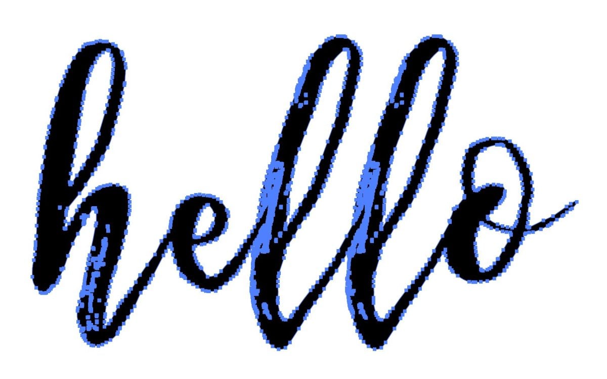
This is just something to be aware of when you’re working with fonts. You want smooth, easily cuttable fonts. Stay away from fonts with “rough” or “grunge” and sometimes even “brush” in the name. Always check your anchor points after you’ve outlined to make sure your font is a good one for cutting.
Smoothing Fonts
If you do have a font that isn’t super rough but it still has a lot of anchor points, there’s a tool you can use to help remove some of those anchor points while maintaining your font shape. This makes for faster, easier cutting.
For example, I have the font Author here. When outlined, it’s a bit anchor-heavy, so let’s simplify it.
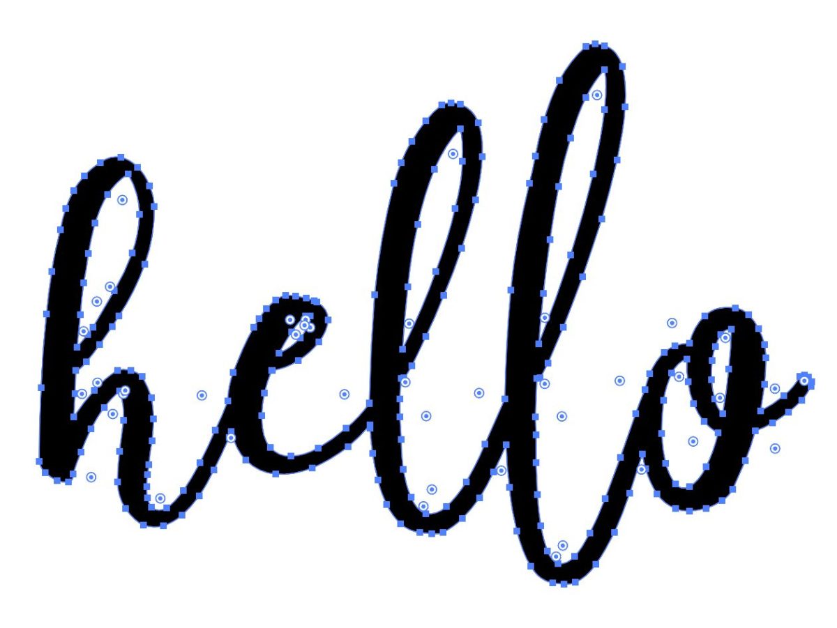
Select your image (V) and then go to the top menu bar and go to Object > Path > Simplify. This will give you a small slider that you can slide back and forth to simplify your font. Slide to the left and you’ll have fewer anchor points, slide to the right and you’ll have more.

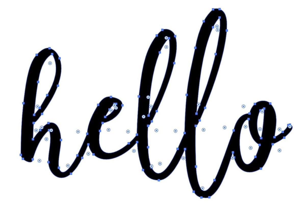
You want to try and find the point on the slider where your font looks the same as it does originally, but with fewer anchor points. You don’t want to slide the slider so far to the left that it starts to distort your font in the simplification.
If you click on the three dots on the right, you’ll get some more advanced options, but I like that you can see here how many anchor points you started with and how many you have now. It’s just interesting information!
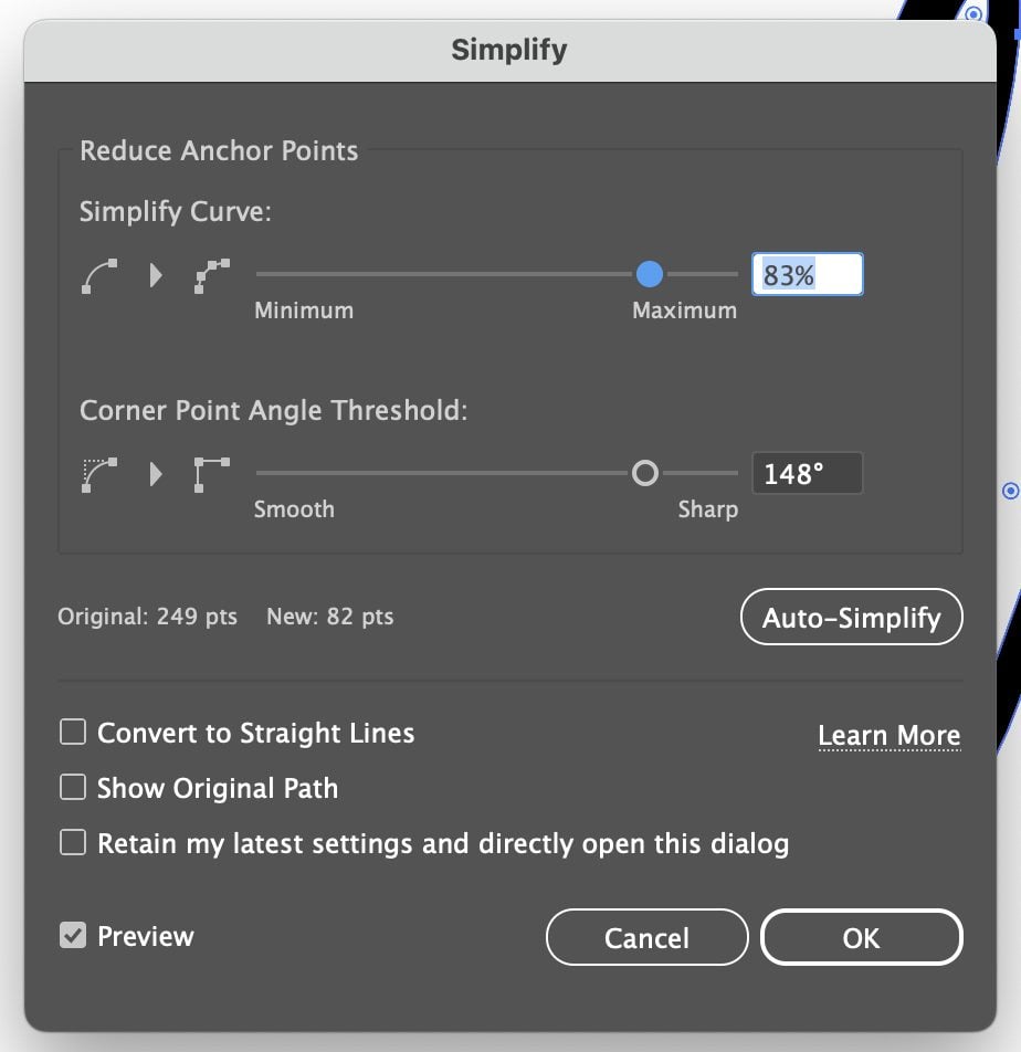
I started with 249 points and ended with 82 points and my text looks the same. Amazing, right?
Homework
For today’s lesson, practice making an SVG with a font! Make a bunch of them! Also try outlining different fonts you have to see how many anchor points they have. You may want to start a spreadsheet of “good” and “bad” fonts that you can refer to so you’re not constantly choosing the same font and finding out it’s not going to work as a cut file.
And that’s it for today’s font lesson! Next week, we’re going to dive deeper into fonts. We’re going to talk a bit more about good font design, processes and elements like kerning, ligatures, and line spacing, as well as creating multi-layer font SVG files. It’s going to be fun—can’t wait to go through it with you!


Leave A Reply!