It’s pretty easy to make a basic SVG in Adobe Illustrator from a font, but these tips and tricks for using fonts in SVGs will help you take your designs to the next level!
Welcome back to my Adobe Illustrator series for SVG designers and crafters! If you’re new, you’ll want to go back and start from the beginning before getting into this tutorial, since each tutorial builds on the next one!
- Workspace Overview (video)
- Paths, Anchor Points, and Handles (video)
- Make an SVG from a Font (video)
- Tips for Using Fonts in SVGs (video)
- Color Basics (video)
- Using Shapes and Lines to Make Illustrations (video)
- Using the Pen Tool (video)
- Creating Fun Text Effects (video)
- Image Trace (video)
- 10 Quick Tricks for SVG Design (video)
In today’s tutorial, we’re going to take what we learned last week for making a simple font SVG in Illustrator and expand upon it. That way you can go from making a simple one-word phrase to more complex designs using a variety of different tools and techniques. This way your SVGs will be much more successful and easier to cut on your Cricut, Silhouette, or other cutting machine.
In this tutorial I’m just using boring black for my SVG color—in the next tutorial we’ll talk about using color. Color isn’t just for looks! It can help you sort the layers in your file, as you’ll see. So stay tuned for that tutorial!
As always, I encourage you to use keyboard shortcuts. They will speed up your workflow and you’ll be much faster at creating your SVG designs. I use shortcuts in this lesson in parentheses. (T) is the text tool shortcut and we’ll be using that one a lot in this lesson! You can also download a keyboard shortcut printable below to help you remember the most popular shortcuts for SVG design.
Watch the Video
Want a video tutorial for using fonts in SVGs? I walk you through making SVGs using fonts in this video! Just click play below. Or read on for a written tutorial!
Get the Free Illustrator Shortcuts File
Want access to this free file? Join my FREE craft library! All you need is the password to get in, which you can get by filling out the form below. The file number is: P121.
Read the TOS of Your Font
Before we get started, make sure to read the terms of service of your font. A handful font designers or sites don’t allow for any manipulation of their fonts and you want to make sure you are following their terms so you don’t get in trouble. Most fonts, however, will allow you to make a lot, if not all, of the changes featured in this tutorial.
The Character Panel
One panel we haven’t talked about yet is the Character Panel. You can add this to your Panels on the right by going to the Menu Bar at the top and clicking Window > Type > Character and then dragging the Character Panel into your sidebar of Panels. You can find most of these tools in the Properties Panel or in the Control Panel under Character, but this is one more option!
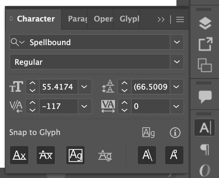
Adding the Character Panel will also give you the Opentype Panel, which we’ll need below!
Saving as an SVG
For these examples, I don’t go into how to save these files as SVGs, but you can follow the last tutorial for those instructions.
In that tutorial, I make a single compound path for the single word in my SVG. But if you have more words, you can save different parts as compound paths, depending on how you want to cut them. So for this image, which I share later on in this tutorial, I may make “friends” and “family” and “choose” as one compound path so they cut together on one mat and “are the” and “we” a second compound path so they cut together on a different mat.

We’ll go more into the best way to choose your compound paths when we talk about color next week. Also make sure to check your Layers Panel for any problems before saving, like I showed you last week!
Using Fonts in SVGs
This tutorial is sort of a mishmash of different tools and techniques you can use to make better and more unique SVGs with fonts. I’ll start with the more simple techniques and move onto more advanced techniques later in this post!
Letter Spacing
Letter spacing can change the overall feel of your design, plus allow you to make your fonts the size you want them without having to skew or stretch the aspect ratio. Letter spacing changes the spacing between each letter of your text box evenly.
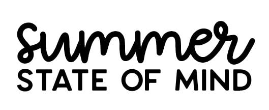
In this example, you can see I have two text boxes. One with “summer” in the font Girly Goose, and “state of mind” in the all-caps font Larosa. Together, these are okay, but I wouldn’t say it looks great. The top and bottom lines are competing for each other and the bottom font looks a bit boring.
But if I select the text box containing “state of mind” and click on Character in the Control Panel (or Properties Panel or Character Panel…told you there were many ways to do the same thing in Illustrator!) and increase the letter spacing (I increased it to 200, but you can use whatever you’d like) and then resize that text box to fit under “summer,” it becomes more successful.
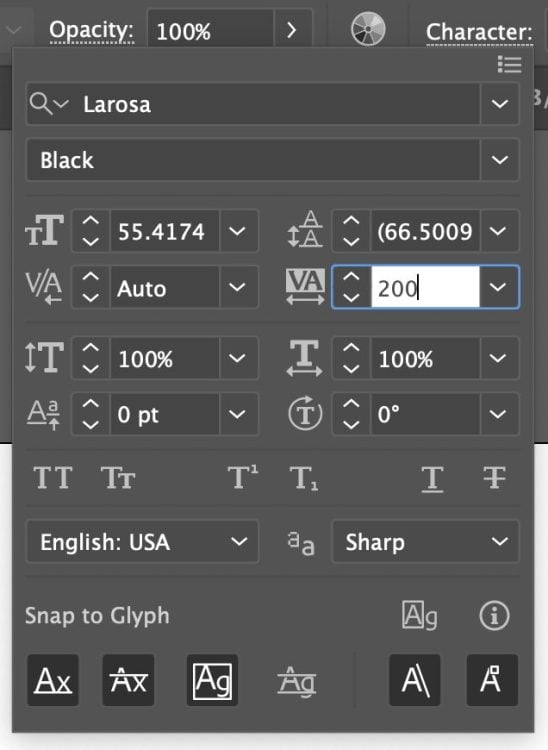
There’s more breathing room between the letters and the word summer stands out more. Same font, but with the wider letter spacing, it is unique and more visually pleasing.
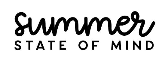
I do any letter spacing changes before my font is outlined—once it’s outlined, you won’t have access to this tool anymore.
Kerning
While letter spacing spaces all the letters evenly, kerning is adjusting the space between two letters to make them more visually appealing. Whether or not you’ll have to kern your letters depends on how well your font is designed. Some designers are really great at kerning and some are not.
Let’s take a look at an example. We have the phrase “boat life” in the font Spellbound in a single text box. You may think this looks okay, but from a designer’s eyes, I see that there’s too much spacing between the letters, particularly the O and the A and the A and the T.

The “right” way to kern is to place your text cursor between the two letters and adjust the kerning in the Character Panel. I often do it this way if only one or two spaces need to be kerned. A negative number will decrease the amount of space between your two letters.
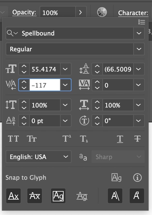
But if I want to adjust my kerning more easily, I will outline my fonts (shift+command+O (Mac) / shift+control+O (PC)) and then select my text image (V) and double click to isolate each letter and move it with the arrow keys on my keyboard. I find this to be much faster than messing with kerning before my font is outlined.

You can also use kerning to add space between letters. Occasionally some fonts have letters that overlap in ways that aren’t particularly attractive.
Different Ways to Resize Text
In the last lesson, we talked about two ways to resize text. The first was using the Font Size dropdown in the Control Panel or in the Properties Panel. You can also drag the corner of the bounding box and resize it while holding down the shift key (you’ll remember from the last tutorial that you don’t want to skew or stretch your fonts. Always hold down the shift key while resizing the font using the bounding box so your font retains the proper aspect ratio).
But if I want all of my lines the same width (a popular way to design SVGs), I have a third way I will resize my text. Let’s say I have three different text boxes with “baking” and “is love made” and “edible” in the font FB-Pizzarony.
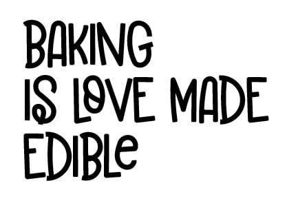
I could try and resize my text boxes using the font dropdown or the bounding box, but I find it much easier to outline my fonts (shift+command+O (Mac) / shift+control+O (PC)). Then I’ll use the width box in the Control Panel to make each individual outlined text image the same size, in this case 4″ wide.
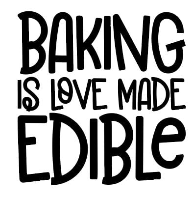
Then you can select all three using the Selection Tool (V) and use the Horizontal Center Align tool (found in the Control Panel, the Properties Panel, or the Align Panel) to align them perfectly. You may also need to move the text boxes to get them spaced nicely top to bottom.
Rotating Text
Sometimes I find that I can’t get a pleasing layout to an SVG with the words that I have. I try resizing the text as above or changing fonts, but it’s still not quite there. Let’s take this example of “bows and bling it’s a cheer thing” in the font Sportsball.
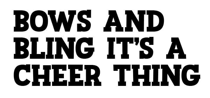
I couldn’t seem to get the right words to stand out and look good, no matter how many lines I had. So I went back and put every word in its own text box. This way I could work with each word separately. I do this often—I rarely work with a whole phrase in a single text box.
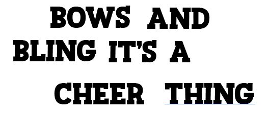
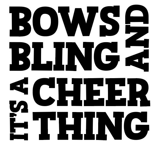
I outlined the font (shift+command+O (Mac) / shift+control+O (PC)). Then I selected the first text box I wanted to rotate. Hover near a corner anchor point and you’ll see a little rotate arrow. Click the arrow and you can rotate your text box.
I rotated the less important words so that the more important words stood out more. I would definitely add color to this SVG to make it pop, but overall, this is a much more successful design.
Emphasizing Words
Like in the last example, sometimes you want to emphasize important words and downplay others. This is hard to do when you’re using all the same font in all the same size. For example, “friends are the family we choose” is all in the font September and every line is in its own text box. Again, it’s just a bit hard to read because nothing stands out and there are some awkward white spaces.

But if we use the Font Selection dropdown in the Control Panel at the top to change the less important words to a simple font—in this case “are the” and “we” are in the font Aquabella—and then nest the words together a little better and make the word family a little bigger, we have a much more appealing SVG. Nesting text like this is one of my favorite ways to create a really nice cut file.

I won’t go into pairing fonts in this tutorial, but I do have a mini e-course that includes pairing fonts!
Moving Individual Letters
Sometimes moving individual letters can create an even better look to your SVGs. This is easiest to do after you’ve outlined your fonts (shift+command+O (Mac) / shift+control+O (PC)). I started with “trick or treat” in my favorite Halloween font Mitoos.

But I don’t love how some of these letters are sitting next to each other. Particularly the TR at the front of “trick” and “treat,” but others as well. So after you’ve outlined your font, use the selection tool (V), double click on the individual letters, and move them. I moved my letters up and down until I had an arrangement I liked. I think it’s much better than the original!

Increasing the Stroke
What if you find a font you really like…but the letters are just too thin to cut well on a cutting machine? You can increase the stroke (the outline of the font) a bit, to make it easier to cut. In this case, I have the font Delight Script spelling out “all is bright.” You may be able to cut this for a large project, but a cutting machine will definitely struggle with those thin lines on a smaller project.
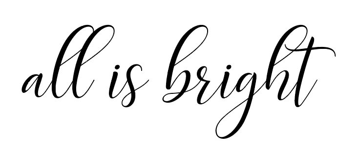
So you can add a stroke to your text. If you remember, the fill is the color that fills your image (in this case, black) and the stroke is the outline (which I also made black). I added a 1pt stroke to help thicken the letters just a bit. You don’t want to go overboard, you just want to make it cuttable.
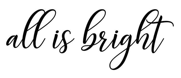
Now you may think this works as is if you outline it, but there are a few additional things we need to do to get it to cut properly.
First, we will outline the font like normal (shift+command+O (Mac) / shift+control+O (PC)). Select your text image (V) and you’ll see that now we have an outlined font…with a stroke.
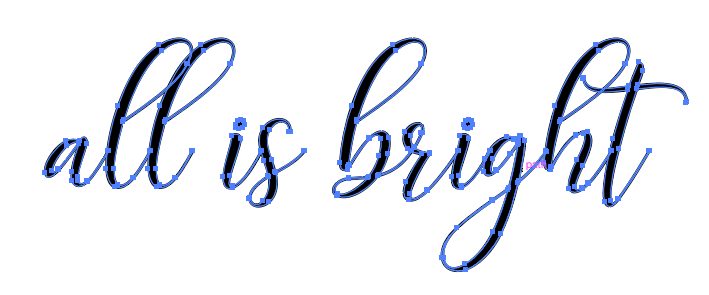
If we upload this to a cutting software, it won’t work properly—the stroke will disappear. So our next step here is to Expand our fill and stroke. Go to the Menu Bar and go to Object > Expand. Make sure both Fill and Stroke are checked.
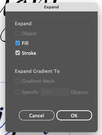
This turns the stroke into its own cut shape.
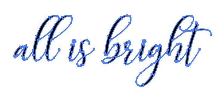
But now we actually have two separate images—a fill image and a stroke image. So we need to Unite our fill and stroke to make it a single image (and connect our overlapping letters). Select your image (V) and go to the Pathfinder Panel and choose the first option under Shape Modes, Unite.
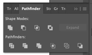
This will give us a single image.
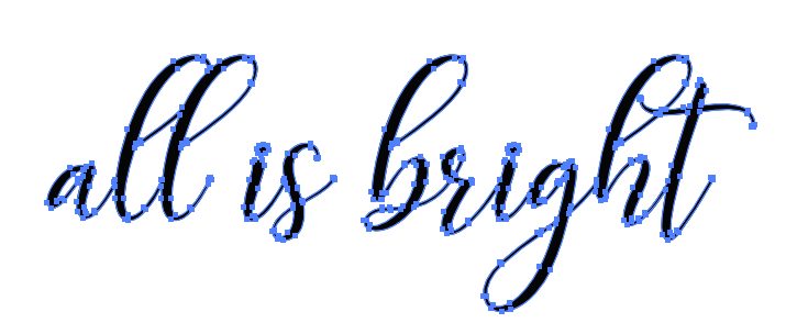
Typing Text on a Circle
Another fun way to use text in your SVG files is to type text on a circle. I often add an image in the center (we’ll go into creating images in a future tutorial), but for now we’ll just do the circle part. Draw a circle (L) on your art board. Remember to hold down the shift key to get a circle and not an oval. You can also use an oval for this if you’d like!
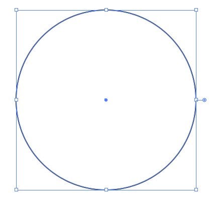
Click and hold the Type tool in the Toolbar on the left. This will give you more type-based options. Choose the Type on a Path Tool.
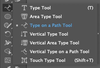
Then you can click on the circle. You can click at the top or the bottom for centered text. Honestly I find it a bit counterintuitive to figure out how my text will appear on my circle so you may need to play around with it a bit depending on your text. I chose to click on the bottom anchor point in the circle, and Illustrator added a bunch of lorem ipsum filler text.
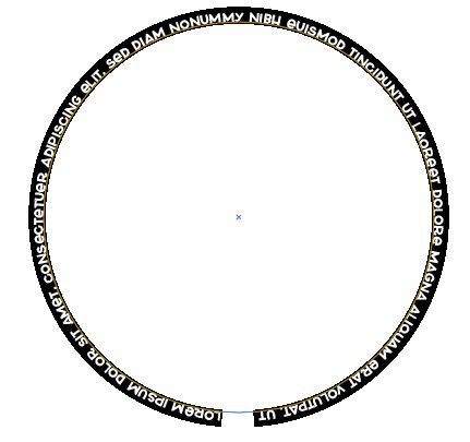
You can replace that text with whatever you’d like. I chose “you are my sunshine” in the font Poolside and repeated it because I didn’t want my words to be too large.
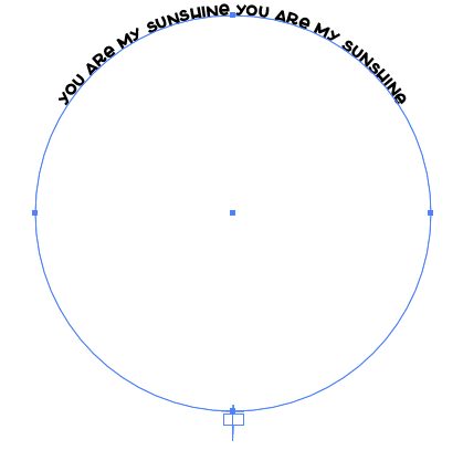
I then selected all of my text and increased the size of the text until it filled the entire circle.
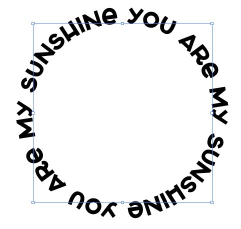
For this one, I think I’d put a sun right in the center to complete my SVG!
Typing on a Path
Similarly, you can type on a path that is not a full circle. I often use this feature to make text go around an image or to create some movement in my designs. This uses the same tool as we used above, but for this one we’re going to try using the Pen Tool for the first time.
I’ll be going into the Pen Tool more in an upcoming tutorial because it can be intimidating, but let’s try a simple Pen Tool line. To start, make sure you have an empty fill and a colored stroke. You can do this in one of the many places you can change the colors, but I did it in the bottom of the Toolbar on the left. The box on the left is the fill and the box on the right underneath it is the stroke.

Now select the Pen Tool (P). Click to add an anchor point. Then add a few more so you have a line that looks similar to this (it doesn’t need to be exact):

Then choose the anchor point tool (Shift+C). Click and drag the two middle anchor points to the right to turn those anchor points from corner anchor points into smooth anchor points—create a wavy line!

Now use the same Type on a Path tool as above and click on the left side of your line. I typed “vacation squad” using the font Charley and Beau. Add your text and you can see how you could create some interesting movement in your text with this tool!

You can even use the Direct Selection Tool to select the anchor points and handles in the path you created to really refine the curve. I curved the right anchor point up a bit, for example.

And if you’re like OMG, Cori, what are anchor points and paths and handles, I am completely lost…you need to go back and read my post Adobe Illustrator: Paths, Anchor Points, and Handles!
Ligatures and Glyphs
Another fun thing you can do with fonts is use ligatures and glyphs! Not all fonts have ligatures and glyphs but if your fonts do have them, they are a great way to make your SVG designs more unique.
Ligatures
Ligatures are letterforms that combine two or more letters into a single letterform to make them more aesthetically pleasing. So you can see below in the font Glamor Absolute, that the two letters have been combined into a single ligature. The dot on the “i” is not longer awkwardly running into the “f” for example. There’s a more decorative combination for the “r” and the “a,” etc.
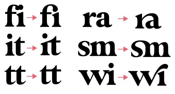
You can turn ligatures off and on in the OpenType Panel that I mentioned earlier in this post along with the Character Panel. The OpenType Panel is an “O” and when you click on it you’ll see some options. The two we are interested in here are Standard Ligatures (the first icon) and Discretionary Ligatures (the third icon).
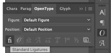
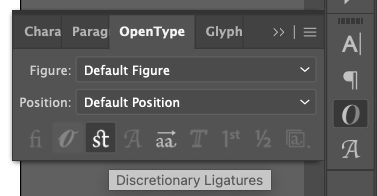
From here you can click these buttons to turn off your ligatures. Depending on how the font designer coded their font, ligatures may either be standard or discretionary. They are different for every font and some fonts may have both. So if you want to turn them off or on, use either or both of these buttons.
Glyphs
Glyphs are all the letterforms in a font (ligatures are a type of glyph!). In addition to ligatures, many fonts have alternate glyphs that you can use to make your designs more interesting. A lot of times glyphs will include swashes or other designs.
Let’s say I have “wanderlust” in the font Bigola. It’s a pretty, classic font…but it’s not in any way interesting.

There are two ways to access the glyphs in Adobe Illustrator. The first is to open the Glyph Panel. I had you install this way back in the first lesson, or you can go to the Menu Bar at the top and choose Window > Type > Glyphs. In the Glyphs panel, you’ll see every letterform for the font, including the normal letterforms, punctuation, numbers, and any alternate letterforms.
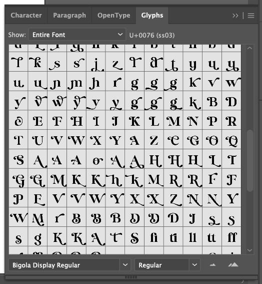
If you select a letter in your text, and then double click on a glyph in the Glyph Panel, it will replace your letter with the glyph.
Another way to insert a glyph is to select your letter in your text and wait half a second. The glyphs for that letter should pop up below the letter and you can select it there. Super easy!
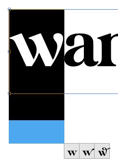
You can see that I’ve replaced several of the letters in our boring “wanderlust” to create a much more visually interesting version using glyphs! This might be more glyphs than I would actually use in a design, but I wanted you to get an idea of what you can do with glyphs.

Manipulating Anchor Points and Handles
Finally, you can really make minute edits by actually editing the anchor points and handles within a font. This is getting into the weeds, but if you want your designs to stand out, this is one way to do it! For this one, I suggest you watch the video above to see all the details.
But overall, I outlined my fonts (shift+command+O (Mac) / shift+control+O (PC)) and then used the Direct Selection Tool to select just certain anchor points in my letters, allowing me to shift and manipulate just small parts of each letter, vs. the entire letter itself.
So I started with this “love will keep us warm” image in font Anything Goes.

Then I zoomed in (command+ (Mac) / control+ (PC)) so I could work more easily and I selected a few anchor points at the ends of the letters and stretched them in different ways. My final product looks like this:
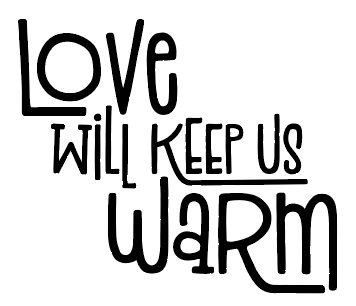
You can see that I’ve extended a bunch of the letters to be more interesting and reshaped some others. This is a bit advanced, but manipulating anchor points and handles can also help you make small changes that will make your design perfect. This is one of those things that takes a lot of practice but it’s worth learning!
WHEW! That was a ton about using fonts in SVGs! If you have any questions, feel free to leave them below. Stay tuned for next week when we’ll dive into color!


Leave A Reply!