Take your SVG designs to the next level by using different Adobe Illustrator text effects and tools! Learn how to create retro designs, interesting styles, and more in this Adobe Illustrator tutorial for beginners.
We’re well into this Adobe Illustrator series and today we’re diving even deeper into text! We learned how to create a simple SVG from a font and some basic tips and tricks for using fonts in SVG files. Today we’re going to continue exploring fonts and create some really fun text effects and using some of my favorite tools in Adobe Illustrator.
You can use these Adobe Illustrator text effects and tools in so many ways to create really interesting, unique cut files for your Cricut, Silhouette, laser, or other cutting machine.
This is the eighth tutorial in this series! Each tutorial builds on the next, so I highly recommend reading them in order so that you’re not lost going through this tutorial.
- Workspace Overview (video)
- Paths, Anchor Points, and Handles (video)
- Make an SVG from a Font (video)
- Tips for Using Fonts in SVGs (video)
- Color Basics (video)
- Using Shapes and Lines to Make Illustrations (video)
- Using the Pen Tool (video)
- Creating Fun Text Effects (video)
- Image Trace (video)
- 10 Quick Tricks for SVG Design (video)
Like in every tutorial, I encourage you to use keyboard shortcuts. They will speed up your workflow and you’ll be much faster at creating your SVG designs. I use shortcuts in this lesson in parentheses. You can also download a keyboard shortcut printable below to help you remember the most popular shortcuts for SVG design.
Watch the Video
Want a video tutorial for using these Adobe Illustrator text effects? Just click play below. Or read on for a written tutorial!
Get the Free Illustrator Shortcuts File
Want access to this free file? Join my FREE craft library! All you need is the password to get in, which you can get by filling out the form below. The file number is: P121.
Adobe Illustrator Text Effects
Using an Arc Text Effect
The first arc text effect has a similar result to the typing on a circle path that we talked about in the Tips for Using Fonts in SVGs post. Depending on your font and the look you are going for, you can use either method. I find that sometimes the arc works better and sometimes the circle works better, depending on the font!
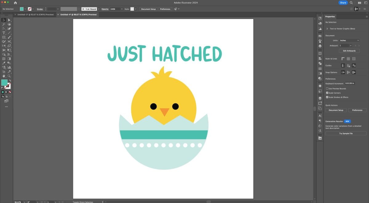
Let’s say we have this cute chick image. You should be able to draw something similar using what you’ve learned in this tutorial series so far! We want to put “just hatched” over the top, perfect for newborn baby projects, using the Text Tool (T). I’ve chosen a font (Marker Print) and changed the color to teal.
Now I want to arc the words over the top of the chick’s head. Select the text (V) and in the Menu at the top, go to Effect > Warp > Arc. This will open up the Warp options. In the dropdown, you can see tons of different text effects, but the two I’m showing in this tutorial (Arc and Wave) are the two I use most often.
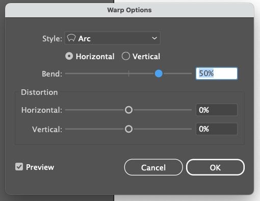
You can play around with the settings. If you have the Preview box checked, you should be able to see the live changes. When you have an arc you like, click OK.

So cute! Now if you hover over the text, you’ll see that it’s not expanded. You’ll see the original text in blue (and you can edit it). But we need to expand it to be able to cut it on a cutting machine.
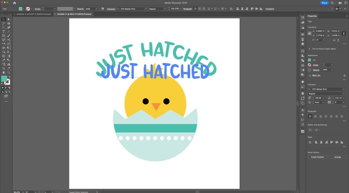
Select the text (V) and go to the top Menu and choose Object > Expand Appearance. This step is in lieu of the Outline Fonts step we normally do. Because we’ve used a text effect, we need to Expand Appearance vs. Outline Fonts.
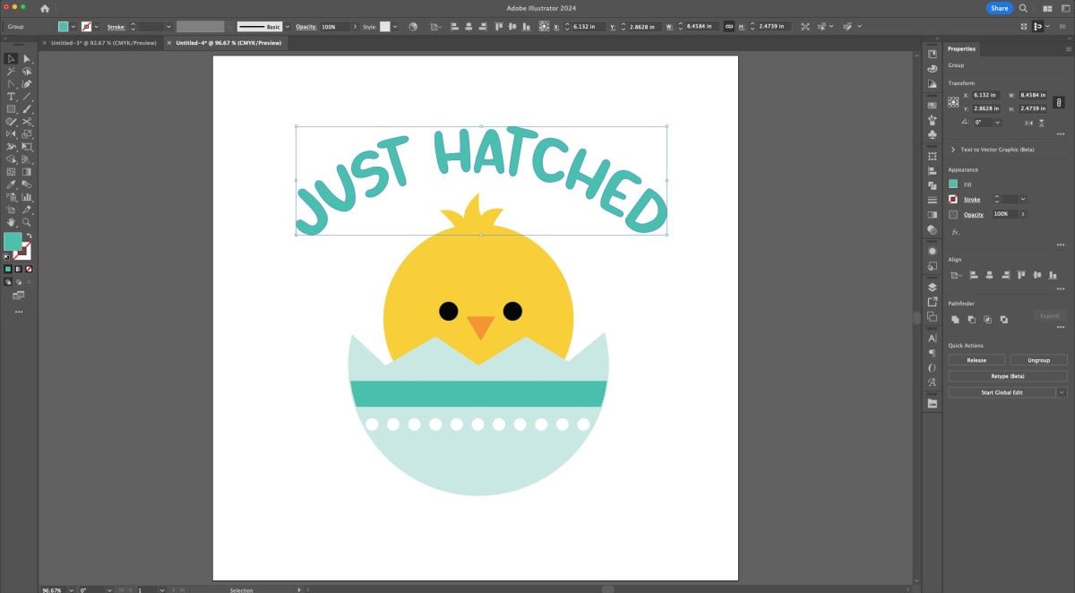
Now the text is a shape that can be cut!
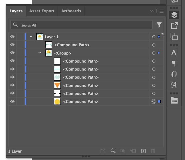
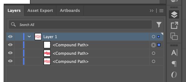
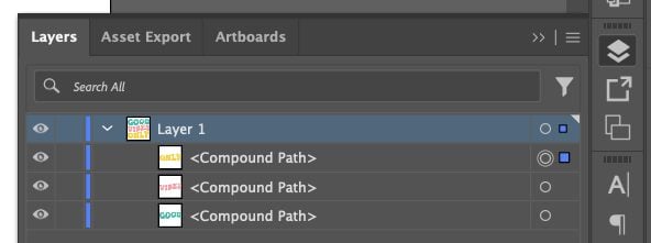
Make each piece of your project a compound path (Command+8 (Mac) / Control+8 (PC)) and your SVG is finished! (See more in the How to Make a Font from an SVG post for more information about why compound paths are important.) You can see in the Layers Panel that I have my words as a compound path, and then I’ve grouped (Command+G (Mac) / Control+G (PC)) the compound paths of the chick together.
Using an Offset Text Effect
Another fun way to create unique SVG files in Adobe Illustrator is using an offset. Let’s start by typing (T) a simple “xoxo” on our artboard. I’m using the font Vintage Culture.
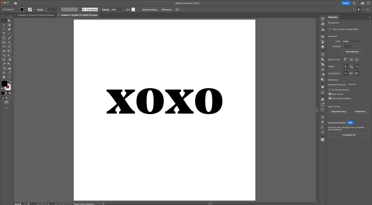
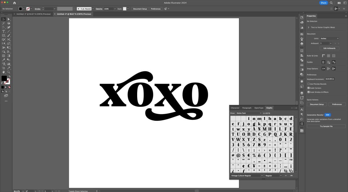
I used two different glyphs for the x’s, to make the text more interesting (we covered this in the Tips for Using Fonts in SVGs post).
Select the text (V) and now we need to outline our font (Shift+Command+O (Mac) / Shift+Control+O (PC)). This turns it from a font to a shape we can cut. You can see the blue outline around the letters.
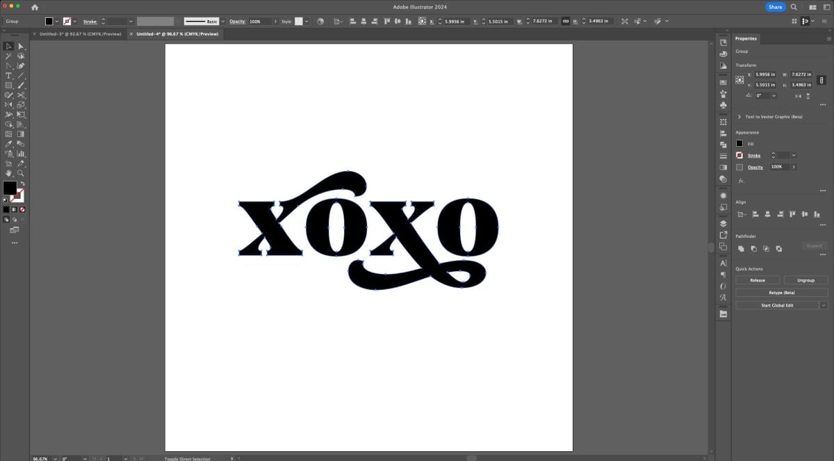
Now let’s select our shape (V) and make it a compound path (Command+8 (Mac) / Control+8 (PC)). This is one of those cases where it looks like our image disappears (we’ve talked about this in previous lessons), but really it’s still there—it just has an empty fill.
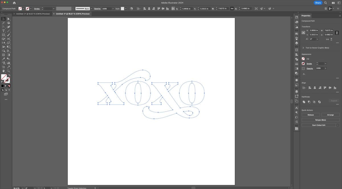
Using the Select tool, click on the image (V) and change the color back to black.
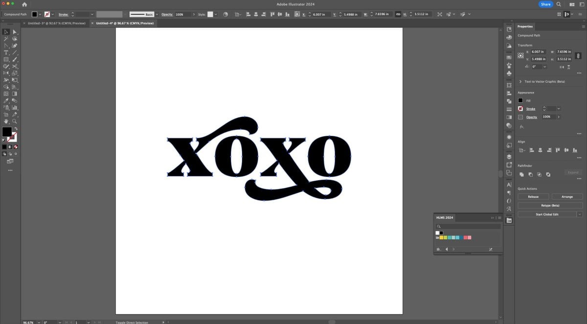
Now we can apply our offset. In the Menu at the top, go to Object > Path > Offset Path. This will bring up the Offset Path window.
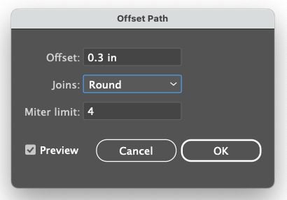
You can play around with the settings here. Again, if you keep Preview checked you’ll be able to see the changes as you make them. I settled on a 0.3 offset with round joins. Click OK.
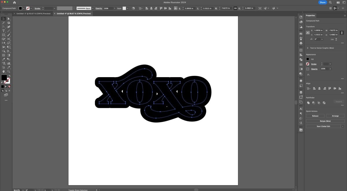
Now you can click on the original “xoxo” in the middle of the offset and see the offset around the edge.
Do you see how we have those awkward white triangles where the offset didn’t fully cover our gaps? We can easily get rid of those. Double click on the offset piece to take it into isolation mode. Then you should be able to click on each triangle and just hit the delete or backspace key to delete it.
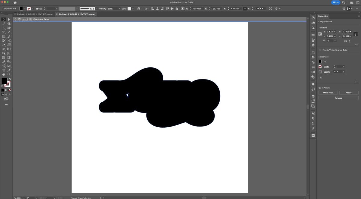
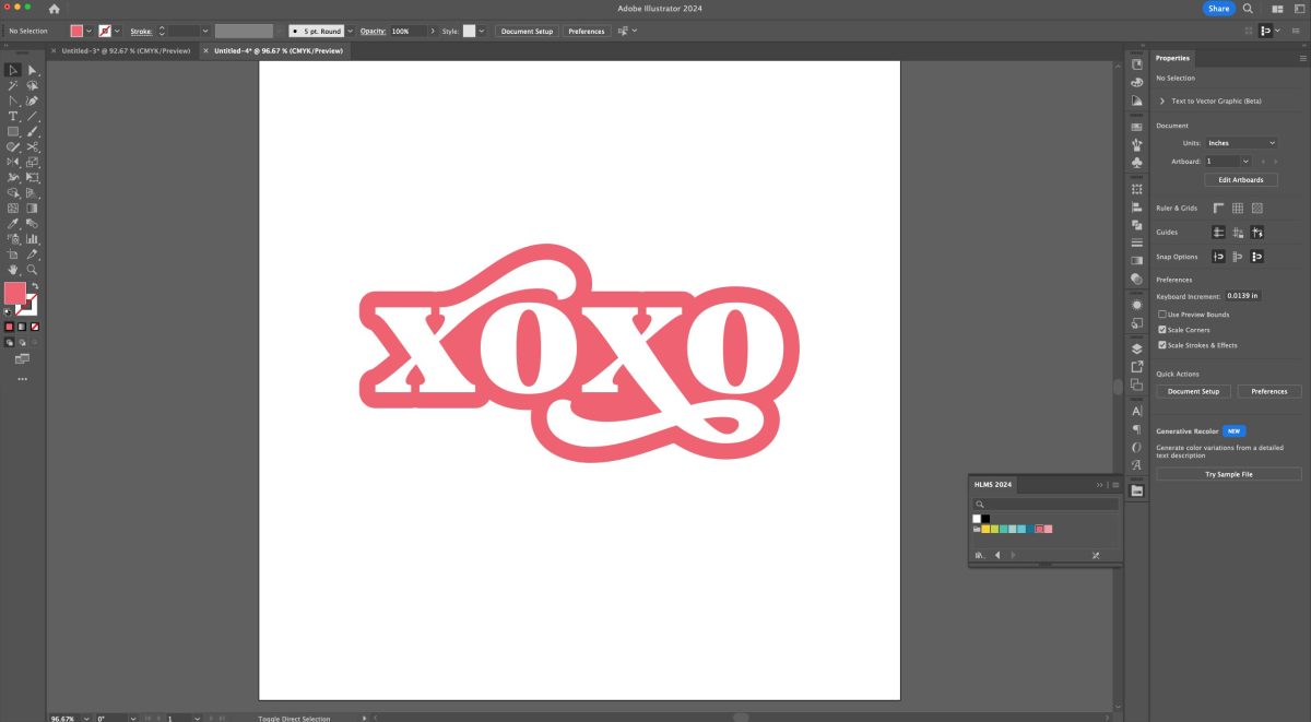
Then double click back on your art board to exit the isolation mode. I changed the color of my text to white and the color of my offset to a dark pink.
So cute! You can leave it as is, or you can add another offset, using the same method. I colored my second offset a lighter pink.
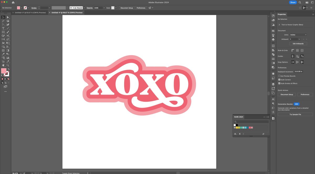
Then make your text and each offset its own compound path (Command+8 (Mac) / Control+8 (PC)) so it’s ready to cut!
Creating a Retro Wave Text Effect
Retro files have been all the rage for a few years now and they don’t show any sign of slowing down. Let’s use the Wave tool to make a cute retro design!
Use the text tool (T) to type your phrase. I’m using “good vibes only” in my favorite retro font Nellie. I’m using a single text box for this project, hitting enter after every word. If you remember from the Tips for Using Fonts in SVGs tutorial, I usually use separate text boxes for more than one line of text. But to get the Wave effect to work, you need a single text box.
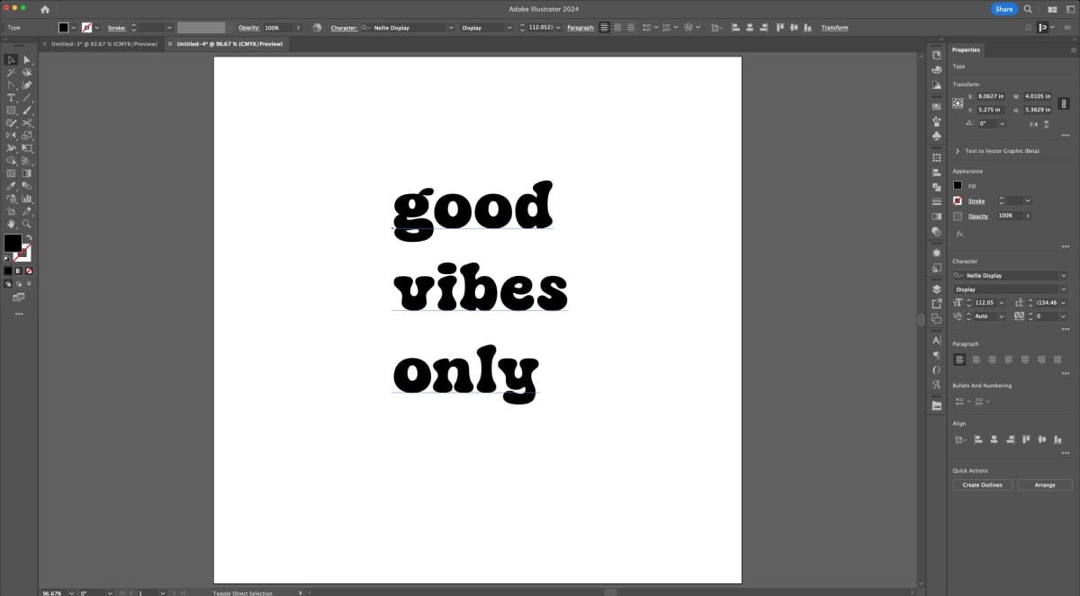
Notice that out of habit I typed it in all lowercase. Here’s a quick tip for changing it quick. Go to the Menu bar at the top and choose Type > Change Case > UPPERCASE. It’s so much faster than typing it out again with the caps lock on!
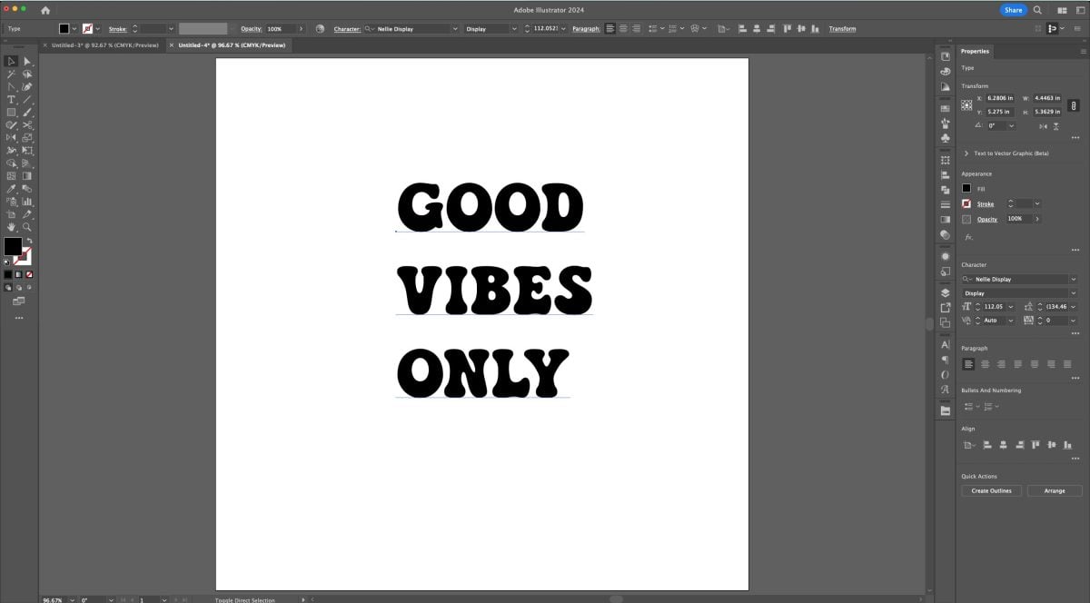
Now let’s make each line the same size. With the text tool (T), highlight GOOD and increase the size until it’s the same size as VIBES, using the text sizing box in the Character Panel.
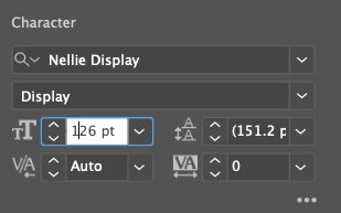
Do the same with ONLY.
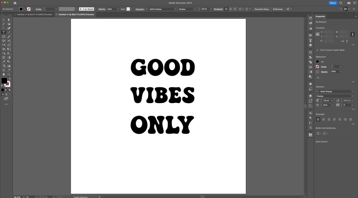
Now our lines are too far apart, so we’ll need to change the leading (which is the designer word for line spacing). Leading is also found in the Character panel. First, using the text tool (T), highlight the word VIBES and decrease the leading until it’s closer to GOOD.
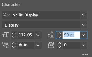
The highlight the word ONLY and decrease the leading until it’s closer to VIBES.
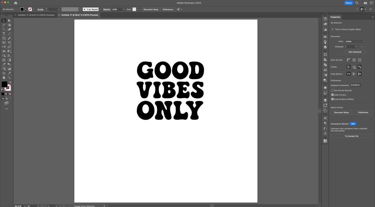
Looking good! Now select (V) the text and in the Menu bar, go to Effects > Warp > Wave. This will open up the Warp Options window.
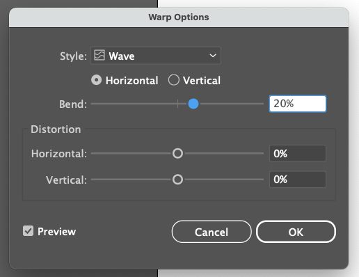
Again, you can play around here and see what you’re doing if you keep that Preview box checked. Don’t warp your text so far as to make it unreadable or uncuttable. Just a bit of a groovy wave will do. Click OK.
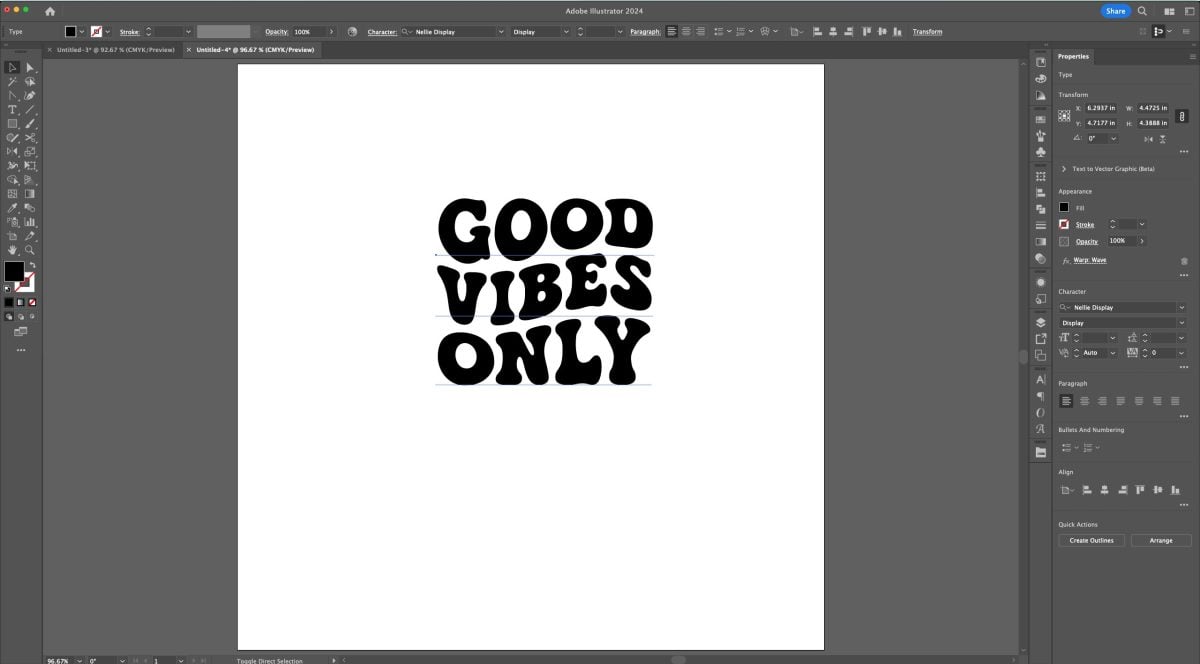
Perfect. Let’s outline our font (Shift+Command+O (Mac) / Shift+Control+O (PC)). Now it’s a cuttable file instead of a font.
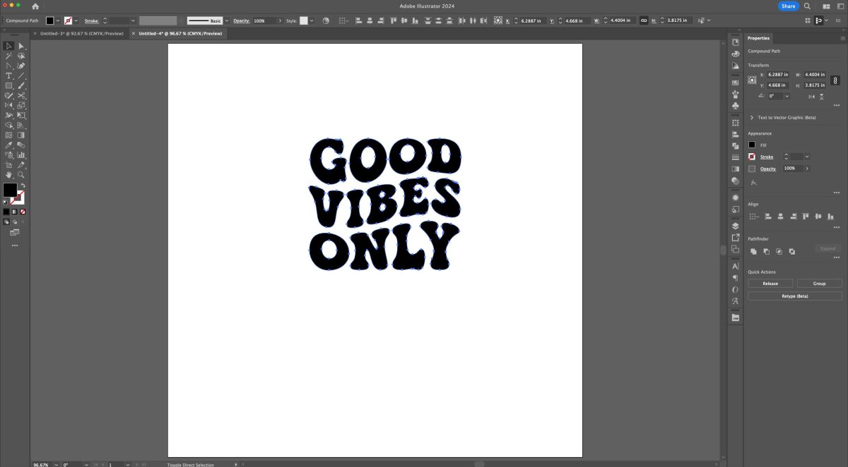
You could make this whole thing a compound path, but if you want to have different colored lines, for instance, you’d want to select the letters and ungroup (Shift+Command+G (Mac) / Shift+Control+G (PC)). Then you can select each word and make them each a different color.
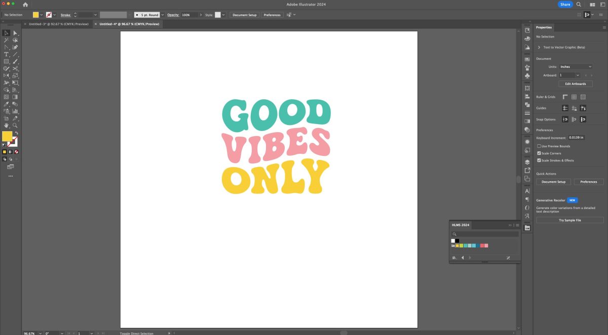
Make each word a compound path (Command+8 (Mac) / Control+8 (PC)) and your SVG is done! This is one of my favorite Adobe Illustrator text effects, and once you get comfortable making these retro SVGs they are SO quick!
Creating a 3D Retro Drop Shadow Text Effect
Finally, let’s create a fun 3D retro drop shadow effect. I feel like this is the type of effect you’d see on vintage baseball tees, for example.
Let’s start out by typing our word (T) in a sort of retro font—I find a bolder script font works well. I used Selphia.
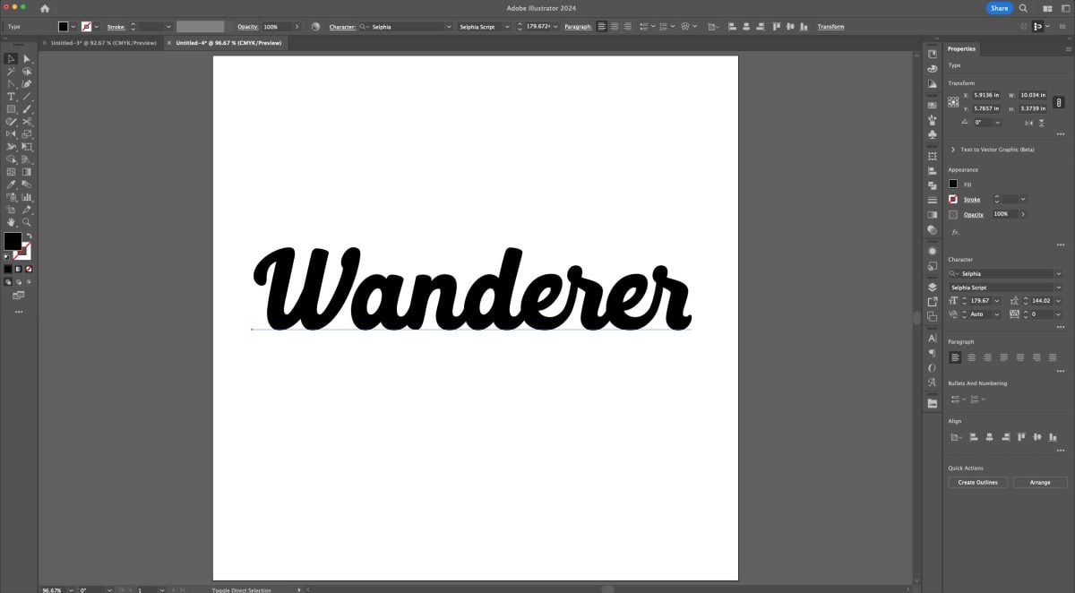
Outline your font (Shift+Command+O (Mac) / Shift+Control+O (PC)).
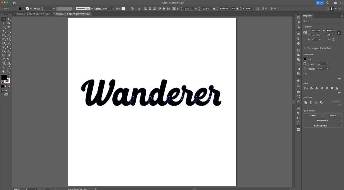
Then unite your font using Unite in the Pathfinder panel (we add this step because the letters overlap).

Now let’s use that offset again. Go to the Menu bar and choose Object > Path > Offset Path.
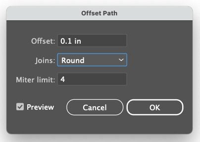
Here I’m going to choose a smaller offset than we used above, and a round join.
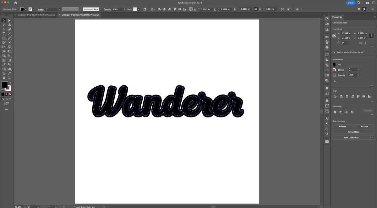
Recolor your artwork. I choose white for my word and teal for my offset.
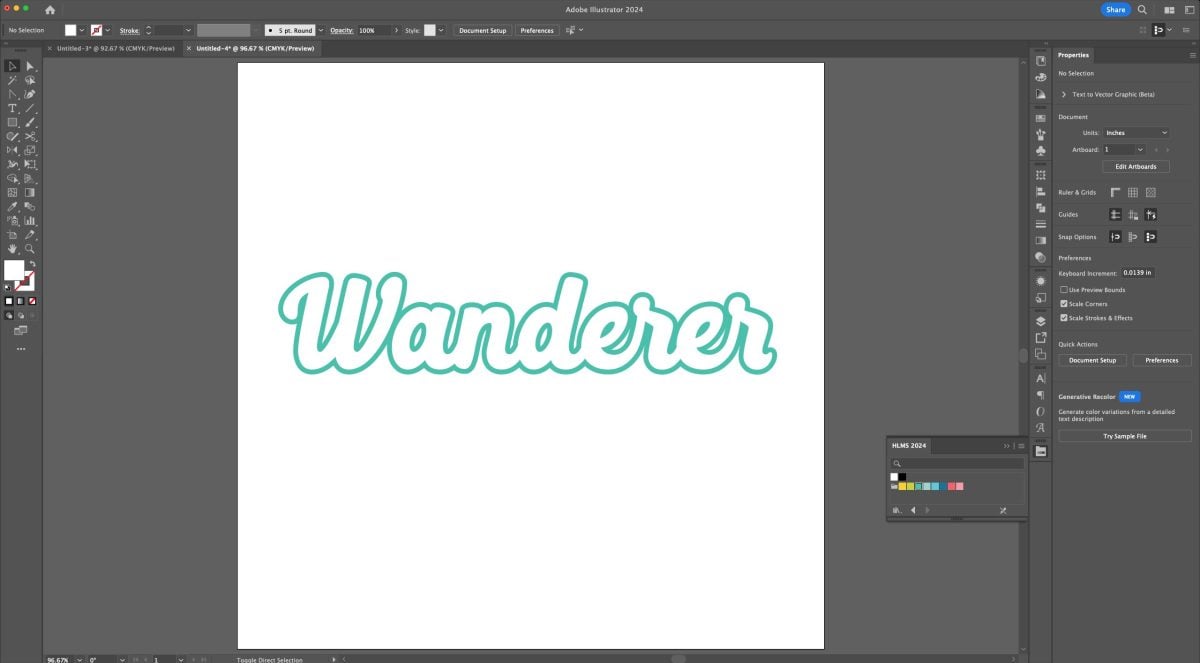
Now select just the offset and copy it (Command+C (Mac) / Control+C (PC)) and paste it (Command+V (Mac) / Control+V (PC)). Then move it so it’s a bit to the right and below the first word you made.
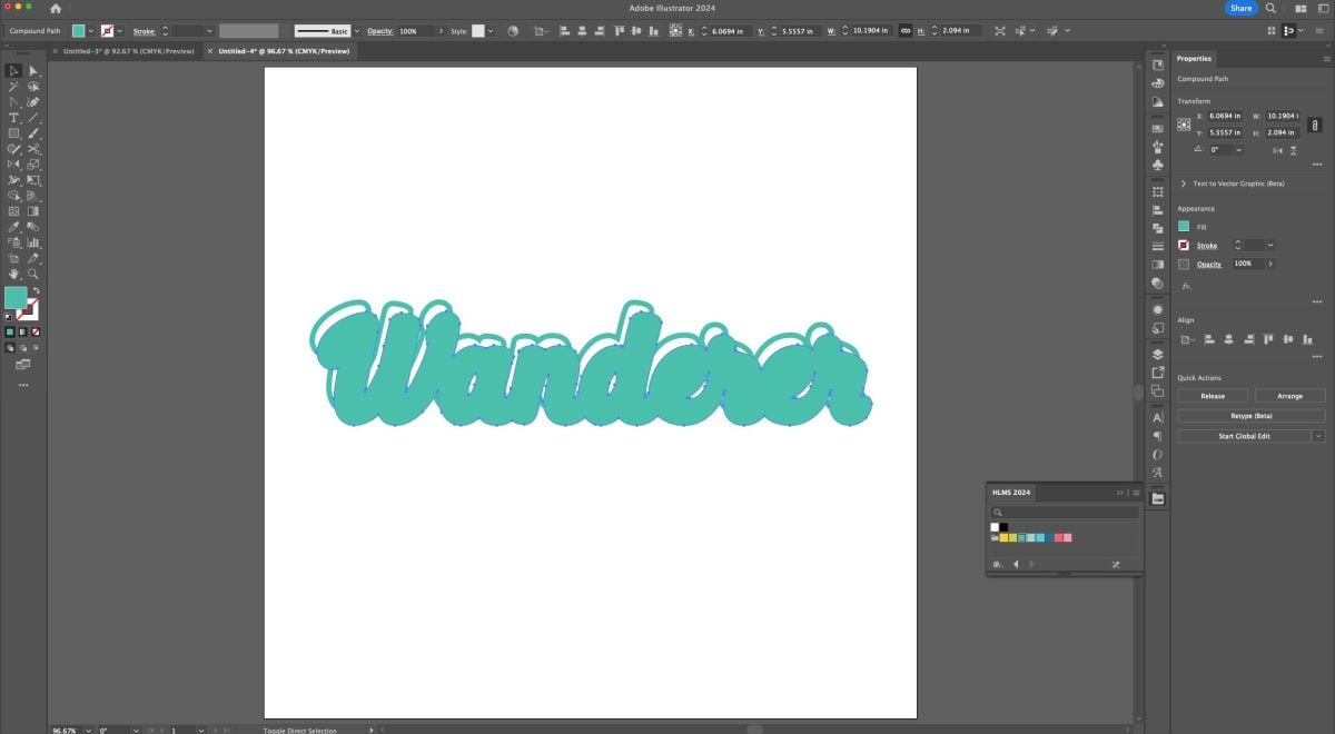
Now let’s send it to the back. You can go to the Menu bar and choose Object > Arrange > Send to Back or use the keyboard shortcut (Shift+Command+[ (Mac) / Shift+Control+[ (PC)). This is a regular drop shadow and can be used for a lot of designs!
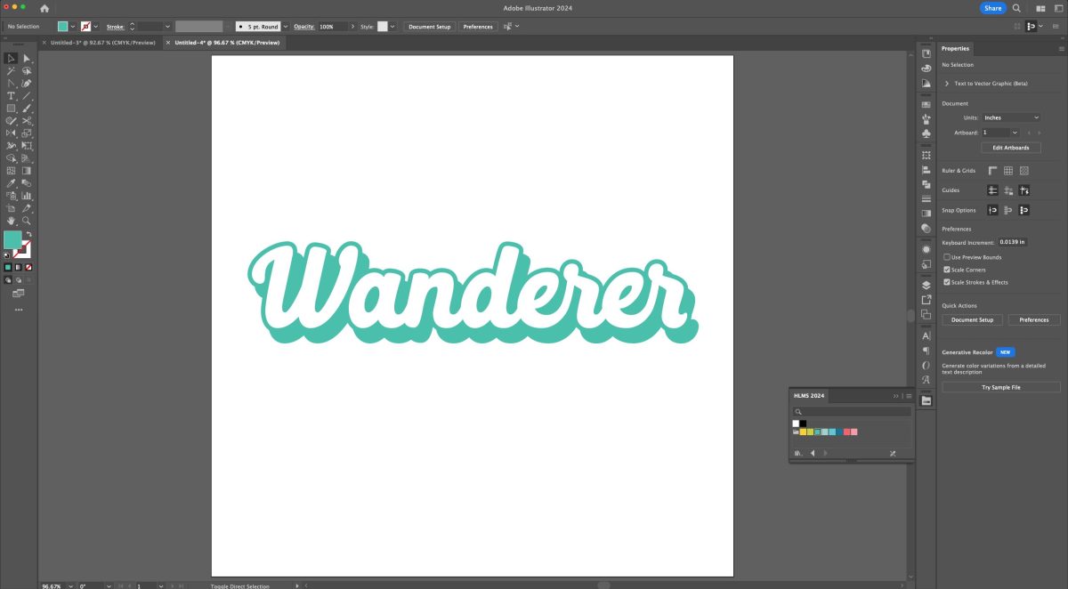
But now we’re going to use the Blend tool to make this shadow smooth so it looks more 3D. In the Menu bar, go to Object > Blend > Make. This will add basically one extra offset in between the two offsets we have.

Now go to Object > Blend > Blend Options.
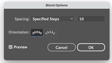
Change the dropdown from Smooth to Specified Steps and add 10 steps. Then click OK.
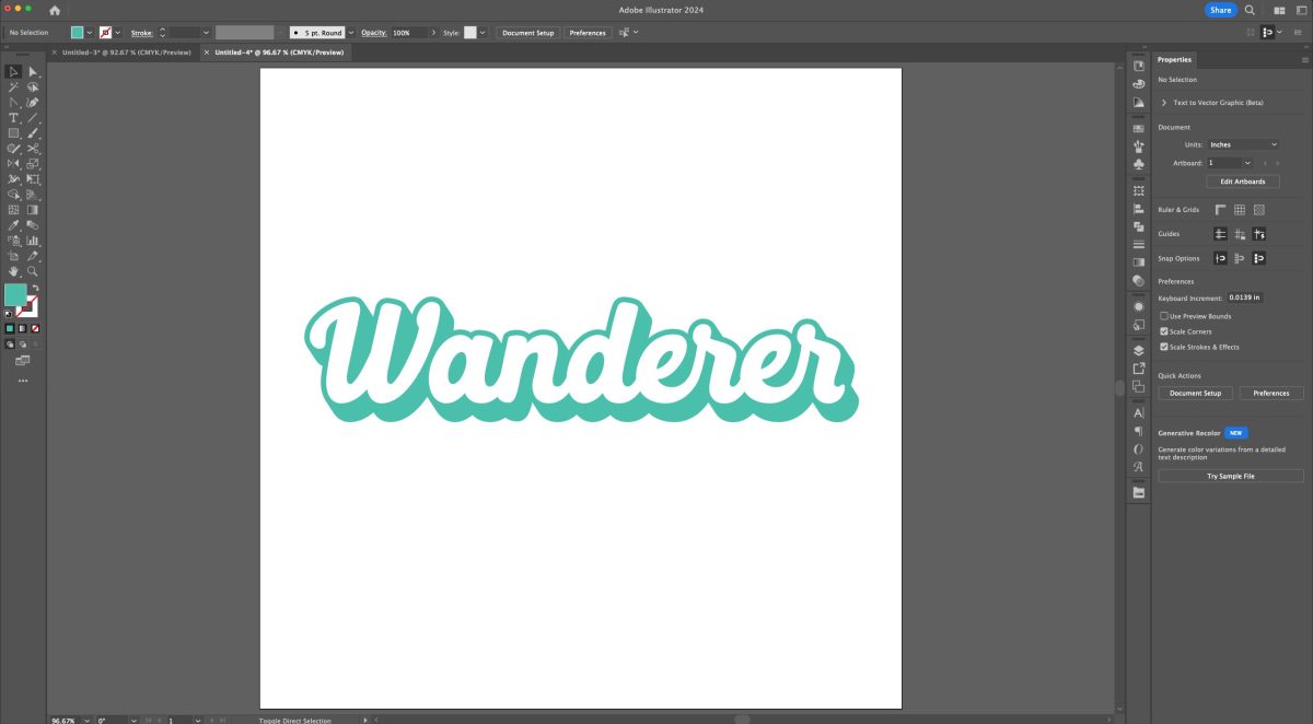
Now you can see that our shadow looks 3D because it smoothly projects from the back of our word!
Select the blended offset and go to the Menu bar and click Object > Expand.
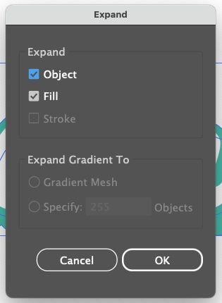
This will expand the blend so each step is an individual shape.
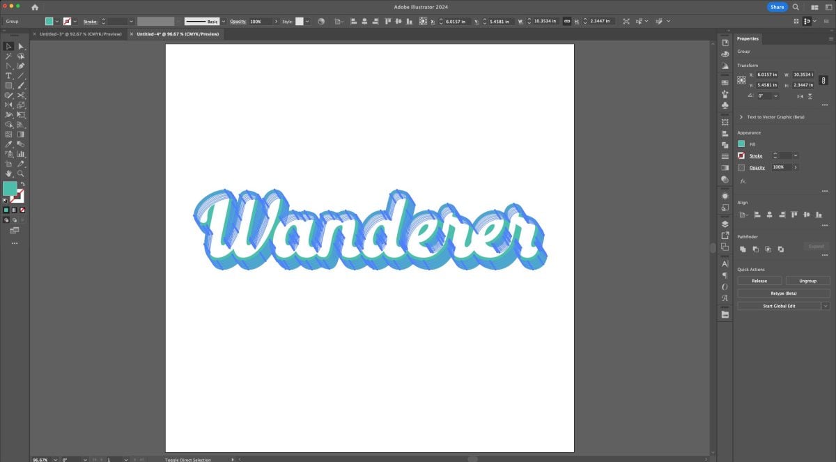
Now unite all the blend pieces into a single piece using the Unite in the Pathfinder panel.
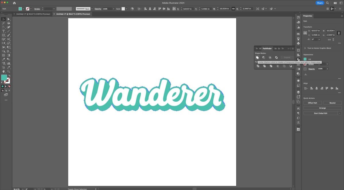
This looks good, but we have a lot of extra anchor points, particularly where we have diagonal lines.
So go to the Menu and go to Object > Path > Simplify.
This will open up the Simplify slider. You can use this to simplify the number of anchor points, making your file much more cuttable.
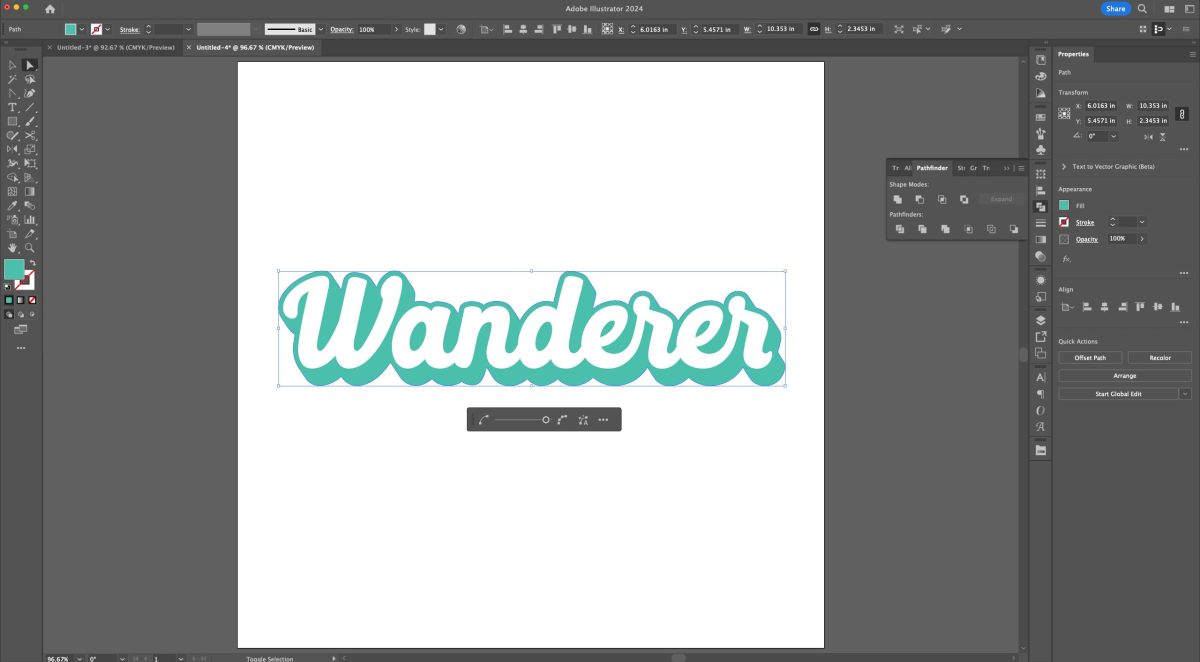
Then make the word and the shadow each a compound path (Command+8 (Mac) / Control+8 (PC)) and your retro 3D SVG is done!
I hope you enjoyed this tutorial for using text effects in Adobe Illustrator! Stay tuned next week when we’re going to learn how to create a vector from a sketch and a photo!



Leave A Reply!